Visualization of Multidimensional Data
Bob Jensen at Trinity University


You can read about many more mistakes (over 400 illustrations), particularly bias, missing variables, misleading definitions, incomplete analyses, etc. at
http://faculty.trinity.edu/rjensen/MisleadWithStatistics.htm 

Seeing Theory: A Visual Introduction to Probability and Statistics ---
https://students.brown.edu/seeing-theory/?vt=4

Seeing Theory (probability and statistics) --- http://students.brown.edu/seeing-theory

Visual Arts Data Service (VADS) --- https://vads.ac.uk

Powers of Ten: Census Edition (data visualization) --- https://jjjiia.github.io/powers/

"The Quick and Dirty on Data Visualization," by Nancy Duarte, Harvard Business Review Blog, April 16, 2014 ---
http://blogs.hbr.org/2014/04/the-quick-and-dirty-on-data-visualization/

Data Visualization Software for CPAs ---
https://www.cpajournal.com/2018/06/20/data-visualization-software/

Seeing Data --- http://seeingdata.org/

My favorite multivariate visualization is the History of Pandemic Deaths at
https://www.visualcapitalist.com/history-of-pandemics-deadliest/
Although there have been more deaths from Corona-19 the above graph would still show that our current pandemic is relatively puny.

MAKEOVER MONDAY (Data Visualization) --- www.makeovermonday.co.uk

Debt Clocks --- https://www.usdebtclock.org/  

TED Talk:  Without realizing it, we're fluent in the language of pictures, says illustrator Christoph Niemann in a highly entertaining talk ---
https://www.ted.com/talks/christoph_niemann_you_are_fluent_in_this_language_and_don_t_even_know_it?utm_source=newsletter_weekly_2018-07-28&utm_campaign=newsletter_weekly&utm_medium=email&utm_content=talk_of_the_week_button

Using Visualization Software to Compile and Analyze Data ---
https://www.cpajournal.com/2018/06/27/using-visualization-software-to-compile-and-analyze-data/

TED Talk:  Without realizing it, we're fluent in the language of pictures, says illustrator Christoph Niemann in a highly entertaining talk ---
https://www.ted.com/talks/christoph_niemann_you_are_fluent_in_this_language_and_don_t_even_know_it?utm_source=newsletter_weekly_2018-07-28&utm_campaign=newsletter_weekly&utm_medium=email&utm_content=talk_of_the_week_button

Ted Talk: The simple genius of a good graphic ---
https://www.ted.com/talks/tommy_mccall_the_simple_genius_of_a_good_graphic?utm_source=newsletter_weekly_2018-09-29&utm_campaign=newsletter_weekly&utm_medium=email&utm_content=talk_of_the_week_image

The Pudding Cup (data and story visualization) --- https://pudding.cool/process/pudding-awards-2018/

Why the world's flight paths are such a mess ---
https://multimedia.scmp.com/news/world/article/2165980/flight-paths/

FiveThirtyEight Blog's Data Visualization Highlights of 2018 ---
https://fivethirtyeight.com/features/the-45-best-and-weirdest-charts-we-made-in-2018/

Refugee Flow 2010 --- http://refugeeflow.world/

Kantar Information is Beautiful Awards 2018 (data visualization)  --- 
www.informationisbeautifulawards.com/showcase?award=2018&pcategory=winner&type=awards

The Atlas of Economic Complexity --- http://atlas.cid.harvard.edu/

Tutorial on How to Make Instructional Story Maps --- https://collections.storymaps.esri.com/how-to-stories/

The multibillion-dollar sales of Tableau and Looker are a coming of age for data visualization ---
https://qz.com/1640415/acquisitions-of-tableau-and-looker-show-coming-of-age-for-dataviz/

Beautiful News Daily (visualizing the news) --- https://informationisbeautiful.net/beautifulnews/

Visualization with a Bar Chart That Changes With Each Year's New Chart
Biggest Fast Food Chains in the World 1971 - 2019 (Stores)
https://public.flourish.studio/visualisation/1160235/
The year in question is shown in the lower right corner of the chart (which might be missed on some high resolution monitors)

Global Commodities (illustrations of data visualization) ---
https://www.dailyfx.com/research/global-commodities/?tr=imports&yr=2018&cm=gold,copper,oil,gas

Visualization:  An In-Depth Look at 10 Types of Maps
https://www.finereport.com/en/data-visualization/top-10-map-types-in-data-visualization.html

College undergrads find hidden text on medieval manuscript via UV imaging ---
https://arstechnica.com/science/2020/11/college-undergrads-find-hidden-text-on-medieval-manuscript-via-uv-imaging/  


A Fantastic Graphic on the History of Pandemics ---
https://www.visualcapitalist.com/history-of-pandemics-deadliest/
Thank you Paula Ward for the heads up

Jensen Comment
It's tricky to make clever graphics of multivariate phenomena.
This is an illustration of one of the best graphics I've ever seen.

Bob Jensen's Threads on Visualization of Multivariate Data (including faces) --- 
http://faculty.trinity.edu/rjensen/352wpvisual/000datavisualization.htm 


The First High-Resolution Map of America’s Food Supply Chain: How It All Really Gets from Farm to Table ---
http://www.openculture.com/2019/11/the-first-high-resolution-map-of-americas-food-supply-chain.html?utm_source=feedburner&utm_medium=email&utm_campaign=Feed%3A+OpenCulture+%28Open+Culture%29
Jensen Comment
Some graphs have too much detail even when its not enough detail. Perhaps the map should should color exports (think grain down the Mississippi river) from imports (think fruits and vegetables out of California, Texas, and Florida). In some way the map needs to distinguish food supply (think Iowa) from food flow through (think Mississippi).


Radar Chart --- https://en.wikipedia.org/wiki/Radar_chart

Interview With Kaplan and Porter at the Harvard Business School
Managing healthcare costs and value

by Kaplan, R. S., M. E. Porter and M. L. Frigo. 2017
Strategic Finance (January 2017): 24-33.
http://maaw.info/ArticleSummaries/ArtSumKaplanPorterFrigo2017.htm
Thank you Jim Martin for the heads up

This article provides the text of an interview with Kaplan and Porter conducted by Mark Frigo. The problem discussed is how to manage the true costs and value of health care.

The first question Frigo asked is how Kaplan and Porter got together to address the health care issue. Porter mentions his earlier work and the Value-Based Health Care Agenda described in a 2013 article by Porter and Lee (See the related summaries below). Porter called Kaplan in 2010 explaining that health care needed a better way to measure cost. Kaplan responded that time-driven activity-based costing would work well in health care, but he had not found a hospital willing to give it a chance. Porter had connections with some hospitals that were open to implementing a new cost system, and the Kaplan-Porter partnership to build a proper foundation for value-based health care began.

Frigo's second question: "What are the most important contributions management accountants can make in this area?" Kaplan's response is that management accountants can play a critical role in providing more valid measurements of cost and outcomes and in designing value-based payment models like bundled payments that cover the treatment of a patient's medical condition.

The third question is related to what tools and approaches are used in the value-based agenda to help health care organizations create greater value. Porter responds that value improvement means better outcomes for patients relative to the costs of achieving those outcomes. The most powerful step is to start measuring outcomes at the patient level for a given medical condition, including the functional status of patients after treatment. A sufficient set of outcomes should be developed and standardized for every major medical condition. The International Consortium for Health Outcomes Measurement has currently published 20 sets of outcomes covering 45% of the disease burden in the U.S.

The article includes four radar charts that illustrate the value-based framework. I developed two adaptations to show how both outcomes and cost can be presented in a visual way to compare procedures and surgeons. The first chart below, based on data from Scottsdale Healthcare, compares two alternative surgical treatments for obesity. The scale is from 0-100% where 100% is ideal. Cost is plotted as the reciprocal of the cost based on time-driven ABC. It is fairly easy to see from the illustration that sleeve surgery provides better outcomes and cost compared to gastric bypass. Sleeve surgery cost less than gastric bypass, and also involves fewer complications, readmissions, and reoperations.

Continued in article


Teaching Structural Geology in the 21st Century: Visualizations ---
http://serc.carleton.edu/NAGTWorkshops/structure/visualizations.html

2014: The Year in Interactive Storytelling, Graphics, and Multimedia --- http://www.nytimes.com/interactive/2014/12/29/us/year-in-interactive-storytelling.html

Bob Jensen's threads on tools and tricks of the trade ---
http://faculty.trinity.edu/rjensen/000aaa/thetools.htm

FlowingData (including how to make interactive graphics) --- http://flowingdata.com/  

"Harvard and MIT Release Visualization Tools for Trove of MOOC Data," Chronicle of Higher Education, February 20, 2014 --- Click Here
http://chronicle.com/blogs/wiredcampus/harvard-and-mit-release-visualization-tools-for-trove-of-mooc-data/50631?cid=at&utm_source=at&utm_medium=en

Harvard University and the Massachusetts Institute of Technology have released a set of open-source visualization tools for working with a rich trove of data from more than a million people registered for 17 of the two institutions’ massive open online courses, which are offered through their edX platform.

The tools let users see and work with “near real-time” information about course registrants—minus personally identifying details—from 193 countries. A Harvard news release says the tools “showcase the potential promise” of data generated by MOOCs. The aggregated data sets that the tools use can be also downloaded.

The suite of tools, named Insights, was created by Sergiy Nesterko, a research fellow in HarvardX, the university’s instructional-technology office, and Daniel Seaton, a postdoctoral research fellow at MIT’s Office of Digital Learning. Mr. Nesterko said the tools “can help to guide instruction while courses are running and deepen our understanding of the impact of courses after they are complete.”

The Harvard tools are here, while those for MIT are here.

Maps Are Territories (cross-cultural study of history and philosophy) --- http://territories.indigenousknowledge.org/

Florence Nightingale Created Revolutionary Visualizations of Statistics That Saved Lives (1855) ---
http://www.openculture.com/2016/03/florence-nightingale-created-revolutionary-visualizations-of-statistics-that-saved-lives-1855.html 

Bob Jensen's threads on MOOCs and open sharing learning materials in general ---
http://faculty.trinity.edu/rjensen/000aaa/updateee.htm#OKI

Tabletop Whale (vidualization) --- http://tabletopwhale.com

Wikiverse (data visualization of Wikipedia concepts) --- http://wikiverse.io


"Classic Data Visualizations," by David Gilles, Econometrics Beat, August 12, 2015 ---
http://davegiles.blogspot.com/2015/08/classic-data-visualizations.html

My thanks to Veronica Johnson at Investech.com for drawing my attention a recent piece of theirs relating to Classic Data Visualizations.

As they say:

"A single data visualization graphic can be priceless. It can save you hours of research. They’re easy to read, interpret, and, if based on the right sources, accurate, as well. And with the highly social nature of the web, the data can be lighthearted, fun and presented in so many different ways.

What’s most striking about data visualizations though is that they aren’t as modern a concept as we tend to think they are.

In fact, they go back to more than 2,500 years—before computers and tools for easy visual representation of data even existed."

Here are the eleven graphics that they highlight:

Continued in article

Visual Cinnamon (data visualization) --- http://www.visualcinnamon.com


The Periodic Table of Elements Scaled to Show The Elements’ Actual Abundance on Earth ---
http://www.openculture.com/2015/10/the-periodic-table-of-elements-scaled-to-show-the-elements-actual-abundance-on-earth.html

Advances in Visualization
From the CFO Journal's Morning Ledger on January 16, 2015

We know how you feel
http://www.newyorker.com/magazine/2015/01/19/know-feel
The New Yorker’s Raffi Khatchadourian reports on how technology conceived to help autistic individuals recognize the emotional meanings behind facial expressions came to be embraced by the advertising industry and beyond. User engagement has become an increasingly valuable commodity “and just as the increasing scarcity of oil has led to more exotic methods of recovery the scarcity of attention, combined with a growing economy built around its exchange, has prompted R&D in the mining of consumer cognition.”  Today many industries, from film studios to cable companies to even nightclubs, are paying attention to advances in hardware and software platforms that detect and record even the most minute facial expressions for signs of engagement. Representative Mike Capuano, of Massachusetts tried and failed to propose an act to compel companies to indicate when sensing begins. “People were saying, ‘Come on. What are you, crazy, Capuano? What, do you have tinfoil wrapped around your head?’ And I was like, ‘Well, no. But if I did, it’s still real.’ ”


"Visualizing Algorithms," by Mike Bostock (The New York Times Graphics Editor) , June 26, 2014 ---
http://bost.ocks.org/mike/algorithms/

"The power of the unaided mind is highly overrated… The real powers come from devising external aids that enhance cognitive abilities. " —Donald Norman

Algorithms are a fascinating use case for visualization. To visualize an algorithm, we don’t merely fit data to a chart; there is no primary dataset. Instead there are logical rules that describe behavior. This may be why algorithm visualizations are so unusual, as designers experiment with novel forms to better communicate. This is reason enough to study them.

But algorithms are also a reminder that visualization is more than a tool for finding patterns in data. Visualization leverages the human visual system to augment human intellect: we can use it to better understand these important abstract processes, and perhaps other things, too.

Continued in the article (You really have to study the visuals to appreciate this article)

Visualization of Multivariate Data (including faces) ---
http://faculty.trinity.edu/rjensen/352wpvisual/000datavisualization.htm 


Piktochart: 5 Language Infographics (story telling in pictures) --- http://piktochart.com/5-top-language-infographics/

WSDOT: Visual Engineering Resource Group (VERG) http://www.wsdot.wa.gov/business/visualcommunications/


"The Best Infographics of the Year: Nate Silver on the 3 Keys to Great Information Design and the Line Between Editing and Censorship," by Maria Popova, Brain Pickings, October 14, 2014 ---
http://www.brainpickings.org/2014/10/14/best-american-infographics-2014-nate-silver/ 


MathJax (mathematics visual displays) --- http://www.mathjax.org/


Imaging Technology Group --- http://itg.beckman.illinois.edu/index.cgi

"The Quick and Dirty on Data Visualization," by Nancy Duarte, Harvard Business Review Blog, April 16, 2014 ---
http://blogs.hbr.org/2014/04/the-quick-and-dirty-on-data-visualization/

"Harvard and MIT Release Visualization Tools for Trove of MOOC Data," Chronicle of Higher Education, February 20, 2014 --- Click Here
http://chronicle.com/blogs/wiredcampus/harvard-and-mit-release-visualization-tools-for-trove-of-mooc-data/50631?cid=at&utm_source=at&utm_medium=en

50 Great Examples of Data Visualization ---
http://www.webdesignerdepot.com/2009/06/50-great-examples-of-data-visualization/

Bob,
Just wanted to give you a heads up that I created a similar one. It’s like 50 Great Examples of Data Visualization, but more thorough and up to date:
http://inspire.blufra.me/big-data-visualization-review-of-the-20-best-tools/


DensityDesign (visual representation of complex social, organizational and urban phenomena) --- http://www.densitydesign.org


The periodic table of data/information visualization:
http://www.visual-literacy.org/periodic_table/periodic_table.html
Thank you Jagdish Gangolly for the heads up.

U.S. Census: Data Visualization --- http://www.census.gov/dataviz/

50 Great Examples of Data Visualization ---
http://www.webdesignerdepot.com/2009/06/50-great-examples-of-data-visualization/

The 2008-2009 Economic Downfall
Great Graphic:  Infographic: Anatomy of the Crash
http://www.simoleonsense.com/infographic-anatomy-of-the-crash/
Bob Jensen's threads on the downfall --- http://faculty.trinity.edu/rjensen/2008Bailout.htm 

"Swimming in Data? Three Benefits of Visualization," by John Siviokla, Harvard Business School December 4, 2009 ---
http://blogs.harvardbusiness.org/sviokla/2009/12/swimming_in_data_three_benefit.html?cm_mmc=npv-_-DAILY_ALERT-_-AWEBER-_-DATE

Visualizing Economics
Comparing Income, Corporate, Capital Gains Tax Rates: 1916-2011 and Other Graphics --- Click Here
http://visualizingeconomics.com/2012/01/24/comparing-tax-rates/?utm_source=feedburner&utm_medium=feed&utm_campaign=Feed%3A+VisualizingEconomics+%28Visualizing+Economics%29&utm_content=Google+Reader

Google Public Data Explorer
Data visualizations for a changing world --- http://www.google.com/publicdata/home

Available Data Sets --- http://www.google.com/publicdata/directory

Mathematical Imagery --- http://www.ams.org/mathimagery/thumbnails.php?album=28#galleries

2010 Found Math Gallery --- http://www.maa.org/FoundMath/FMgallery10.html

50 Great Examples of Data Visualization ---
http://www.webdesignerdepot.com/2009/06/50-great-examples-of-data-visualization/

IBM's Website for Data Visualization --- --- http://services.alphaworks.ibm.com/manyeyes/app 
IBM's site lets people collaborate to creatively visualize and discuss data on fast food, Jesus' apostles, greenhouse-gas trends, and more.

The Science of Vision and the Emergence of Art --- http://www.webexhibits.org/colorart/index.html

Exploratorium: Optical Illusions --- https://www.exploratorium.edu/explore/staff_picks/optical_illusions

Money Chart --- http://xkcd.com/980/huge/#x=-8064&y=-2880&z=4
Thank you George Wright for the heads up.

Bartlett Centre for Advanced Spatial Analysis (and visualization) ---
http://www.bartlett.ucl.ac.uk/casa
Thank you Ramesh Fernando for the heads up.

Advances in Visualization
Mapping for Results: The World Bank --- http://maps.worldbank.org/

Explore America's history the 21st century way with: 700 digital maps --- http://dailym.ai/1kEvKnB

The Higgs Boson explained by PhD Comics, July 4, 2012 ---
http://flowingdata.com/2012/07/04/higgs-boson-explained-by-phd-comics/
Infographics by Nathan Yau
 

From the Scout Report on September 14, 2012

Color Uncovered: An Interactive Book for the iPad --- http://www.exploratorium.edu/downloads/coloruncovered/ 

If you've ever wondered what color a whisper might be, this delightful interactive book is for you. Created by the folks at the Exploratorium in San Francisco, "Color Uncovered" is a unique volume complete with articles, illusions, and videos that explore the art, physics, and psychology of color. Also, the book has some color activities that just require an iPad and basic items such as a drop of water and a piece of paper. This book is compatible with all iPads running iOS 4.3 and newer.

"Psychologists Release Emotion-On-Demand Plug In For Virtual Characters:  Downloadable facial expressions for virtual characters are guaranteed to convey specific emotions, say psychologists," MIT's Technology Review, November 22, 2012 --- Click Here
http://www.technologyreview.com/view/507786/psychologists-release-emotion-on-demand-plug-in-for-virtual-characters/?utm_campaign=newsletters&utm_source=newsletter-daily-all&utm_medium=email&utm_content=20121123 

Also see http://arxiv.org/abs/1211.4500

Downloadable Expressions --- http://www.joostbroekens.com/

NOAA: Images, Visualizing Data, Marine Geology & Geophysics Division --- http://www.ngdc.noaa.gov/mgg/image/

50 Great Examples of Data Visualization ---
http://www.webdesignerdepot.com/2009/06/50-great-examples-of-data-visualization/


"Facebook Creates Software That Matches Faces Almost as Well as You Do:  Facebook’s new AI research group reports a major improvement in face-processing software," by Tom Simonite, MIT's Technology Review, March 17, 2014 ---
http://www.technologyreview.com/news/525586/facebook-creates-software-that-matches-faces-almost-as-well-as-you-do/?utm_campaign=newsletters&utm_source=newsletter-daily-all&utm_medium=email&utm_content=20140318

Asked whether two unfamiliar photos of faces show the same person, a human being will get it right 97.53 percent of the time. New software developed by researchers at Facebook can score 97.25 percent on the same challenge, regardless of variations in lighting or whether the person in the picture is directly facing the camera.

That’s a significant advance over previous face-matching software, and it demonstrates the power of a new approach to artificial intelligence known as deep learning, which Facebook and its competitors have bet heavily on in the past year (see Deep Learning”). This area of AI involves software that uses networks of simulated neurons to learn to recognize patterns in large amounts of data.

“You normally don’t see that sort of improvement,” says Yaniv Taigman, a member of Facebook’s AI team, a research group created last year to explore how deep learning might help the company (see “Facebook Launches Advanced AI Effort”). “We closely approach human performance,” says Taigman of the new software. He notes that the error rate has been reduced by more than a quarter relative to earlier software that can take on the same task.

Jensen Comment

Jensen Comment
It might be interesting to combine face recognition software with face generation software. Years ago I experimented with displaying multivariate data in faces.  However, in those days I was working with Chernoff Faces that were cartoon depictions of multivariate data. There were, however, some efforts in those days to depict multivariate data in the form of real faces constructed from FBI mug books.

The purpose behind displaying multivariate data in the form of faces is so that human observers can then try to find faces that are the most similar or the most different. It would seem that for real faces that depict multivariate data, face recognition software could replace humans in matching up the faces.

Visualization of Multivariate Data (including faces) ---
See Below


Smithsonian X 3D --- http://3d.si.edu/

Mathematical Imagery --- http://www.ams.org/mathimagery/thumbnails.php?album=28#galleries

The Educational Multimedia Visualization Center (video) ---  http://emvc.geol.ucsb.edu/

From the Scout Report on June 21, 2013


Skype Recorder --- http://im.simkl.com/ 

In an increasingly connected world, it's often necessary to conduct interviews, customer support, and more over Skype. Simkl is a good way to keep track of conversations users need to reference later. The conversations can be stored on any computer or to the cloud. Additionally, visitors can use the same application to record IM conversations. The program is available in over a dozen languages and it is compatible with all operating systems

Video:  Augmented 3-D Sketching ---
http://www.technologyreview.com/blog/editors/24253/?nlid=2446&a=f
Bob Jensen's threads on visualization of multivariate data ---
http://faculty.trinity.edu/rjensen/352wpvisual/000datavisualization.htm


How to Mislead With Statistics and Visualization

"I'm Business Insider's math reporter, and these 10 everyday things drive me insane, by Andy Kiersz, Business Insider, August 2, 2015 ---
http://www.businessinsider.com/things-annoying-for-a-quant-reporter-2015-4 

Bob Jensen's threads on common statistical analysis and reporting mistakes ---
http://www.cs.trinity.edu/~rjensen/temp/AccounticsScienceStatisticalMistakes.htm


"The Value of a Good Visual: Immediacy," by Bill Franks, Harvard Business Review Blog, March 21, 2013 ---
 http://blogs.hbr.org/cs/2013/03/the_value_of_a_good_visual_imm.html


"David Byrne’s Hand-Drawn Pencil Diagrams of the Human Condition," by Maria Popova, Brain Pickings, January 2013 ---
https://mail.google.com/mail/u/0/?shva=1#inbox/13c580ec24eb29f8

. . .

Social Information Flow

More than half a century after Vannevar Bush's timeless meditation on the value of connections in the knowledge economy, Byrne echoes Stanford's Robert Sapolsky and contributes a beautiful addition to history's finest definitions of science:

f you can draw a relationship, it can exist. The world keeps opening up, unfolding, and just when we expect it to be closed – to be a sealed sensible box – it shows us something completely surprising. In fact, the result and possibly unacknowledged aim of science may be to know how much it is that we don't know, rather than what we do think we know. What we think we know we probably aren't really sure of anyway. At least if can get a sense of what we don't know, we don't be guilty of the hubris of thinking we know any of it. Science's job is to map our ignorance.


. . .

Bob Jensen's threads on visualization are at
http://faculty.trinity.edu/rjensen/352wpvisual/000datavisualization.htm 


During a goodly number of years of my career I was rather deep into cluster analysis that in biology is known as numerical taxonomy ---
http://en.wikipedia.org/wiki/Cluster_analysis
Also see http://en.wikipedia.org/wiki/Numerical_taxonomy
Some of my presentations and publications on this topic include the following:

"Isotropic Scaling of the Interior Components Inside Joiner Scaler Block Clusterings of Entities (Cases) and Variates (Attributes): An Application to United Nations Voting Records," University of Manchester, England, October 3, 1988.

"Extension of Consensus Methods For Priority Ranking Problems: Eigenvector Analysis of 'Pick-the-Winner' Paired Comparison Matrices," Decision Sciences, Vol. 17, Spring 1986, 195-211.

"Aggregation (Composition) Schema for Eigenvector Scaling of Priorities in Hierarchial Structures," Multivariate Behavioral Research, Vol. 18, January 1983, 63-84.

"Accounting Futures Analysis: An Eigenvector Model for Subjective Elicitations of Variations in Cross-Impacts Over Time," Decision Sciences, January 1982, Vol. 13, 15-37.

"Scenario Probability Scaling: An Eigenvector Analysis of Elicited Scenario Odds Ratios," Futures, December 1981, Vol. 13, 489-98.

"The Evaluation of Generic Cross-Impact Models: A Revised Balancing Law for the R-Space Model," Futures, June 1981, 217-220.\

"A Dynamic Programming Algorithm for Cluster Analysis," Mathematical Programming in Statistics, Edited by Arthanari and Dodge, 1979, New York, John Wiley & Sons.

Seminar on cluster analysis, sponsored by The Institute for Advanced Technology, January 10 and 11, 1972, New York City.

"A Cluster Analysis Study of Financial Performance of Selected Business Firms," The Accounting Review, Vol. XLVI, No. 1, January 1971, 36-56.

Here's a paper that was rejected by a referee who later plagiarized part of it in his own name
Working Paper 127
Comparisons of Eigenvector, Least Squares, Chi Square, and Logarithmic Least Squares Methods of Scaling a Reciprocal Matrix
http://faculty.trinity.edu/rjensen/127wp/127wp.htm


Therefore it's of some interest to me that neuroscientists are now learning how the brain seems to perform a natural cluster analysis for terminology:
"Data + Design Project How Do Our Brains Semantically Map the Things We See?"
December 23. 2012
Posted by Paul Caridad
http://www.visualnews.com/2012/12/23/how-do-our-brains-semantically-map-things/

I always thought there was great potential for cluster analysis in financial statement analysis, but along the way I got distracted by other lines of research. But I still think there is great potential for basic research in clustering and pattern recognition. Now there may be some research idea potential in numerical taxonomy of XBRL taxonomy.

Visualization of Multivariate Data (including faces) ---
See Below


How to Lie/Mislead With Statistics:  Great Graphs on Correlation vs.Causes

"Correlation or Causation? Need to prove something you already believe? Statistics are easy: All you need are two graphs and a leading question," by Vali Chandrasekaran, Business Week, December 1, 2011 ---
http://www.businessweek.com/magazine/correlation-or-causation-12012011-gfx.html


This is neat:  Dynamic Multivariate Data Visualization and Filtering
World Bank Data Visualizer
--- http://devdata.worldbank.org/DataVisualizer/
Click on the arrow buttons to change variable selections
Check and uncheck nation selections
Remember to click the Play button when you change the variables and country selections

I found it fascinating to compare economic variables for the BRIC nations compared with the U.S.
You can choose from a variety of economic variates

Brazil, Russia, India and China, (the BRICs) sometimes lumped together as BRIC to represent fast-growing developing economies, are selling off their U.S. Treasury Bond holdings. Russia announced earlier this month it will sell U.S. Treasury Bonds, while China and Brazil have announced plans to cut the amount of U.S. Treasury Bonds in their foreign currency reserves and buy bonds issued by the International Monetary Fund instead. The BRICs are also soliciting public support for a "super currency" capable of replacing what they see as the ailing U.S. dollar. The four countries account for 22 percent of the global economy, and their defection could deal a severe blow to the greenback. If the BRICs sell their U.S. Treasury Bond holdings, the price will drop and yields rise, and that could prompt the central banks of other countries to start selling their holdings to avoid losses too. A sell-off on a grand scale could trigger a collapse in the value of the dollar, ending the appeal of both dollars and bonds as safe-haven assets. The moves are a challenge to the power of the dollar in international financial markets. Goldman Sachs economist Alberto Ramos in an interview with Bloomberg News on Thursday said the decision by the BRICs to buy IMF bonds should not be seen simply as a desire to diversify their foreign currency portfolios but as a show of muscle.
"BRICs Launch Assault on Dollar's Global Status," The Chosun IIbo, June 14, 2009 ---
http://english.chosun.com/site/data/html_dir/2009/06/12/2009061200855.html


This might be a great way to compare  selected XBRL subsets of corporate financial statements ---
http://faculty.trinity.edu/rjensen/XBRLandOLAP.htm#TimelineXBRL

Multivariate data visualization has always fascinated me and has been a subject of my research and scholarship over the years ---
Visualization of Multivariate Data (including faces) --- http://faculty.trinity.edu/rjensen/352wpvisual/000datavisualization.htm 

Video:  Hans Rosling Uses Ikea Props to Explain World of 7 Billion People --- Click Here
http://www.openculture.com/2011/11/hans_rosling_uses_ikea_props.html?utm_source=feedburner&utm_medium=email&utm_campaign=Feed%3A+OpenCulture+%28Open+Culture%29

Video: The Housing Speculative Bubble Explained in Animated Infographics ---
http://www.simoleonsense.com/video-the-housing-speculative-bubble-explained-in-animated-infographics/

December 6, 2010 reply from Julie Smith David (Arizona State University)

For those who enjoy visualization, http://dailyinfographic.com/  is a great site for getting information delivered in a visual format.
Enjoy!

December 7, 2010 reply from Jagdish Gangolly

Bob,

The World Bank data visualisations look suspiciously
similar but a lot less sophisticated than the well-known
Rosling's visualisations in public health.

Rosling's lectures are available at


http://www.ted.com/talks/hans_rosling_shows_the_best_stats_you_ve_ever_seen.html

The software used is available for download at
gapminder.org ---
http://www.gapminder.org/

Regards,

Jagdish
--
Jagdish Gangolly (gangolly@albany.edu)
Department of Informatics
College of Computing & Information
State University of New York at Albany
7A, Harriman Campus Road, Suite 220
Albany, NY 12206
Phone: (518) 956-8251, Fax: (518) 956-8247


"Reproduction of Hierarchy? A Social Network Analysis of the American Law Professoriate"
Daniel Martin Katz --- Michigan State University - College of Law
Joshua R. Gubler  --- Brigham Young University - Department of Political Science
Jon Zelner --- University of Michigan at Ann Arbor - Center for Study of Complex Systems
Michael James Bommarito II --- University of Michigan, Department of Financial Engineering; University of Michigan, Department of Political Science; University of Michigan, Center for the Study of Complex Systems
Eric A. Provins  --- University of Michigan - Department of Political Science
Eitan M. Ingall  --- affiliation not provided to SSRN

SSRN, August 2011 ---
http://papers.ssrn.com/sol3/papers.cfm?abstract_id=1352656

Abstract:
As its structure offers one causal mechanism for the emergence of and convergence upon a collective conception of what constitutes a sound legal rule, we believe the social structure of the American law professoriate is an important piece of a broader model of American common law development. Leveraging advances in network science and drawing from available information on the more 7,200 tenure-track professor employed by an ABA accredited institution, we explore the topology of the legal academy including the relative distribution of authority among its institutions. Drawing from social epidemiology literature, we provide a computational model for diffusion on our network. The model provides a parsimonious display of the trade off between "idea infectiousness" and structural position. While our model is undoubtedly simple, our initial foray into computational legal studies should, at a minimum, motivate future scholarship.

The authors constructed this network chart, showing the core law schools feeding the most law school faculty as Harvard, Yale, Columbia, Michigan, Chicago, NYU, Stanford, and UC-Berkeley :


Although you may not be so interested in medical statistics today, you might be interested in some advances in visualizing data
"Video: Ted Talk – Visualizing the medical data explosion," Simoleon Sense, January 20, 2011
http://www.simoleonsense.com/video-ted-talk-visualizing-the-medical-data-explosion/


Visualizing Global Corruption (Infographic) --- http://globalsociology.com/2012/11/14/visualizing-corruption-infographics-compared/

Hit the arrow button to start the video.


Japan Earthquake:  Before and After --- http://www.abc.net.au/news/events/japan-quake-2011/beforeafter.htm
 This is neat visualization technology. Drag the mouse pointer back and forth across each picture.


Mathematics Made Visible: The Extraordinary Art of M.C. Escher --- Click Here
http://www.openculture.com/2012/06/mathematics_made_visible_the_extraordinary_art_of_mc_escher.html?utm_source=feedburner&utm_medium=email&utm_campaign=Feed%3A+OpenCulture+%28Open+Culture%29

Binary Visions: 19th-Century Woven Coverlets from the Collection of Historic Huguenot Street --- http://www.hrvh.org/exhibit/hhsbinary/

Bob Jensen's threads on visualization ---
http://faculty.trinity.edu/rjensen/352wpvisual/000datavisualization.htm


Data Visualization and Music

April 10, 2012 message from Scott Bokaker

Right up Prof. Jensen's Alley. I bet he is an aficionado too.

Music is embedded with mathematical logic -- But it can be hard to hear the patterns beneath the sounds.

Which is where visualizations come in. While bar graphs call to mind business presentations and third grade science fair projects, YouTube user musanim has repurposed these little lines to help you out.

Using Music Animation Machine MIDI Player, classical favorites including Ludwig van Beethoven's Fifth Symphony, Claude Debussy's Clair de Lune and more, appear as colored lines that scroll along as the music plays. Lines are different lengths depending on the time they're held in the song, and different colors depending on the note being played.

Read (and see) the rest at:
http://www.huffingtonpost.com/2012/04/10/classical-music-bar-graph_n_1415766.html


Teaching with Maps --- http://library.buffalo.edu/maps/mapresources/researching_maps.php


Using Excel Pivot Tables and Charts When Analyzing Financial Students

A professor of finance recently called for some suggestions about assigning Excel projects in an investments course (December 4, 2010)
http://financialrounds.blogspot.com/
 

The comment I posted to the above professor's Financial Rounds blog is as follows:

I don't think Microsoft continues to provide its Excel pivot tables in recent annual reports, but in past years these were great for students learning both about analyzing financial statements and learning about using pivot tables.  
 
http://www.cs.trinity.edu/~rjensen/MicrosoftInvestorRelationPivots/  
 
 
Your students may also want to learn how to prepare their own pivot tables and pivot charts.  
Go to the ExcelPivotTable01.wmv  video listed at http://www.cs.trinity.edu/~rjensen/video/acct5342/   
 
 
Bob Jensen  
http://faculty.trinity.edu/rjensen/  


"Fidelity’s Oculus App Lets You Fly Through Your Investments:  Brokerage giant Fidelity gives a glimpse of how virtual reality might be used beyond gaming," by David Talbot, MIT's Technology Review, November 19, 2014 --- Click Here
http://www.technologyreview.com/news/532676/fidelitys-oculus-app-lets-you-fly-through-your-investments/?utm_campaign=newsletters&utm_source=newsletter-daily-all&utm_medium=email&utm_content=20141120


"Whatever Happened to ... Virtual Reality? Remember the movie Lawnmower Man? Here's why we're not even close," MIT's Technology Review, October 21, 2010 --- http://www.technologyreview.com/blog/mimssbits/25917/?nlid=3673

The early 90's were awesome. Bill Waters was still drawing Calvin and Hobbes, the tattered remnants of the Cold War were falling down around our ears, and most of Wall Street was convinced that the Macintosh was a computer for effete graphic designers and that Apple was more or less on its way out.

Into this time of innocence came a radical vision of the future, epitomized by the movie Lawnmower Man. It was a future in which Hollywood starlets had virtual intercourse with developmentally challenged computer geeks in Tron-style bodysuits and everything looked like it was rendered by a Commodore Amiga.

Anyway, at that time Virtual Reality was a Big Deal. Jaron Lanier, the computer scientist most closely associated with the idea, was bouncing from one important position to another, developing virtual worlds with head mounted displays and, later, heading up the National Tele-immersion initiative, "a coalition of research universities studying advanced applications for Internet 2," whatever the heck that was.

Google Trend shows the steady decline in searches for "Virtual Reality" Soon some sensed that the technology wasn't bringing about the revolution that had been promised. In a 1993 column for Wired that earns a 9 out of 10 for hilarity and a 2 out of 10 for accuracy, Nicholas Negroponte, founder of the MIT Media Lab (who I'm praying will have a sense of humor about this) asked the question that was on everyone's mind: Virtual Reality: Oxymoron or Pleonasm?

It didn't matter if anyone knew what he was talking about, because time has proved most of it to be nonsense:

"The argument will be made that head-mounted displays are not acceptable because people feel silly wearing them. The same was once said about stereo headphones. If Sony's Akio Morita had not insisted on marketing the damn things, we might not have the Walkman today. I expect that within the next five years more than one in ten people will wear head-mounted computer displays while traveling in buses, trains, and planes."..."One company, whose name I am obliged to omit, will soon introduce a VR display system with a parts cost of less than US$25."

Affordable VR headsets were just around the corner, really? And the only real barrier to adoption, according to Negroponte? Lag. Computers in 1993 just weren't fast enough to react in real time when a user turned his or her head, breaking the illusion of the virtual.

According to Moore's Law, we've gone through something like 10 doublings of computer power since 1993, so computers should be about a thousand times as powerful as they were when this piece was written - not to mention the advances in massively parallel graphics processing brought about by the widespread adoption of GPUs, and we're still not there.

So what was it, really, that kept us from getting to Virtual Reality?

For one thing, we moved the goal posts - now it's all about augmented reality, in which the virtual is laid over the real. Now you have a whole new set of problems - how do you make the virtual line up perfectly with the real when your head has six degrees of freedom and you're outside where there aren't many spatial referents for your computer to latch onto?

And most important of all, how do you develop screens tiny enough to present the same resolution as a large computer monitor, but in something like 1/400th the space? This is exactly the problem that has plagued the industry leader in display headsets, Vuzix. Their products are fine for watching movies, but don't try using them as a monitor replacement.

Consumer-level Virtual Reality, it turns out, is really, really hard - not quite Artificial Intelligence hard, but so much harder than anyone expected that people just aren't excited anymore. The Trough of Disillusionment on this technology is deep and long.

That doesn't mean Virtual Reality is gone forever - remember how many false starts touch computing had before technologists succeeded with, of all things, a phone?

And, just a coda, even though the public long ago gave up on searching for Virtual Reality, the news media never got tired of it. Which just shows you how totally out of touch we can be:

Jensen Comments 

Artificial intelligence
To my opinion there is a big need to artificial intelligence, therefore the virtual reality research has future. I wish the mankind had artificial "people", who work instead him. Virtual reality must be created from the simple reality, and storaged in big memories of artificial creatures. Afterwards these robots can learn anything... Rate this comment: (Reply) vkrmful 10/22/2010 Posts:1

VR, AR, etc.
The problem with all of these technologies is not just interface (getting the tools to work well), it is also one of content and content creation. I would argue that iPhone only made touch interfaces sexy again because they created a platform that had just enough tools to make it easy for the 3rd party comunity to generate lots of exciting content for it that leveraged the interface. If someone could create an inexpensive VR/AR system and tool kit that not just worked but also made it easy to for instance point the system's cameras at a nearby object and get a workable shaded 3D model which the user could easily manipulate and use to create new conent I think these products will continue to stay out of the consumer space. Sure bits and pieces of AR and VR will continue to creep into our lives but don't expect any explosions anytime soon there is a lot of work on this stuff left to be done. 

Re: VR, AR, etc.
VR has to be vectored, In order to deal with the specter, Of people losing their way, While navigating their stay, In a world where reality is sectored. Rate this comment: (Reply) luddite 10/22/2010 Posts:151 Avg Rating:

Jensen Comment
High end virtual reality learning was and is too expensive for main stream higher education. Second Life is vastly inferior to virtual reality but was more affordable until the 50% academic discount was taken away. Any type of virtual world learning beyond video is probably to technical facilitate and deliver for mainstream higher education Now in the military training for most any nation, it is quite another matter where virtual reality is too valuable to ignore..

Bob Jensen's threads on virtual learning worlds ---
http://faculty.trinity.edu/rjensen/000aaa/thetools.htm#VirtualWorldResearch


This is a must-view video
Video: Ted Talk Pivot a new tool for web exploration?" Simoleon Sense, March 3, 2010 ---
http://www.simoleonsense.com/video-ted-talk-pivot-a-new-tool-for-web-exploration/

Gary Flake demos Pivot, a new way to browse and arrange massive amounts of images and data online. Built on breakthrough Seadragon technology, it enables spectacular zooms in and out of web databases, and the discovery of patterns and links invisible in standard web browsing.

Gary Flake is a Technical Fellow at Microsoft, and the founder and director of Live Labs.

"Video: Ted Talk–Navigating The Information Glut :The beauty of data visualization," Simoleon Sense, August 23, 2010 ---
http://www.simoleonsense.com/video-ted-talk-navigating-the-information-glut-the-beauty-of-data-visualization/

Bob Jensen's search helpers ---
http://faculty.trinity.edu/rjensen/searchh.htm


Video:  Augmented 3-D Sketching --- http://www.technologyreview.com/blog/editors/24253/?nlid=2446&a=f

IBM's Website for Data Visualization --- --- http://services.alphaworks.ibm.com/manyeyes/app 
IBM's site lets people collaborate to creatively visualize and discuss data on fast food, Jesus' apostles, greenhouse-gas trends, and more.

Cartography 2.0 --- http://cartography2.org/


"Video: Ted Talk:  Navigating The Information Glut :The beauty of data visualization," Simoleon Sense, August 23, 2010 ---
http://www.simoleonsense.com/video-ted-talk-navigating-the-information-glut-the-beauty-of-data-visualization/


Parallel Coordinates Book

-----Original Message-----
From: Alfred Inselberg [mailto:aiisreal@post.tau.ac.il]
Sent: Friday, April 02, 2010 11:53 AM
To: Jensen, Robert
Subject: Parallel Coordinates Book

Dear Bob,

I saw some of your interesting work on "Data Visualization" and would like to recommend

Parallel Coordinates - This book is about visualization, systematically incorporating the fantastic human pattern recognition into the problem-solving

.http://www.springer.com/mathematics/numerical+and+computational+mathematics/book/978-0-387-21507-5

 which is now available. It contains an easy to read chapter (10) on Data Mining. Among others, I received a wonderful compliment from Stephen Hawking who also recommended this "valuable book" to his students.

Best regards

Alfred

  -- Alfred Inselberg, Professor
School of Mathematical Sciences
Tel Aviv University
Tel Aviv 69978, Israel
Tel +972 (0)528 465 888

http://www.cs.tau.ac.il/~aiisreal/

May 18, 2012 message from Alfred Inselberg

Hello Bob,

I saw and enjoyed your very interesting site and believe that you will be interested in


http://www.amazon.com/Parallel-Coordinates-Multidimensional-Geometry-Applications/dp/0387215077

which contains the recent breakthroughs in the field. It has a self-contained chapter in Data Mining with examples on real multivariate datasets (some with undreds of variables). Also there are other applications to Air Traffic, Process Control, Decision Support and elsewhere.

Among others the book was praised by Stephen Hawking. I hope that you will also enjoy it.

Best regards

Alfred


"BP Misleads You With Charts," by Andrew Price, Good Blog, May 27, 2010 --- Click Here
http://www.good.is/post/bp-misleads-you-with-charts/?utm_source=feedburner&utm_medium=feed&utm_campaign=Feed%3A+good%2Flbvp+%28GOOD+Main+RSS+Feed%29

Kent Wells, BP's Senior Vice President of Exploration and Production, has a "technical briefing" video up. Its aim is to give the public a little more detail about their efforts to stop the leak. After explaining what all their different ships and robots are doing, he gets into their containment efforts and talks about how they're collecting oil directly from the leak with their "riser insertion tool." He uses this chart (bigger version here) to illustrate the amount they've been collecting.

case you can't read the chart, it has time on the x-axis and the volume of oil collected on the y-axis. Wells explains (at around 4:10) that since they got the riser insertion tool in there, they've been tweaking a few different variables to maximize the amount of oil it collects and points to the chart, saying that it illustrates how they've been "ramping up."

Here's the problem
(first caught by Rachel Maddow's blog): The volume of oil represented by those green bars is cumulative. It's the running total amount of oil the riser insertion tool has collected, not each day's individual total. So of course it's increasing. It couldn't possibly decrease. In the context of the video, however, you might well think that these ever-taller green bars represent an ever-more effective oil collection thanks to the parameter tweaking he's just been talking about.

And worse, if you look at the amounts of oil collected on each day, they don't steadily increase. Here's a chart from Stephen Few:

Continued in article

Bob Jensen's threads on data visualization are at
http://faculty.trinity.edu/rjensen/352wpvisual/000datavisualization.htm


After all these years of hard work, I did not even make the top 300,000 --- thinking about adding women wearing only green eyeshades
Actually I could be wrong about my site not being in the top 300,000
I could not get the "Search for Website Name" search box to work for anything
Even when I entered "Google" nothing came up
And my site really does not have an icon --- here's where a naked woman wearing a green eyeshade cap might improve the popularity of the site

To be honest, I doubt that any site focused on accounting will make the top 300,000 most popular Websites on the Internet
I also doubt that this site includes porn because the top 289,811 most popular sites are almost certain to be porn sites

"Visualizing the internet’s 300,000 most popular websites (Zoomable) ---
http://nmap.org/favicon/
Left mouse click to zoom


Visualizing Text
May 12, 2010 message from Scott Bonacker [lister@BONACKERS.COM]

No-one questions whether tax rules are hard to read or not, but in school I remember wondering if I would ever use sentence diagramming again.

Who knew?

This has a lot to do with the usefulness of http://www.tax-charts.com/  and http://www.andrewmitchel.com/html/topic.html 

A college level refresher course on the meaning of words and sentence structure might not be a bad idea .....

Scott Bonacker CPA
Springfield, MO

May 13, 2010 reply from Bob Jensen

Thanks Scott,
I added this to my threads on visualization at
http://faculty.trinity.edu/rjensen/352wpvisual/000datavisualization.htm

This is somewhat related to concept maps.


The Theory Underlying Concept Maps and How to Construct and Use Them

Concept Maps --- http://en.wikipedia.org/wiki/Concept_maps

Concept Mapping Software --- http://faculty.trinity.edu/rjensen/000aaa/thetools.htm

Description: Concept mapping (a method of brainstorming) is a technique for visualizing the relationships between concepts and creating a visual image to represent the relationship.  Concept mapping software serves several purposes in the educational environment.  One is to capture the conceptual thinking of one or more persons in a way that is visually represented.  Another is to represent the structure of knowledge gleaned from written documents so that such knowledge can be visually represented.  In essence, a concept map is a diagram showing relationships, often between complex ideas.  With new mapping software such as the open source Cmap ( http://www.cmap.ihmc.us/download/ ), concepts are easily represented with images (bubbles or pictures) called concept nodes, and are connected with lines that show the relationship between and among the concepts.  In addition, the software allows users to attach documents, diagrams, images other concept maps, hypertextual links and even media files to the concept nodes.  Concept maps can be saved as a PDF or image file and distributed electronically in a variety of ways including the Internet and storage devices.


"The Theory Underlying Concept Maps and How to Construct and Use Them." by Joseph D. Novak & Alberto J. Cañas, Florida Institute for Human and Machine Cognition Pensacola Fl, 32502 --- http://cmap.ihmc.us/Publications/ResearchPapers/TheoryCmaps/TheoryUnderlyingConceptMaps.htm

Concept maps are graphical tools for organizing and representing knowledge. They include concepts, usually enclosed in circles or boxes of some type, and relationships between concepts indicated by a connecting line linking two concepts. Words on the line, referred to as linking words or linking phrases, specify the relationship between the two concepts. We define concept as a perceived regularity in events or objects, or records of events or objects, designated by a label. The label for most concepts is a word, although sometimes we use symbols such as + or %, and sometimes more than one word is used. Propositions are statements about some object or event in the universe, either naturally occurring or constructed. Propositions contain two or more concepts connected using linking words or phrases to form a meaningful statement. Sometimes these are called semantic units, or units of meaning. Figure 1 shows an example of a concept map that describes the structure of concept maps and illustrates the above characteristics.

Another characteristic of concept maps is that the concepts are represented in a hierarchical fashion with the most inclusive, most general concepts at the top of the map and the more specific, less general concepts arranged hierarchically below. The hierarchical structure for a particular domain of knowledge also depends on the context in which that knowledge is being applied or considered. Therefore, it is best to construct concept maps with reference to some particular question we seek to answer, which we have called a focus question. The concept map may pertain to some situation or event that we are trying to understand through the organization of knowledge in the form of a concept map, thus providing the context for the concept map.

Another important characteristic of concept maps is the inclusion of cross-links. These are relationships or links between concepts in different segments or domains of the concept map. Cross-links help us see how a concept in one domain of knowledge represented on the map is related to a concept in another domain shown on the map. In the creation of new knowledge, cross-links often represent creative leaps on the part of the knowledge producer. There are two features of concept maps that are important in the facilitation of creative thinking: the hierarchical structure that is represented in a good map and the ability to search for and characterize new cross-links.

A final feature that may be added to concept maps is specific examples of events or objects that help to clarify the meaning of a given concept. Normally these are not included in ovals or boxes, since they are specific events or objects and do not represent concepts.

Concept maps were developed in 1972 in the course of Novak’s research program at Cornell where he sought to follow and understand changes in children’s knowledge of science (Novak & Musonda, 1991). During the course of this study the researchers interviewed many children, and they found it difficult to identify specific changes in the children’s understanding of science concepts by examination of interview transcripts. This program was based on the learning psychology of David Ausubel (1963; 1968; Ausubel et al., 1978). The fundamental idea in Ausubel’s cognitive psychology is that learning takes place by the assimilation of new concepts and propositions into existing concept and propositional frameworks held by the learner. This knowledge structure as held by a learner is also referred to as the individual’s cognitive structure. Out of the necessity to find a better way to represent children’s conceptual understanding emerged the idea of representing children’s knowledge in the form of a concept map. Thus was born a new tool not only for use in research, but also for many other uses.

Psychological Foundations of Concept Maps

The question sometimes arises as to the origin of our first concepts. These are acquired by children during the ages of birth to three years, when they recognize regularities in the world around them and begin to identify language labels or symbols for these regularities (Macnamara, 1982). This early learning of concepts is primarily a discovery learning process, where the individual discerns patterns or regularities in events or objects and recognizes these as the same regularities labeled by older persons with words or symbols. This is a phenomenal ability that is part of the evolutionary heritage of all normal human beings. After age 3, new concept and propositional learning is mediated heavily by language, and takes place primarily by a reception learning process where new meanings are obtained by asking questions and getting clarification of relationships between old concepts and propositions and new concepts and propositions. This acquisition is mediated in a very important way when concrete experiences or props are available; hence the importance of “hands-on” activity for science learning with young children, but this is also true with learners of any age and in any subject matter domain.

Continued in article

"Using Cmap Tools to Create Concept Diagrams for Accounting," by Rick Lillie, AAA Commons --- http://commons.aaahq.org/posts/6d0b8c8402
There are many comments following this entry on the AAA Commons

activity type:
Using Cmap Tools to Create Concept Diagrams for Accounting Classes
delivery method:
technology
author name:
IHMC (Institute for Human and Machine Cognition)
topic(s):
This teaching tip explains how to use Cmap Tools, a concept mapping software program, to create concept maps.  Concept maps provide a way to visually present complex concepts and rules.  Research suggests that NetGen students are visually oriented.  If true, concept maps should prove to be a useful way to present accounting concepts and rules to today's NetGen accounting students.

Attached to this posting is a Cmap diagram that I created for my ACCT 574 Intermediate Accounting class.

audience:
undergraduate
course type:
Intermediate Accounting
level:
intermediate

Also see   http://www.drlillie.com/Investments.jpg

Bob Jensen's threads on Concept Maps ---
http://faculty.trinity.edu/rjensen/000aaa/thetools.htm#ConceptMaps


Data Visualization and Twitter

"Four Ways of Looking at Twitter," by Scott Berinato, Harvard Business School Publishing Blog, February 18, 2010 ---
http://blogs.hbr.org/research/2010/02/visualizing-twitter.html?cm_mmc=npv-_-DAILY_ALERT-_-AWEBER-_-DATE

Data visualization is cool. It's also becoming ever more useful, as the vibrant online community of data visualizers (programmers, designers, artists, and statisticians — sometimes all in one person) grows and the tools to execute their visions improve.

Jeff Clark is part of this community. He, like many data visualization enthusiasts, fell into it after being inspired by pioneer Martin Wattenberg's landmark treemap that visualized the stock market.

Clark's latest work shows much promise. He's built four engines that visualize that giant pile of data known as Twitter. All four basically search words used in tweets, then look for relationships to other words or to other Tweeters. They function in almost real time.

"Twitter is an obvious data source for lots of text information," says Clark. "It's actually proven to be a great playground for testing out data visualization ideas." Clark readily admits not all the visualizations are the product of his design genius. It's his programming skills that allow him to build engines that drive the visualizations. "I spend a fair amount of time looking at what's out there. I'll take what someone did visually and use a different data source. Twitter Spectrum was based on things people search for on Google. Chris Harrison did interesting work that looks really great and I thought, I can do something like that that's based on live data. So I brought it to Twitter."

His tools are definitely early stages, but even now, it's easy to imagine where they could be taken.

Take TwitterVenn. You enter three search terms and the app returns a venn diagram showing frequency of use of each term and frequency of overlap of the terms in a single tweet. As a bonus, it shows a small word map of the most common terms related to each search term; tweets per day for each term by itself and each combination of terms; and a recent tweet. I entered "apple, google, microsoft." Here's what a got:

Continued in article (note the Venn diagram)


One of my goals in life is to stimulate applied research on how to visualize multivariate financial data and other performance data (including qualitative data). I’m hoping other researchers can find success where I’ve failed --- http://faculty.trinity.edu/rjensen/352wpvisual/000datavisualization.htm

"A New Graphical Representation of the Periodic Table:  But is the latest redrawing of Mendeleev's masterpiece an improvement?" MIT's Technology Review, October 6, 2009  ---
http://www.technologyreview.com/blog/arxiv/24204/?nlid=2410

The periodic table has been stamped into the minds of countless generations of schoolchildren. Immediately recognised and universally adopted, it has long since achieved iconic status.

So why change it? According to Mohd Abubakr from Microsoft Research in Hyderabad, the table can be improved by arranging it in circular form. He says this gives a sense of the relative size of atoms--the closer to the centre, the smaller they are--something that is missing from the current form of the table. It preserves the periods and groups that make Mendeleev's table so useful. And by placing hydrogen and helium near the centre, Abubakr says this solves the problem of whether to put hydrogen with the halogens or alkali metals and of whther to put helium in the 2nd group or with the inert gases.

That's worthy but flawed. Unfortunately, Abubakr's arrangement means that the table can only be read by rotating it. That's tricky with a textbook and impossible with most computer screens.

The great utility of Mendeleev's arrangements was its predictive power: the gaps in his table allowed him to predict the properties of undiscovered elements. It's worth preserving in its current form for that reaosn alone.

However, there's another relatively new way of arranging the elements developed by Maurice Kibler at Institut de Physique Nucleaire de Lyon in France that may have new predictive power.

Kibler says the symmetries of the periodic table can be captured by a group theory, specifically the composition of the special orthogonal group in 4 + 2 dimensions with the special unitary group of degree 2 (ie SO (4,2) x SU(2)).

Continued in article

October 7, 2009 reply from Jagdish Gangolly [gangolly@GMAIL.COM]

Bob,

You may like to add these sites to your data visualisation page. 

My favourite, which I require my students in Statistics to read, is:
http://www.math.yorku.ca/SCS/Gallery/).

http://www.webdesignerdepot.com/2009/06/50-great-examples-of-data-visualization/

http://www.smashingmagazine.com/2007/08/02/data-visualization-modern-approaches/

http://images.businessweek.com/ss/09/08/0812_data_visualization_heroes/index.htm

http://mashable.com/2007/05/15/16-awesome-data-visualization-tools/

http://www.datavisualization.ch/

http://www.tableausoftware.com/data-visualization-software

http://reference.wolfram.com/mathematica/guide/DataVisualization.html

Jagdish S. Gangolly
Department of Informatics
College of Computing & Information
State University of New York at Albany
Harriman Campus, Building 7A, Suite 220
Albany, NY 12222
Phone: 518-956-8251, Fax: 518-956-8247


This link was forwarded to me by David Albrecht
Visualizing Spatial and Social Attributes on Distorted World Maps
Beerkens' Blog, Januiary 16, 2007 --- http://blog.beerkens.info/index.php/2007/01/the-world-according-to-maps/

The Spatial and Social Inequalities Research Group of the Geography Department at the University of Sheffield have created an interesting website. Worldmapper: the world as you’ve never seen it before. It is a collection of world maps, where territories are re-sized on each map according to the subject of interest. I played around a bit, creating maps reflecting the participation in higher education, the amount higher education spending and the scientific research in terms of the number of scientific articles. Unsurprisingly, this creates maps where the US, Europe and East Asia is dominating. However, if you compare it with a population map, it’s clear that the dominance is especially in North America, Europe and Japan.

However, if we look at the maps (click for enlargements) that show the growth in higher education spending and the growth in scientific research over the period 1990-2001, we see some interesting things.


Pictures Versus Words

"Bending the Curve," by William Saphire, The New York Times, September 11, 2009 ---
http://www.nytimes.com/2009/09/13/magazine/13FOB-OnLanguage-t.html?_r=1&ref=magazine

Taking on the issue of the cost of health care, a Washington Post editorialist intoned recently that “knowing more about which treatments are effective is essential” — knowing about when to use a plural verb is tough, too — “but, without a mechanism to put that knowledge into action, it won’t be enough to bend the cost curve.”

That curvature continued in The Chicago Tribune, which put the fast-blooming metaphor in a headline: ‘‘Bending the Curve on Health Spending.” It leaps boundaries beyond costs and subjects: a book has been titled “Bending the Curve: Your Guide to Tackling Climate Change in South Africa.”

Why has curve-bending become such a popular sport? Because the language is in the grip of graphs. The graphic arts are on the march as “showing” tramples on “explaining,” and now we are afflicted with the symbols of symbols. As an old Chinese philosopher never said, “Words about graphs are worth a thousand pictures.”

The first straight-line challenge to the muscular line-benders I could find was in the 1960s, when the power curve was first explained to me by a pilot. “Being behind or ‘on the backside of the power curve’ is an aviation expression,” rooted in World War I, he maintained. “It’s a condition when flying slow takes more energy than going fast, and you produce a result opposite to what you intended.” On the graph of the power that a plane needs to overcome wind resistance, most “drag” increases as a plane slows; that’s why you hear a fresh surge of power when a jet is landing. Pilots know that being “behind the power curve” is to be on the way to a crash. That image was snapped up in political lingo, when “to be behind that power curve” quickly came to mean “to be out of the loop, trailing the with-it crowd, doomed to be left behind the barn door when the goodies were being handed out.”

Now we have President Obama, no slouch at seizing on popular figures of speech, warning Fred Hiatt of The Washington Post that “it’s important for us to bend the cost curve, separate and apart from coverage issues, just because the system we have right now is unsustainable and hugely inefficient and uncompetitive.” In other words, as the bygone aviators knew — bend it or crash. That led to the Nation’s headline “Bend It Like Obama,” a play on the movie title “Bend It Like Beckham.”

Came the current recession, the graphic-metaphor crowd stopped worrying about a cost line bending inexorably upward and directed its attention to the need to get the upward-bending unemployment figures bending down. Thus, the meaning of the phrase bending the curve is switching from “bend that awful, upward-curving line down before we can’t afford an aspirin” to “bend that line up down quick, before we all head for the bread line!” This leads to metaphoric confusion. It’s what happens when you fall in love with full-color graphs to explain to the screen-entranced set what’s happening and scorn plain words.

I am not the only one who observes this in medium-high dudgeon. “Optics” is hot, rivaling content. “It seems that politicians are now working to ensure that their policy positions are stated in a way that’s ‘optically acceptable’ to their constituents,” writes Tom Short of San Rafael, Calif. “Not good. Anytime I hear this word used in any context outside of graphic arts, my eye doctor’s office or the field of astronomy, my B.S. detector goes into high alert.”

Symbols are fine; we live by words, figures, pictures. But as Alfred Korzybski postulated seven decades ago, the symbol is not the thing itself: you cannot milk the word “cow,” and as he put it, “a map is not the territory.” Arthur Laffer’s famous curve drawn on a cocktail napkin offers some economists a nice shorthand guide to his supply-side idea, but it is not the theory itself. Today’s mind-bending surge toward the use of words about graphs and poll trends — even when presented in color on elaborate Power­Point presentations — takes us steps away from reality. There must be a curve to illustrate that, and I say bend it way back.

DEPARTMENT OF AMPLIFICATION

To a recent exploration of the origin of real estate’s location, location, location, there have been these useful additions from readers: David K. Barnhart of the lexicographical family writes: “It reminds me of the book collector’s eccentric way of insisting that bindings must be in not less than pristine shape. Our adage is condition, condition, condition.”

Joe Asher of Seattle adds the three things that matter in public speaking: “locution, locution, locution.”

And a fishhook on this page daring to suggest that Abe Lincoln deliberately adopted the “mistakes were made” passive voice to avoid taking personal responsibility drew this amplification from Frank Myers, distinguished professor at Stony Brook University in New York: “Lincoln’s Second Inaugural Address contains (by my count) six uses of the passive voice in his first seven sentences, tending to obscure the subject — especially himself as speaker and actor. No doubt this is part of the artistry of the speech.” Nobody’s perfect.

Finally, word from the geezersphere, pioneering Comic Strip Division: “Your citation of Nov shmoz ka pop revitalized nostalgic memories,” writes Albert Varon of Chicago earnestly if redundantly. “My recollection is that the comic strip was called ‘The Squirrel Cage’ and that the ride-thumbing little guy was half-buried in snow next to a barber pole and was dressed in a full tunic or robe and some kind of turban.” He adds proudly — and usefully to later generations — “For many years, I have announced ‘Nov shmoz ka pop!’ assertively and dismissively to put off phone solicitors and aggressive panhandlers. Thank you for refreshing those halcyon days of my youth.”

Ed Scribner suggested that AECMers commence to catalog problems where professors and students in the accounting academy can one day make creative contributions (inventions?) that will aid practitioners as well as researchers.

I’ve long thought that some of the many ways we might be of help is in creating/inventing ways of visualizing multivariate data beyond our traditional two dimensional spreadsheet graphs.  I once published some research with Chernoff faces, Glyph Plotts, etc. along this lines which using social accounting data for power companies --- Volume 14 monograph entitled Phantasmagoric Accounting in the American Accounting Association Studies in Accounting Research Series ---

http://aaahq.org/market/display.cfm?catID=5

Shane Moriarity later picked up on this idea and analyzed some financial statements using Chernoff Faces.
“Communicating Financial Information Through Multidimensional Graphics”
Journal of Accounting Research, Vol. 17, No. 1, Spring 1979 ---
http://www.jstor.org/pss/2490314

I don’t think any accounting researchers picked up on the Jensen and Moriarity ideas, although I may have missed some unpublished working papers.

I summarize some applications of multivariate visualizations in other disciplines at
http://faculty.trinity.edu/rjensen/352wpvisual/000datavisualization.htm


IBM's Website for Data Visualization --- --- http://services.alphaworks.ibm.com/manyeyes/app 
IBM's site lets people collaborate to creatively visualize and discuss data on fast food, Jesus' apostles, greenhouse-gas trends, and more.

"Sharing Data Visualization," by Kate Greene, MIT's Technology Review, April 11, 2007 --- http://www.technologyreview.com/Infotech/18516/ 

IBM is showing that there's more to the social Internet than just sharing pictures and video clips. The company has launched a new website, called Many Eyes, with the hope of adding a social aspect to data visualizations like maps, network diagrams, and scatter plots. The site's users already include Christian bloggers, nutritionists, and professors.

Many Eyes teaches people how to build their own visualizations (a simple tutorial can be found here) so that they can dive into complex, multidimensional data. Since its launch in January, the site has amassed nearly 2,000 visualizations that illustrate, for example, the carbon emission of cars and the nutritional information of food on a McDonald's menu. For example, by illustrating numbers graphically, users see how Big Macs compare with double cheeseburgers in terms of calories, fat, and sodium--differences that might be harder to spot on a chart of numbers.

Many Eyes was developed by Martin Wattenberg and Fernanda Viegas, researchers at IBM's Visual Communication Lab, in Cambridge, MA. To be sure, Many Eyes is not the first, or even the most powerful, data-visualization tool available. Spotfire, for instance, is well-known software that businesses use to visualize and analyze trends. But what makes Many Eyes novel is that it's explicitly designed to be a social site for sharing visualizations and analysis; it's essentially the Flickr of data plots.

While the field of data visualization in general isn't new, it has seen a sort of rebirth in the past few years thanks to the availability of software tools that explore data sets, as well as the ubiquity of data sets themselves, says Ben Shneiderman, a professor of computer science at the University of Maryland, in College Park. "It's one of those things that after 15 years, it's an overnight success." Recently, Shneiderman says, data visualizations have gone from static charts commonly used in PowerPoint presentations to dynamic displays of multidimensional data. "Suddenly," he says, "we've been given a new eye to see things that we've never seen before."

The IBM software was built using standard software architectures, says Wattenberg; the visualizations are displayed using Java, and there are a few somewhat sophisticated algorithms that crunch numbers and produce the graph layouts. Ultimately, he says, he and Viegas wanted a simple, immersive experience. "The more that it becomes almost gamelike in its level of activity, the more fun it becomes."

Within days of Many Eyes going live, the researchers saw a big spike in traffic from a user-generated visualization. A user named "crossway" had uploaded a data set of names from the New Testament and how often they occurred near one another in the text. The user chose to visualize the data using a network diagram; the result was essentially an illustration of the social network of Jesus and his apostles. Crossway posted the network diagram on his or her well-trafficked Christian blog, and soon awareness of the visualization moved from the Christian community into the technology community, thanks to an appearance on the popular blog BoingBoing.net.


Microsoft's Shiny New Toy Photosynth is an application that's still a work in progress.
It is dazzling, but what is it for?

Jeffrey McIntyre, MIT's Technology Review, March/April 2008 --- http://www.technologyreview.com/Infotech/20203/?nlid=915&a=f
Watch Photosynth stitch photos together
View the images and see how it works

Jensen Comment
It struck me that if a company's financial report could be visualized in a photograph then Photosynth might be used to stitch various financial reports together.


Now for College Males Seeking an Unknown Roommate
How to assess the beauty of a woman's face

"Grad Student Creates a Hot-or-Not Bot:  An Israeli computer-science grad student has designed a program that judges how attractive women are," by Catherine Rampell, Chronicle of Higher Education, April 4, 2008 ---

According to Haaretz, the program identifies basic facial features that are considered beautiful. For his master’s thesis at Tel Aviv University, Amit Kagian had human participants rate the beauty of photographed faces. He then processed the photos and mathematically mapped the faces by computer, coming up with 98 numbers that represent the geometric shape of the face, hair color, smoothness of skin, facial symmetry, and other characteristics. The computer then uses these dimensions to predict how human subjects would rate other female faces.

The study only covered female faces because “there is a greater variety of positions regarding male beauty,” Haaretz said.


Bob Jensen's threads on mixed gender roommates in college are at http://faculty.trinity.edu/rjensen/HigherEdControversies.htm#DatingRoommates


Question
What does a student's blinkless stare signify?

a. Daydreaming
b. Confusion
c. Anger
d. Drug trip

"Facial-Recognition Software Could Give Valuable Feedback to Online Professors." Jeffrey R. Young, Chronicle of Higher Education, June 27, 2008 --- http://chronicle.com/wiredcampus/index.php?id=3126&utm_source=wc&utm_medium=en

Many professors who teach online complain that they have no way of seeing whether their far-away students are following the lectures — or whether the students have fallen asleep at their desks. But researchers at the University of California at San Diego say they have a solution. They recently tested a system that can detect facial expressions of online students and determine when they find the material difficult, so that cues could be sent to the professors telling them to slow down.

Jacob Whitehill, a doctoral student at the university working on the research, presented results from the experiment this week at the Intelligent Tutoring Systems 2008 conference in Montreal.

In the experiment, eight subjects were shown short video clips of lectures while a Web cam tracked their facial expressions — looking for smiles, blinks, raised eyebrows, and the like. The subjects were then asked to report how difficult they found each section, and to take a quiz on the material. Mr. Whitehill says that the system correctly detected when students were having trouble (the most reliable indicator: students blinked less when they were struggling to understand).

The system could be used to give valuable feedback to professors teaching online, says Mr. Whitehill. “It’s not going to be perfect by any means,” he says, but it’s better than no student feedback at all. “Professors say that they can’t see the students. This could do it for them automatically.”

Bob Jensen's threads on tricks and tools of the trade in education technology are at http://faculty.trinity.edu/rjensen/000aaa/thetools.htm


Speak to Me Only With Thine Eyes:  The Sound of Colors for the Blind
Researchers at the Balearic Islands University in Spain are developing a device that will allow blind children to distinguish colors by associating each shade to a specific sound. The project, dubbed COL-diesis, is based on the synesthesia principle--a confusion of senses where people involuntarily relate the real information gathered by one sense with a different sensation. "Only 4 percent of the population are true synesthetes, but everybody else is influenced by associations between sounds and colors," said Jessica Rossi, one of the coordinators of the project. For example, people tend to associate light colors with high-pitched sounds. "We want to give the user a device that allows [blind children] to chose specific associations of colors and sounds based on each user's sensitivity," Rossi said. The device will include a sensor the blind kids will wear on their fingertips to touch the objects they want to know the colors of, and a bracelet that will transform the color into a sound. The researchers expect to have their prototype ready by September.
Maria José Viñas, Chronicle of Higher Education, June 23, 2008 --- http://chronicle.com/wiredcampus/index.php?id=3109&utm_source=wc&utm_medium=en
Jensen Question
Do we need multiple sounds for some colors? For example, there's Wall Street green, Al Gore's green, vegetable green, freshman green, and seasick green.

Bob Jensen's threads on technology aids for handicapped learners are at http://faculty.trinity.edu/rjensen/000aaa/thetools.htm#Handicapped

Jensen Comment for Accountants
Proposed (actually now optional) fair value financial statements have so many shades of accuracy regarding measurements of financial items. Cash counts are highly accurate along with cash received from sales of financial instruments. Unrealized earnings on actively traded bonds and stocks are quite accurate according to FAS 157. Value estimates of interest rate swaps may be inaccurate but inaccuracy doesn't matter much since these value changes will all wash out to zero when the swaps mature. Color them blah. Value estimates of most anything highly unique, like parcels of real estate, are highly subjective and prone to fraud among appraisal sharks. Color them scarlet!

Our Students Might Actually Like Color Book Accounting
Could we add information to fair value financial statements by colorizing them according to degrees of uncertainty and accuracy? And could we add sounds of uncertainty so that SEC-recommended bracelets could listen to the soothing waltzes Strauss (read that cash) and the rancorous hard rock-sounding shares in a REIT. What sounds and colors might you give to FIN 41 items Amy?

Bob Jensen's threads on visualization of multivariate data are shown below.
I think the tidbits below are interesting, but I never get any feedback about these tidbits.
There are all sorts of research opportunities in visualization of multivariate fair value financial performance!

Bob Jensen's threads on alternative valuations in accounting are at http://faculty.trinity.edu/rjensen/theory01.htm#UnderlyingBases


Question
What new technology reads emotions in faces?

A demonstration version of the face detection and analysis software package is available for download at: http://www.iis.fraunhofer.de/EN/bf/bv/kognitiv/biom/dd.jsp 

"Happy, sad, angry or astonished?" PhysOrg, July 3, 2007 ---

An advertisement for a new perfume is hanging in the departure lounge of an airport. Thousands of people walk past it every day. Some stop and stare in astonishment, others walk by, clearly amused. And then there are those who seem puzzled when they look at the poster.

With the help of a small video camera, the system automatically localizes the faces of everyone who walks past the advertisement. And nothing escapes its watchful eye: Does the passerby look happy, surprised, sad or even angry?

The system for rapid facial analysis is being developed by researchers at the Fraunhofer Institute for Integrated Circuits IIS in Erlangen. Highly complex algorithms immediately localize human faces in the image, differentiate between men and women and analyze their expressions.

“The special feature of our facial analysis software is that it operates in real time,” says Dr. Christian Küblbeck, project manager at the IIS. “What’s more, it is able to localize and analyze a large number of faces simultaneously.” The most important facial characteristics used by the system are the contours of the face, the eyes, the eyebrows and the nose. First of all, the system has to go through a training phase in which it is presented with huge quantities of data containing images of faces. In normal operation, the computer compares 30,000 facial characteristics with the information that it has previously learned.

“On a standard PC, the calculations are carried out so quickly that mood changes can be tracked live,” explains Küblbeck. However, we do not need to worry about an invasion of our privacy, as the software analyzes the data on a purely statistical basis.

The software package is not only of interest to advertising psychologists; there are numerous potential applications for the system. It can be used, for example, to test the user-friendliness of computer software programs. The system monitors the facial expressions of the user in order to determine which aspects of the program arouse a particularly strong reaction. Alternatively, it can assess the reactions of the users of learning software, in order to establish the extent to which they are put under stress or challenged by the task they are performing. The system could also be used to check the levels of concentration of car drivers.

A demonstration version of the face detection and analysis software package is available for download at: http://www.iis.fraunhofer.de/EN/bf/bv/kognitiv/biom/dd.jsp 


Question
Can you detect when Jeff Skilling lied just by studying his face?

"Guest Post: Fraud Girl – Can We Detect Lying From Nonverbal Cues?" Simoleon Sense, June 20, 2010 ---
http://www.simoleonsense.com/guest-post-fraud-girl-can-we-detect-lying-from-nonverbal-cues/
This includes a video of Jeff Skilling's testimony

“The greatest past users of deception…are highly individualistic and competitive; they would not easily fit into a large organization…and tend to work by themselves. They are often convinced of the superiority of their own opinions. They do in some ways fit the supposed character of the lonely, eccentric bohemian artist, only the art they practice is different. This is apparently the only common denominator for great practitioners of deception such as Churchill, Hitler, Dayan, and T.E. Lawrence”

-Michael I. Handel (58)

Welcome Back.

Last week we wrapped up Part II of the Fraud by Hindsight case. We noted that hindsight bias is a major concern in securities litigation & fraud cases. We explained how fraud by hindsight leads judges to misinterpret relevant facts and such let financial criminals off the hook.

This week we will analyze the work of Paul Ekman, a professor at the University of California who has spent approximately 50 years analyzing human emotions and nonverbal communication. Ekman’s work is featured in the television show “Lie to Me”. One of his most popular books, Telling Lies: Clues to Deceit in the Marketplace, Politics, and Marriage, describes “how lies vary in form and how they can differ from other types of misinformation that can reveal untruths”. He claims that although ‘professional lie hunters’ can learn how to recognize a lie, the so-called ‘natural liars’ can still fool them.

So the question is:

Can most financial felons be classified as ‘natural liars’? If so, is it at all possible to catch them via their body language, voice, and facial expressions?

To test this, I examined (a clip from) the February 2002 testimony of former Enron CEO Jeff Skilling to see if I could spot any deception clues. In his testimony, Skilling pleads that his resignation from Enron was solely for personal reasons and that he had no knowledge that Enron was on the brink of collapse. In order to not be misled by Skilling’s words, I watched the testimony without sound and focused solely on his facial expressions and body movements. Ekman noted, “most people pay most attention to the least trustworthy sources – words and facial expressions – and so are easily misled” (81). In trying to be coherent with Ekman’s beliefs, this is what I found on Jeff Skilling:

Video of Jeff Skilling's testimony

Continued in article
http://www.simoleonsense.com/guest-post-fraud-girl-can-we-detect-lying-from-nonverbal-cues/

Related References from Bob Jensen's Archives

Question
What new technology reads emotions in faces?

A demonstration version of the face detection and analysis software package is available for download at: http://www.iis.fraunhofer.de/EN/bf/bv/kognitiv/biom/dd.jsp 

"Happy, sad, angry or astonished?" PhysOrg, July 3, 2007 ---

An advertisement for a new perfume is hanging in the departure lounge of an airport. Thousands of people walk past it every day. Some stop and stare in astonishment, others walk by, clearly amused. And then there are those who seem puzzled when they look at the poster.

With the help of a small video camera, the system automatically localizes the faces of everyone who walks past the advertisement. And nothing escapes its watchful eye: Does the passerby look happy, surprised, sad or even angry?

The system for rapid facial analysis is being developed by researchers at the Fraunhofer Institute for Integrated Circuits IIS in Erlangen. Highly complex algorithms immediately localize human faces in the image, differentiate between men and women and analyze their expressions.

“The special feature of our facial analysis software is that it operates in real time,” says Dr. Christian Küblbeck, project manager at the IIS. “What’s more, it is able to localize and analyze a large number of faces simultaneously.” The most important facial characteristics used by the system are the contours of the face, the eyes, the eyebrows and the nose. First of all, the system has to go through a training phase in which it is presented with huge quantities of data containing images of faces. In normal operation, the computer compares 30,000 facial characteristics with the information that it has previously learned.

“On a standard PC, the calculations are carried out so quickly that mood changes can be tracked live,” explains Küblbeck. However, we do not need to worry about an invasion of our privacy, as the software analyzes the data on a purely statistical basis.

The software package is not only of interest to advertising psychologists; there are numerous potential applications for the system. It can be used, for example, to test the user-friendliness of computer software programs. The system monitors the facial expressions of the user in order to determine which aspects of the program arouse a particularly strong reaction. Alternatively, it can assess the reactions of the users of learning software, in order to establish the extent to which they are put under stress or challenged by the task they are performing. The system could also be used to check the levels of concentration of car drivers.

A demonstration version of the face detection and analysis software package is available for download at: http://www.iis.fraunhofer.de/EN/bf/bv/kognitiv/biom/dd.jsp 

From the Scout Report on December 18, 2015

  • The Science of Lie Detection
    Analysis gives a glimpse of the extraordinary language of lying
    https://www.sciencenews.org/blog/culture-beaker/analysis-gives-glimpse-extraordinary-language-lying

    To spot a liar, look at their hands
    http://qz.com/572675/to-spot-a-liar-look-at-their-hands/

    The 8 Biggest Myths About Lying According to the Best Human Lie Detector in
    the World
    http://www.forbes.com/sites/amymorin/2015/06/08/the-8-biggest-myths-about-lying-according-to-the-best-human-lie-detector-in-the-world/

    The Curious story of how the lie detector came to be
    http://www.bbc.com/news/magazine-22467640

    The true history of lying
    http://www.irishtimes.com/culture/books/the-true-history-of-lying-1.2081531

    10 of the Biggest Lies in History
    http://history.howstuffworks.com/history-vs-myth/10-biggest-lies-in-history.htm

  •  

    Hi Glen,

    I was fascinated by the ACM link to the following article:
    "New lie-detecting software from U-M uses real court case data," by Nicole Casal Moore, the University Record published by the University of Michigan, December 41, 2015 ---
    https://record.umich.edu/articles/new-lie-detecting-software-u-m-uses-real-court-case-data

    Jensen Comment
    This is an illustration of "newness timing" in social science research. Unlike most natural science research, social science research faces the risk that discovery alters behavior such that the discovery is no longer as important before people learned about the discovery.

    For example, lie-detecting software may work better on people who are not aware of the details of this software and its research discoveries. For example, if particular types of hand movements are indicative of lying, a  savvy person will no longer use those hand movements when lying or, worse, will deceptively use hand movements to trick the software. This of course is one of the main findings of years of research with lie detection machines. Some experts can easily fool the machines.

    Another example is when politicians or other criminals learn that deleting email messages or other files on computers does not necessarily mean that the deleted bad stuff cannot be recovered by technical experts. As a result computers are no longer contain bad stuff or, as in the case of Adam Lanza, hard drives are destroyed beyond hope for recovering deleted files.

    Unlike a lie detector machine where the person is always aware that the machine is trying to detect lies, the U-M lie-detection software can be used unobtrusively when people are not aware that they are being observed by special software to detect lying. This of course raises some ethics questions. Use of the software on videos of a public trial are not as controversial as use of the software on a video of a private job interview. I think that a job applicant should be made aware and agree to the use of lie detection software in a job interview. Use of the software in public places, however, is less controversial in my opinion. However, I'm not always correct. For example, the NFL fined the New England Patriots for filming and analyzing the hand signals of the opposing team even though those hand signals could also be filmed and analyzed by any fan in the stadium holding a cell phone camera pointed at the coaches using hand signals. I've not investigated details of this case, but there may have been NFL rules for teams doing what fans are free to do in the stands.

    This begs the question of ethics when auditors film meetings with a client's employees. I suspect that those employees should be made aware that the videos will be analyzed by lie detection software.

    One of the problems with lie detection is that emotions vary with respect to consequences of being discovered lying. Those little white lies about eating a Whopper instead of a salad for lunch are less emotional lies than a confrontation over having an extramarital affair, kiting the accounts, or strangling of a victim in an assault. Much depends on the seriousness of the consequences in being found out.

    An even bigger problem is that people vary in the skill of lying. Some people are just very, very good at lying and are also shrewd about rarely telling lies. Other people are just not very skilled in this regard or repeatedly lie so often that getting caught becomes inevitable.


    Questions
    Has the art and science of reading faces ever been part of an auditing curriculum?
    Have there been any accountics studies of Ekman's theories as applied to auditing behavioral experiments?
    (I can imagine that some accounting doctoral students have not experimented along these lines?)

    Paul Ekman video on how to read faces and detect lying --- http://www.youtube.com/watch?v=IA8nYZg4VnI
    This video runs for nearly one hour

    Paul Ekman --- http://en.wikipedia.org/wiki/Paul_Ekman

    Ekman's work on facial expressions had its starting point in the work of psychologist Silvan Tomkins.[Ekman showed that contrary to the belief of some anthropologists including Margaret Mead, facial expressions of emotion are not culturally determined, but universal across human cultures and thus biological in origin. Expressions he found to be universal included those indicating anger, disgust, fear, joy, sadness, and surprise. Findings on contempt are less clear, though there is at least some preliminary evidence that this emotion and its expression are universally recognized.]

    In a research project along with Dr. Maureen O'Sullivan, called the Wizards Project (previously named the Diogenes Project), Ekman reported on facial "microexpressions" which could be used to assist in lie detection. After testing a total of 15,000 [EDIT: This value conflicts with the 20,000 figure given in the article on Microexpressions] people from all walks of life, he found only 50 people that had the ability to spot deception without any formal training. These naturals are also known as "Truth Wizards", or wizards of deception detection from demeanor.

    He developed the Facial Action Coding System (FACS) to taxonomize every conceivable human facial expression. Ekman conducted and published research on a wide variety of topics in the general area of non-verbal behavior. His work on lying, for example, was not limited to the face, but also to observation of the rest of the body.

    In his profession he also uses verbal signs of lying. When interviewed about the Monica Lewinsky scandal, he mentioned that he could detect that former President Bill Clinton was lying because he used distancing language.

    Ekman has contributed much to the study of social aspects of lying, why we lie, and why we are often unconcerned with detecting lies. He is currently on the Editorial Board of Greater Good magazine, published by the Greater Good Science Center of the University of California, Berkeley. His contributions include the interpretation of scientific research into the roots of compassion, altruism, and peaceful human relationships. Ekman is also working with Computer Vision researcher Dimitris Metaxas on designing a visual lie-detector.

    Research Papers Worth Reading On Deceit, Body Language, Influence etc.. (with links to pdfs)
     

    Sixteen Enjoyable Emotions.(2003) Emotion Researcher, 18, 6-7. by Ekman, P

    “Become Versed in Reading Faces”. Entrepreneur, 26 March 2009. Ekman, P. (2009)
    Intoduction: Expression Of Emotion - In RJ Davidson, KR Scherer, & H.H. Goldsmith (Eds.) Handbook of Afective Sciences. Pp. 411-414.Keltner, D. & Ekman, P (2003)

    Facial Expression Of Emotion. – In M.Lewis and J Haviland-Jones (eds) Handbook of emotions, 2nd edition. Pp. 236-249. New York: Guilford Publications, Inc. Keltner, D. & Ekman, P. (2000)

    Emotional And Conversational Nonverbal Signals. – In L.Messing & R. Campbell (eds.) Gesture, Speech and Sign. Pp. 45-55. London: Oxford University Press.

    A Few Can Catch A Liar. - Psychological Science, 10, 263-266. Ekman, P., O’Sullivan, M., Frank, M. (1999)
    Deception, Lying And Demeanor.- In States of Mind: American and Post-Soviet Perspectives on Contemporary Issues in Psychology . D.F. Halpern and A.E.Voiskounsky (Eds.) Pp. 93-105. New York: Oxford University Press.

    Lying And Deception. – In N.L. Stein, P.A. Ornstein, B. Tversky & C. Brainerd (Eds.) Memory for everyday and emotional events. Hillsdale, NJ: Lawrence Erlbaum Associates, 333-347.

    Lies That Fail.- In M. Lewis & C. Saarni (Eds.) Lying and deception in everyday life. Pp. 184-200. New York: Guilford Press.

    Who Can Catch A Liar. -American Psychologist, 1991, 46, 913-120.
    Hazards In Detecting Deceit. In D. Raskin, (Ed.) Psychological Methods for Investigation and Evidence. New York: Springer. 1989. (pp 297-332)

    Self-Deception And Detection Of Misinformation. In J.S. Lockhard & D. L. Paulhus (Eds.) Self-Deception: An Adaptive Mechanism?. Englewood Cliffs, NJ: Prentice-Hall, 1988. Pp. 229- 257.

    Smiles When Lying. – Journal of Personality and Social Psychology, 1988, 54, 414-420.
    Felt- False- And Miserable Smiles.Ekman, P. & Friesen, W.V.

    Mistakes When Deceiving. Annals of the New York Academy of Sciences. 1981, 364, 269-278.

    Nonverbal Leakage And Clues To Deception Psychiatry, 1969, 32, 88-105.

    "You Can't Hide Your Lying Brain (or Can You?), by Tom Bartlett, Chronicle of Higher Education, May 6, 2010 ---
    http://chronicle.com/blogPost/You-Cant-Hide-Your-Lying/23780/

    Earlier this week Wired reported that a Brooklyn lawyer wanted to use fMRI brain scans to prove that his client was telling the truth. The case itself is an average employer-employee dispute, but using brains scans to tell whether someone is lying—which a few, small studies have suggested might be useful—would set a precedent for neuroscience in the courtroom. Plus, I'm pretty sure they did something like this on Star Trek once.

    But why go to all the trouble of scanning someone's brain when you can just count how many times the person blinks? A study published this month in Psychology, Crime & Law found that when people were lying they blinked significantly less than when they were telling the truth. The authors suggest that lying requires more thinking and that this increased cognitive load could account for the reduction in blinking.

    For the study, 13 participants "stole" an exam paper while 13 others did not. All 26 were questioned and the ones who had committed the mock theft blinked less when questioned about it than when questioned about other, unrelated issues. The innocent 13 didn't blink any more or less. Incidentally, the blinking was measured by electrodes, not observation.

    But the authors aren't arguing that the blink method should be used in the courtroom. In fact, they think it might not work. Because the stakes in the study were low--no one was going to get into any trouble--it's unclear whether the results would translate to, say, a murder investigation. Maybe you blink less when being questioned about a murder even if you're innocent, just because you would naturally be nervous. Or maybe you're guilty but your contacts are bothering you. Who knows?

    By the way, the lawyer's request to introduce the brain scanning evidence in court was rejected, but lawyers in another case plan to give it a shot later this month.

    (The abstract of the study, conducted by Sharon Leal and Aldert Vrij, can be found here. The company that administers the lie-detection brain scans is called Cephos and their confident slogan is "The Science Behind the Truth.")

    "The New Face of Emoticons:  Warping photos could help text-based communications become more expressive," by Duncan Graham-Rowe,  MIT's Technology Review, March 27, 2007 --- http://www.technologyreview.com/Infotech/18438/

    Computer scientists at the University of Pittsburgh have developed a way to make e-mails, instant messaging, and texts just a bit more personalized. Their software will allow people to use images of their own faces instead of the more traditional emoticons to communicate their mood. By automatically warping their facial features, people can use a photo to depict any one of a range of different animated emotional expressions, such as happy, sad, angry, or surprised.

    All that is needed is a single photo of the person, preferably with a neutral expression, says Xin Li, who developed the system, called Face Alive Icons. "The user can upload the image from their camera phone," he says. Then, by keying in familiar text symbols, such as ":)" for a smile, the user automatically contorts the face to reflect his or her desired expression.

    "Already, people use avatars on message boards and in other settings," says Sheryl Brahnam, an assistant professor of computer information systems at MissouriStateUniversity, in Springfield. In many respects, she says, this system bridges the gap between emoticons and avatars.

    This is not the first time that someone has tried to use photos in this way, says Li, who now works for Google in New York City. "But the traditional approach is to just send the image itself," he says. "The problem is, the size will be too big, particularly for low-bandwidth applications like PDAs and cell phones." Other approaches involve having to capture a different photo of the person for each unique emoticon, which only further increases the demand for bandwidth.

    Li's solution is not to send the picture each time it is used, but to store a profile of the face on the recipient device. This profile consists of a decomposition of the original photo. Every time the user sends an emoticon, the face is reassembled on the recipient's device in such a way as to show the appropriate expression.

    To make this possible, Li first created generic computational models for each type of expression. Working with Shi-Kuo Chang, a professor of computer science at the University of Pittsburgh, and Chieh-Chih Chang, at the Industrial Technology Research Institute, in Taiwan, Li created the models using a learning program to analyze the expressions in a database of facial expressions and extract features unique to each expression. Each of the resulting models acts like a set of instructions telling the program how to warp, or animate, a neutral face into each particular expression.

    Once the photo has been captured, the user has to click on key areas to help the program identify key features of the face. The program can then decompose the image into sets of features that change and those that will remain unaffected by the warping process.

    Finally, these "pieces" make up a profile that, although it has to be sent to each of a user's contacts, must only be sent once. This approach means that an unlimited number of expressions can be added to the system without increasing the file size or requiring any additional pictures to be taken.

    Li says that preliminary evaluations carried out on eight subjects viewing hundreds of faces showed that the warped expressions are easily identifiable. The results of the evaluations are published in the current edition of the Journal of Visual Languages and Computing.

    Continued in article

    Bob Jensen's threads on visualization ---
    http://faculty.trinity.edu/rjensen/352wpvisual/000datavisualization.htm


    "Truth Is at Hand How Gesture Adds Information During Investigative Interviews," by Sara C. Broaders and Susan Goldin-Meadow, Psychological Science, May 2010 ---
    http://pss.sagepub.com/content/early/2010/03/19/0956797610366082.short?rss=1&ssource=mfc 

    The accuracy of information obtained in forensic interviews is critically important to credibility in the legal system. Research has shown that the way interviewers frame questions influences the accuracy of witnesses’ reports. A separate body of research has shown that speakers gesture spontaneously when they talk and that these gestures can convey information not found anywhere in the speakers’ words. In our study, which joins these two literatures, we interviewed children about an event that they had witnessed. Our results demonstrate that (a) interviewers’ gestures serve as a source of information (and, at times, misinformation) that can lead witnesses to report incorrect details, and (b) the gestures witnesses spontaneously produce during interviews convey substantive information that is often not conveyed anywhere in their speech, and thus would not appear in written transcripts of the proceedings. These findings underscore the need to attend to, and document, gestures produced in investigative interviews, particularly interviews conducted with children.

    Continued in article

    Questions
    Has the art and science of reading faces ever been part of an auditing curriculum?
    Have there been any accountics studies of Ekman's theories as applied to auditing behavioral experiments?
    (I can imagine that some accounting doctoral students have not experimented along these lines?)

    Paul Ekman video on how to read faces and detect lying --- http://www.youtube.com/watch?v=IA8nYZg4VnI
    This video runs for nearly one hour

    Paul Ekman --- http://en.wikipedia.org/wiki/Paul_Ekman

    Ekman's work on facial expressions had its starting point in the work of psychologist Silvan Tomkins.[Ekman showed that contrary to the belief of some anthropologists including Margaret Mead, facial expressions of emotion are not culturally determined, but universal across human cultures and thus biological in origin. Expressions he found to be universal included those indicating anger, disgust, fear, joy, sadness, and surprise. Findings on contempt are less clear, though there is at least some preliminary evidence that this emotion and its expression are universally recognized.]

    In a research project along with Dr. Maureen O'Sullivan, called the Wizards Project (previously named the Diogenes Project), Ekman reported on facial "microexpressions" which could be used to assist in lie detection. After testing a total of 15,000 [EDIT: This value conflicts with the 20,000 figure given in the article on Microexpressions] people from all walks of life, he found only 50 people that had the ability to spot deception without any formal training. These naturals are also known as "Truth Wizards", or wizards of deception detection from demeanor.

    He developed the Facial Action Coding System (FACS) to taxonomize every conceivable human facial expression. Ekman conducted and published research on a wide variety of topics in the general area of non-verbal behavior. His work on lying, for example, was not limited to the face, but also to observation of the rest of the body.

    In his profession he also uses verbal signs of lying. When interviewed about the Monica Lewinsky scandal, he mentioned that he could detect that former President Bill Clinton was lying because he used distancing language.

    Ekman has contributed much to the study of social aspects of lying, why we lie, and why we are often unconcerned with detecting lies. He is currently on the Editorial Board of Greater Good magazine, published by the Greater Good Science Center of the University of California, Berkeley. His contributions include the interpretation of scientific research into the roots of compassion, altruism, and peaceful human relationships. Ekman is also working with Computer Vision researcher Dimitris Metaxas on designing a visual lie-detector.

    Research Papers Worth Reading On Deceit, Body Language, Influence etc.. (with links to pdfs)
     

    Sixteen Enjoyable Emotions.(2003) Emotion Researcher, 18, 6-7. by Ekman, P

    “Become Versed in Reading Faces”. Entrepreneur, 26 March 2009. Ekman, P. (2009)
    Intoduction: Expression Of Emotion - In RJ Davidson, KR Scherer, & H.H. Goldsmith (Eds.) Handbook of Afective Sciences. Pp. 411-414.Keltner, D. & Ekman, P (2003)

    Facial Expression Of Emotion. – In M.Lewis and J Haviland-Jones (eds) Handbook of emotions, 2nd edition. Pp. 236-249. New York: Guilford Publications, Inc. Keltner, D. & Ekman, P. (2000)

    Emotional And Conversational Nonverbal Signals. – In L.Messing & R. Campbell (eds.) Gesture, Speech and Sign. Pp. 45-55. London: Oxford University Press.

    A Few Can Catch A Liar. - Psychological Science, 10, 263-266. Ekman, P., O’Sullivan, M., Frank, M. (1999)
    Deception, Lying And Demeanor.- In States of Mind: American and Post-Soviet Perspectives on Contemporary Issues in Psychology . D.F. Halpern and A.E.Voiskounsky (Eds.) Pp. 93-105. New York: Oxford University Press.

    Lying And Deception. – In N.L. Stein, P.A. Ornstein, B. Tversky & C. Brainerd (Eds.) Memory for everyday and emotional events. Hillsdale, NJ: Lawrence Erlbaum Associates, 333-347.

    Lies That Fail.- In M. Lewis & C. Saarni (Eds.) Lying and deception in everyday life. Pp. 184-200. New York: Guilford Press.

    Who Can Catch A Liar. -American Psychologist, 1991, 46, 913-120.
    Hazards In Detecting Deceit. In D. Raskin, (Ed.) Psychological Methods for Investigation and Evidence. New York: Springer. 1989. (pp 297-332)

    Self-Deception And Detection Of Misinformation. In J.S. Lockhard & D. L. Paulhus (Eds.) Self-Deception: An Adaptive Mechanism?. Englewood Cliffs, NJ: Prentice-Hall, 1988. Pp. 229- 257.

    Smiles When Lying. – Journal of Personality and Social Psychology, 1988, 54, 414-420.
    Felt- False- And Miserable Smiles.Ekman, P. & Friesen, W.V.

    Mistakes When Deceiving. Annals of the New York Academy of Sciences. 1981, 364, 269-278.

    Nonverbal Leakage And Clues To Deception Psychiatry, 1969, 32, 88-105.

    "You Can't Hide Your Lying Brain (or Can You?), by Tom Bartlett, Chronicle of Higher Education, May 6, 2010 ---
    http://chronicle.com/blogPost/You-Cant-Hide-Your-Lying/23780/

    Earlier this week Wired reported that a Brooklyn lawyer wanted to use fMRI brain scans to prove that his client was telling the truth. The case itself is an average employer-employee dispute, but using brains scans to tell whether someone is lying—which a few, small studies have suggested might be useful—would set a precedent for neuroscience in the courtroom. Plus, I'm pretty sure they did something like this on Star Trek once.

    But why go to all the trouble of scanning someone's brain when you can just count how many times the person blinks? A study published this month in Psychology, Crime & Law found that when people were lying they blinked significantly less than when they were telling the truth. The authors suggest that lying requires more thinking and that this increased cognitive load could account for the reduction in blinking.

    For the study, 13 participants "stole" an exam paper while 13 others did not. All 26 were questioned and the ones who had committed the mock theft blinked less when questioned about it than when questioned about other, unrelated issues. The innocent 13 didn't blink any more or less. Incidentally, the blinking was measured by electrodes, not observation.

    But the authors aren't arguing that the blink method should be used in the courtroom. In fact, they think it might not work. Because the stakes in the study were low--no one was going to get into any trouble--it's unclear whether the results would translate to, say, a murder investigation. Maybe you blink less when being questioned about a murder even if you're innocent, just because you would naturally be nervous. Or maybe you're guilty but your contacts are bothering you. Who knows?

    By the way, the lawyer's request to introduce the brain scanning evidence in court was rejected, but lawyers in another case plan to give it a shot later this month.

    (The abstract of the study, conducted by Sharon Leal and Aldert Vrij, can be found here. The company that administers the lie-detection brain scans is called Cephos and their confident slogan is "The Science Behind the Truth.")

    "The New Face of Emoticons:  Warping photos could help text-based communications become more expressive," by Duncan Graham-Rowe,  MIT's Technology Review, March 27, 2007 --- http://www.technologyreview.com/Infotech/18438/

    Computer scientists at the University of Pittsburgh have developed a way to make e-mails, instant messaging, and texts just a bit more personalized. Their software will allow people to use images of their own faces instead of the more traditional emoticons to communicate their mood. By automatically warping their facial features, people can use a photo to depict any one of a range of different animated emotional expressions, such as happy, sad, angry, or surprised.

    All that is needed is a single photo of the person, preferably with a neutral expression, says Xin Li, who developed the system, called Face Alive Icons. "The user can upload the image from their camera phone," he says. Then, by keying in familiar text symbols, such as ":)" for a smile, the user automatically contorts the face to reflect his or her desired expression.

    "Already, people use avatars on message boards and in other settings," says Sheryl Brahnam, an assistant professor of computer information systems at MissouriStateUniversity, in Springfield. In many respects, she says, this system bridges the gap between emoticons and avatars.

    This is not the first time that someone has tried to use photos in this way, says Li, who now works for Google in New York City. "But the traditional approach is to just send the image itself," he says. "The problem is, the size will be too big, particularly for low-bandwidth applications like PDAs and cell phones." Other approaches involve having to capture a different photo of the person for each unique emoticon, which only further increases the demand for bandwidth.

    Li's solution is not to send the picture each time it is used, but to store a profile of the face on the recipient device. This profile consists of a decomposition of the original photo. Every time the user sends an emoticon, the face is reassembled on the recipient's device in such a way as to show the appropriate expression.

    To make this possible, Li first created generic computational models for each type of expression. Working with Shi-Kuo Chang, a professor of computer science at the University of Pittsburgh, and Chieh-Chih Chang, at the Industrial Technology Research Institute, in Taiwan, Li created the models using a learning program to analyze the expressions in a database of facial expressions and extract features unique to each expression. Each of the resulting models acts like a set of instructions telling the program how to warp, or animate, a neutral face into each particular expression.

    Once the photo has been captured, the user has to click on key areas to help the program identify key features of the face. The program can then decompose the image into sets of features that change and those that will remain unaffected by the warping process.

    Finally, these "pieces" make up a profile that, although it has to be sent to each of a user's contacts, must only be sent once. This approach means that an unlimited number of expressions can be added to the system without increasing the file size or requiring any additional pictures to be taken.

    Li says that preliminary evaluations carried out on eight subjects viewing hundreds of faces showed that the warped expressions are easily identifiable. The results of the evaluations are published in the current edition of the Journal of Visual Languages and Computing.

    Continued in article


    Google's Contribution to Data Visualization

    June 1, 2006 message from Brown, Curtis [cbrown@trinity.edu]

    I just stumbled across some very interesting tools for visualizing data that I can't resist sharing. There's a wild play-with-it-yourself tool at http://tools.google.com/gapminder/ , and some prepackaged presentations at http://www.gapminder.org

    I went through the "Human Development Trends 2005" presentation at the second link above and found it fascinating and informative (and also helpful for developing a sense of the significance of the images in the do-it-yourself tool at the first link).

    A minor frustration: toward the end, the presentation includes data on income and child mortality distribution within 42 different countries (it gives the income and child mortality rates of the poorest 20% of the population of the country, the next richest 20%, etc.), but it only has average data for the United States (as far as I could see). I wonder why? Anyone know how to find comparable data for the US?

    Curtis

    Curtis Brown
    Philosophy Department
    Trinity University
    One Trinity Place
    San Antonio, TX 78212


    Questions
    Has the art and science of reading faces ever been part of an auditing curriculum?
    Have there been any accountics studies of Ekman's theories as applied to auditing behavioral experimens?
    (I can imagine that some accounting doctoral students have not experimented along these lines?)

    Paul Ekman video on how to read faces and detect lying --- http://www.youtube.com/watch?v=IA8nYZg4VnI
    This video runs for nearly one hour

    Paul Ekman --- http://en.wikipedia.org/wiki/Paul_Ekman

    Ekman's work on facial expressions had its starting point in the work of psychologist Silvan Tomkins.[Ekman showed that contrary to the belief of some anthropologists including Margaret Mead, facial expressions of emotion are not culturally determined, but universal across human cultures and thus biological in origin. Expressions he found to be universal included those indicating anger, disgust, fear, joy, sadness, and surprise. Findings on contempt are less clear, though there is at least some preliminary evidence that this emotion and its expression are universally recognized.]

    In a research project along with Dr. Maureen O'Sullivan, called the Wizards Project (previously named the Diogenes Project), Ekman reported on facial "microexpressions" which could be used to assist in lie detection. After testing a total of 15,000 [EDIT: This value conflicts with the 20,000 figure given in the article on Microexpressions] people from all walks of life, he found only 50 people that had the ability to spot deception without any formal training. These naturals are also known as "Truth Wizards", or wizards of deception detection from demeanor.

    He developed the Facial Action Coding System (FACS) to taxonomize every conceivable human facial expression. Ekman conducted and published research on a wide variety of topics in the general area of non-verbal behavior. His work on lying, for example, was not limited to the face, but also to observation of the rest of the body.

    In his profession he also uses verbal signs of lying. When interviewed about the Monica Lewinsky scandal, he mentioned that he could detect that former President Bill Clinton was lying because he used distancing language.

    Ekman has contributed much to the study of social aspects of lying, why we lie, and why we are often unconcerned with detecting lies. He is currently on the Editorial Board of Greater Good magazine, published by the Greater Good Science Center of the University of California, Berkeley. His contributions include the interpretation of scientific research into the roots of compassion, altruism, and peaceful human relationships. Ekman is also working with Computer Vision researcher Dimitris Metaxas on designing a visual lie-detector.

    .

    From Simoleon Sense on May 5, 2010 --- http://www.simoleonsense.com/

    Research Papers Worth Reading On Deceit, Body Language, Influence etc.. (with links to pdfs)
     

    Sixteen Enjoyable Emotions.(2003) Emotion Researcher, 18, 6-7. by Ekman, P

    “Become Versed in Reading Faces”. Entrepreneur, 26 March 2009. Ekman, P. (2009)
    Intoduction: Expression Of Emotion - In RJ Davidson, KR Scherer, & H.H. Goldsmith (Eds.) Handbook of Afective Sciences. Pp. 411-414.Keltner, D. & Ekman, P (2003)

    Facial Expression Of Emotion. – In M.Lewis and J Haviland-Jones (eds) Handbook of emotions, 2nd edition. Pp. 236-249. New York: Guilford Publications, Inc. Keltner, D. & Ekman, P. (2000)

    Emotional And Conversational Nonverbal Signals. – In L.Messing & R. Campbell (eds.) Gesture, Speech and Sign. Pp. 45-55. London: Oxford University Press.

    A Few Can Catch A Liar. - Psychological Science, 10, 263-266. Ekman, P., O’Sullivan, M., Frank, M. (1999)
    Deception, Lying And Demeanor.- In States of Mind: American and Post-Soviet Perspectives on Contemporary Issues in Psychology . D.F. Halpern and A.E.Voiskounsky (Eds.) Pp. 93-105. New York: Oxford University Press.

    Lying And Deception. – In N.L. Stein, P.A. Ornstein, B. Tversky & C. Brainerd (Eds.) Memory for everyday and emotional events. Hillsdale, NJ: Lawrence Erlbaum Associates, 333-347.

    Lies That Fail.- In M. Lewis & C. Saarni (Eds.) Lying and deception in everyday life. Pp. 184-200. New York: Guilford Press.

    Who Can Catch A Liar. -American Psychologist, 1991, 46, 913-120.
    Hazards In Detecting Deceit. In D. Raskin, (Ed.) Psychological Methods for Investigation and Evidence. New York: Springer. 1989. (pp 297-332)

    Self-Deception And Detection Of Misinformation. In J.S. Lockhard & D. L. Paulhus (Eds.) Self-Deception: An Adaptive Mechanism?. Englewood Cliffs, NJ: Prentice-Hall, 1988. Pp. 229- 257.

    Smiles When Lying. – Journal of Personality and Social Psychology, 1988, 54, 414-420.
    Felt- False- And Miserable Smiles.Ekman, P. & Friesen, W.V.

    Mistakes When Deceiving. Annals of the New York Academy of Sciences. 1981, 364, 269-278.

    Nonverbal Leakage And Clues To Deception Psychiatry, 1969, 32, 88-105.

    Bob Jensen's threads on visualization
    Visualization of Multivariate Data (including faces) --- http://faculty.trinity.edu/rjensen/352wpvisual/000datavisualization.htm 


    Do you suppose we could also add CEO emotions to annual reports?
    Or maybe this is the dawn of emotional corporate logos!

    "The New Face of Emoticons:  Warping photos could help text-based communications become more expressive," by Duncan Graham-Rowe,  MIT's Technology Review, March 27, 2007 --- http://www.technologyreview.com/Infotech/18438/

    Computer scientists at the University of Pittsburgh have developed a way to make e-mails, instant messaging, and texts just a bit more personalized. Their software will allow people to use images of their own faces instead of the more traditional emoticons to communicate their mood. By automatically warping their facial features, people can use a photo to depict any one of a range of different animated emotional expressions, such as happy, sad, angry, or surprised.

    All that is needed is a single photo of the person, preferably with a neutral expression, says Xin Li, who developed the system, called Face Alive Icons. "The user can upload the image from their camera phone," he says. Then, by keying in familiar text symbols, such as ":)" for a smile, the user automatically contorts the face to reflect his or her desired expression.

    "Already, people use avatars on message boards and in other settings," says Sheryl Brahnam, an assistant professor of computer information systems at MissouriStateUniversity, in Springfield. In many respects, she says, this system bridges the gap between emoticons and avatars.

    This is not the first time that someone has tried to use photos in this way, says Li, who now works for Google in New York City. "But the traditional approach is to just send the image itself," he says. "The problem is, the size will be too big, particularly for low-bandwidth applications like PDAs and cell phones." Other approaches involve having to capture a different photo of the person for each unique emoticon, which only further increases the demand for bandwidth.

    Li's solution is not to send the picture each time it is used, but to store a profile of the face on the recipient device. This profile consists of a decomposition of the original photo. Every time the user sends an emoticon, the face is reassembled on the recipient's device in such a way as to show the appropriate expression.

    To make this possible, Li first created generic computational models for each type of expression. Working with Shi-Kuo Chang, a professor of computer science at the University of Pittsburgh, and Chieh-Chih Chang, at the Industrial Technology Research Institute, in Taiwan, Li created the models using a learning program to analyze the expressions in a database of facial expressions and extract features unique to each expression. Each of the resulting models acts like a set of instructions telling the program how to warp, or animate, a neutral face into each particular expression.

    Once the photo has been captured, the user has to click on key areas to help the program identify key features of the face. The program can then decompose the image into sets of features that change and those that will remain unaffected by the warping process.

    Finally, these "pieces" make up a profile that, although it has to be sent to each of a user's contacts, must only be sent once. This approach means that an unlimited number of expressions can be added to the system without increasing the file size or requiring any additional pictures to be taken.

    Li says that preliminary evaluations carried out on eight subjects viewing hundreds of faces showed that the warped expressions are easily identifiable. The results of the evaluations are published in the current edition of the Journal of Visual Languages and Computing.

    Continued in article

    Bob Jensen's threads on visualization of multivariate data are at
    http://faculty.trinity.edu/rjensen/352wpvisual/000datavisualization.htm 


    Software that recognizes faces on your photographs
    (after some training as to what face goes with what person)

    "Filing Photos by Face," by Leslie Walker, The Washington Post, February 8, 2006 --- http://snipurl.com/WPFeb8

    One of the best afternoon demos came from Riya, a company using face recognition and automated text-reading techniques to classify people's digital photo collections.

    Its software uses image-analysis to index or "tag" photos on the fly. It tries to recognize faces and automatically label them as, say, your Uncle Rupert. Riya's software also reads text inside images, like any signs or words that appear on computer screens.

    Riya chief executive Munjal Shah showed the audience how people can manually train Riya to recognize faces by uploading photos of that person to Riya's Web site and providing their name.

    In the demo, Riya scanned his laptop to search for faces matching ones he'd uploaded of his son -- it even found one photo of Shah in which a framed photo of his son hung behind him on the wall.

    Riya's service resides on the Web, which I gather means you have to upload your photos to a Flickr-like Web site in order for it to analyze your photos. The service is in a private testing now, but will open for public testing in two weeks, Shah said.

    The Ria home page is at http://www.riya.com/

    Jensen Comment
    This reminds me of main frame computer software that I used to use to make Chernoff Faces made from multivariate data having up to 18 variables. Professor Chernoff was a former professor of mine who gave me his main frame computer program. One of the problems was subjectivity in clustering "similar faces." It is possible these days to make real faces rather than cartoon faces from multivariate data. I wonder if Ria software could be adapted to cluster similar faces?
     

    You can scroll down this document to see examples of my Chernoff faces.


    January 16, 2005 message from my graduate assistant

    Dr. Jensen, 

    I searched for some software to graph multivariate and multidimensional data, and while a lot of them cost a good sum of money or required the use of linux or unix OS, I found a couple that could perhaps be useful and are free to the public domain. If you want to check them out and let me know what you think, they are:

    *Xgobi: http://www.research.att.com/areas/stat/xgobi/  
    (by its description, looks like this program could do a lot, although I haven't downloaded it yet since its instructions are a handful)

    *Vista: http://forrest.psych.unc.edu/research/  
    (says it can be used in conjunction with Excel, which would be the best of both worlds)

    Chris


    An important observation by Phillip Long:

    Why does this matter? Because we are asking our students to learn more and more from a monitor. Getting clear thoughts across on the printed page has always been a challenge. Doing it with a computer is harder, even with the unique attributes it has over the static page. But clear thinking visually is not just good teaching, it can be a matter of life and death.

    The Challenger disaster, for instance, could have been avoided if the visual representation of quantitative data had been clear. The engineers knew there was a problem nearly 12 hours before the launch and voted to postpone it. But when challenged to justify their argument, the contractors presented tables and charts, none of which brought the essential point to light: the causal relationship between temperature and O-ring damage at launches.

    The sad fact is that had the data been ordered by temperature, it would have shown a direct correlation with O-ring damage. The Challenger launch temperature was six standard deviations outside the range for which they had actual engineering data. It was, as they say, a disaster waiting to happen.

    "The Visual Display of Data," by Phillip D. Long, Syllabus, December 2002, Page 8 --- http://www.syllabus.com/article.asp?id=6987 

    Visual representation of multidimensional data should be of particular interest in accountancy in modern times as we move toward improved networking of data with OLAP, XBRL, EDGAR, and other advances in reporting of financial and non-financial measures --- http://faculty.trinity.edu/rjensen/XBRLandOLAP.htm 

    The Insignificance of Testing the Null

    October 1, 2010 message from Amy Dunbar

    Nick Cox posted a link to a statistics paper on statalist:

    2009. Statistics: reasoning on uncertainty, and the insignificance of testing null. Annales Zoologici Fennici 46: 138-157.

    http://www.sekj.org/PDF/anz46-free/anz46-138.pdf

    Cox commented that the paper touches provocatively on several topics often aired on statalist including the uselessness of dynamite or detonator plots, displays for comparing group means and especially the over-use of null hypothesis testing. The main target audience is ecologists but most of the issues cut across statistical science.

    Dunbar comment: The paper would be a great addition to any PhD research seminar. The author also has some suggestions for journal editors. I included some responses to Nick's original post below.

    Jensen Comment
    And to think Alpha (Type 1) error is the easy part. Does anybody ever test for the more important Beta (Type 2) error? I think some engineers test for Type 2 error with Operating Characteristic (OC) curves, but these are generally applied where controlled experiments are super controlled such as in quality control testing.

    Beta Error --- http://en.wikipedia.org/wiki/Beta_error#Type_II_error

    Kind of Great Video:  Visualization of Multivariate Data
    In countless applications analysts are finding that visualization of data may be more rewarding than traditional statistical analyses.

    Watch the Entire Video
    "Journalism in the Age of Data, a Visually Stunning Documentary," Good Topics, September 28, 2010 --- Click Here
    http://www.good.is/post/journalism-in-the-age-of-data-a-visually-stunning-documentary/?utm_source=feedburner&utm_medium=feed&utm_campaign=Feed%3A+good%2Flbvp+%28GOOD+Main+RSS+Feed%29

    I watched the entire video. It was great on why to explore clever ways to visualize data, but the video was weak on how to create data visualizations. The message is that the state of the art today is still incredibly complicated for animated visualization --- not the kind of thing most accounting/journalism professors can tackle on their own. But the day will come when software will be more user friendly for accounting and journalism professors.

    As usual Google is on the leading edge of bringing visualization to the Web.

    For me, one type of graphic of great interest is a stream graphic that often depicts temporal data over time. An early application not mentioned in the video is Minard's historic graphic of Napoleon's disastrous 1812 invasion of Russia ---
    "The Visual Display of Data," by Phillip D. Long, Syllabus, December 2002, pp. 6-8 --- http://www.syllabus.com/article.asp?id=6987 

    The computer has provided a revolutionary tool to represent information visually. Its power is clearly demonstrated by the captivating power of today's video games. While usually describing a narrative of mayhem and destruction, the stunningly seductive rendering of 3D imagery in video games draws the gamer into new visual worlds. It also has the power to bring forward data from multiple dimensions to render information.

    One of the most stunning multidimensional graphical representations of human folly was created 141 years ago by Charles Joseph Minard, a French engineer and general inspector of bridges and roads. Sometimes called the "best statistical graphic ever produced," and a work that "defies the pen of the historian," Minard drew a flow-map depicting the tragic fate of Napoleon's Grand Army in the disastrous 1812 Russian campaign. Using pen and ink, Minard captured on the two-dimensional page no fewer than six dimensions of descriptive data.

    Edward Tufte, an information designer who, for over three decades, has cultivated the art and science of making sense of data, has eloquently described Minard's map.

    The thick band in the middle describes the size of Napoleon's army, 422,000 men strong, when he began the invasion of Russia in June of 1812 from the Polish-Russian border near the Niemen River. As the army advances, the line's thickness reflects its size, narrowing to reflect the attrition suffered during the advance on Moscow. By the time the army reached Moscow (right most side of the drawing), it had been reduced to 100,000 men, one-quarter of its initial size. The lower black line depicts the retreat of Napoleon's army, and the catastrophic effect of the bleak Russian winter. The line of retreat is linked to both dates and temperature at the bottom of the graphic. The harsh cold reduced the army to a mere 10,000 men by the time it re-crossed into Poland. In addition to the main army, Minard characterizes the actions of auxiliary troops who move to protect the advancing army's main flanks.

    Minard's map is a tour de force of data representation, an escape from flatland. He conveys a central reality about the world: Things that are interesting are multidimensional. Minard captures and plots six variables: the size of the army (1); the army's location on a two-dimensional surface (2, 3); direction of the army's movement (4); the temperature on various dates during the retreat from Moscow (5, 6).

    The truth is nearly everything is multidimensional. Consider giving directions. Telling someone how to get from Logan airport to Cambridge at different times of the day requires the traveler to juggle information in four dimensions.

    Continued at http://www.syllabus.com/article.asp?id=6987 


    "LAPD Studies Facial Recognition Software," The Associated Press, The New York Times, December 25, 2004 --- http://www.nytimes.com/aponline/technology/AP-Facial-Recognition.html  

    The Los Angeles Police Department is experimenting with facial-recognition software it says will help identify suspects, but civil liberties advocates say the technology raises privacy concerns and may not identity people accurately.

    ``It's like a mobile electronic mug book,'' said Capt. Charles Beck of the gang-heavy Rampart Division, which has been using the software. ``It's not a silver bullet, but we wouldn't use it unless it helped us make arrests.'

    But Ramona Ripston, executive director of the American Civil Liberties Union of Southern California, said the technology was unproven and could encourage profiling on the basis of race or clothing.

    ``This is creeping Big Brotherism. There is a long history of government misusing information it gathers,'' Ripston said.

    The department is seeking about $500,000 from the federal government to expand the use of the technology, the Los Angeles Times reported Saturday. Police have been testing it on Alvarado Street just west of downtown Los Angeles.

    In one recent incident, two officers suspected two men illegally riding double on a bicycle of being gang members. If they were, they may have been violating an injunction that barred those named in a court documents from gathering in public and other activities.

    As the officers questioned the men, Rampart Division Senior Lead Officer Mike Wang pointed a hand-held computer with an attached camera at one of the men. Facial-recognition software compared his image image to those of recent fugitives, as well as dozens of members of local gangs.

    Within seconds, the screen displayed nine faces that had contours similar to the man's. The computer said the image of one particular gang member subject to the injunction was 94 percent likely to be a match.

    That enough to trigger a search that yielded a small amount of methamphetamine. The man did turn out to be the gang member, and was arrested on suspicion of violating the injunction by possessing illegal drugs. The city attorney's office has not yet decided whether to charge the man.

    The LAPD has been using two computers donated by their developer, Santa Monica-based Neven Vision, which wanted field-testing for its technology. The computers are still considered experimental.

    The Rampart Division has used the devices about 25 times in the two months officers have been testing them. The technology has resulted in 16 arrests for alleged criminal contempt of a permanent gang injunction, and three arrests on outstanding felony warrants.

    On one occasion, the computer was used to clear a man the officers suspected of being someone else, police said.

    So far, the city attorney has filed seven injunction cases in arrests that involved the technology. A judge dismissed a case after questioning the technology, but it has been refiled. Suspects in two cases pleaded guilty.

    Continued in article

    For more on Manard, see http://www.math.yorku.ca/SCS/Gallery/


    Books and Seminars of Edward R. Tufte --- http://www.edwardtufte.com/1635855389/tufte/ 

    Also see http://www-users.cs.york.ac.uk/~susan/bib/nf/t/tufte.htm 


    Hi Chuck,

    One of my major professors at Stanford was Yuji Ijiri. One of his major research contributions was a monograph on triple-entry accounting. But the theory never took off in practice. Perhaps all that is needed is this new Adobe Atmosphere software.

    Thanks,

    Original Message----- 
    From: White, Charles 
    Sent: Wednesday, May 07, 2003 12:07 PM 
    To: Jensen, Robert Subject: 3D authoring tool

    Bob:

    Check this one out. The beta download is available for us to use. Our new NMC participation brought this to my attention as the consortium is looking for collaborative projects involving this software.

    http://www.adobe.com/products/atmosphere/main.html 

    May 8, 2003 reply from Paul Williams [williamsp@COMFS1.COM.NCSU.EDU

    Succinctly: Ijiri analogized the wealth process to Newtonian mechanics. The third dimension was force (his monograph and Star Wars were near contemporaries, so Professor Ijiri heard "let the force be with you" more times than he probably cared to). The general idea is that earnings are the first derivative of capital, so, by analogy, the second derivative (the rate of change in income) is a logical extension and the logical third dimension of an accounting recording system (Ijiri posed the problem of whether there were logically more dimensions beyond two in his Theory of Accounting Measurement and multiple-classifications did not qualify as a solution. As Bob Jensen has noted elsewhere, Professor Ijiri was intrigued by mathematical puzzles, notably the 4-color map problem, and he puzzled over whether accounting logically had more than two dimensions (causal double entry, not merely classificatory double entry). Triple entry accounting was his proposed solution to the problem. Practically speaking it likely never caught on because analogizing to the natural world, we have learned, can be dangerous to understanding, particularly when it is to 18th century models of the natural world (Adam Smith, for example). The randomness of the phenomenon accounting attempts to measure (represent) makes it doubtful that wealth has a second derivative (or first one for that matter) in any practical sense for an individual firm. I make my students in my Masters Class read Professor Ijiri's Theory of Accounting Measurement. His work, I believe sadly, has been lost to new accounting scholars. He was nearly unique as a scholar who thought deeply about accounting problems using concepts and ideas from other fields to enhance rather than replace reasoning in the terms that belong to accounting. In light of the recent accounting scandals, perhaps the SEC and FASB should visit some of Ijiri's ideas (hardness, for example, and the notion that accounting is about accountability!!!). 
    PFW

    Data Visualization in Accounting Richard Dull [rdull@CLEMSON.EDU

    My dissertation (Virginia Tech, 1997) used "triple entry" (aka "momentum accounting") as a problem space for looking at 2D & 3D visualizations. I found that when I talked about the "momentum accounting" part of the study, there were polar reactions -- "it's an interesting idea" and "it's totally off-the-wall".

    I still believe the concept has significant merit, and believe Dr. Ijiri will be someday be better recognized for his contribution, as technology makes his ideas feasible.

    Far from a "succinct summary" my dissertation is available on line at http://scholar.lib.vt.edu/theses/available/etd-81197-165010/  . It not only gives some background, pro's and con's regarding momentum accounting, it also offers some visualization ideas. (Side note: There was a paper published from it, with David Tegarden, in JIS, Fall 1999.)

    Richard Dull


    Learners do not need as much reality built into simulations as is commonly believed.
    How Much Reality Does Simulation Need?  by Phillip D. Long, Syllabus, February 2003, Page 6 --- http://www.syllabus.com/article.asp?id=7255 

    Today's students are immersed in a world of images that draw them into multi-sensory experiences. These are often provided by various entertainment genres, from video games (individual or multi-user) to movies. Young people and old find the engagement compelling, which has lead to the burgeoning gaming industry and laments from the English faculty about the deterioration of linear narrative.

    Developments in computer graphics have brought a new realism to video games, movies, and simulations. Blending reality with a suspension of physical constraints made possible by computer simulation has given rise to characters such as Spiderman, who swings by a thread through the canyons of Manhattan. We perceive that experience unfolding as "real." Now, while we certainly remember these scenes from the cinema, if the same computational power were applied to learning would the impact be as powerful?

    Chris Dede at Harvard has been studying the impact of adding multi-sensory perceptual information to aid students struggling to understand complex scientific models. He and his colleagues have built virtual environments such as NewtonWorld and MaxwellWorld to test how they affect learning. Providing experiences that leverage human pattern recognition capabilities in three-dimensional space (e.g., shifting among various frames-of-reference and points-of-view) also extends the perceptual nature of visualization.

    Their work has concentrated on middle school students who have not scored well on standardized tests of scientific understanding. Among the questions they are investigating is what the motivational impact that graphical multi-user simulation environments have on learning. These environments include some or all of the following characteristics: 3-D representations; multiple perspectives and frames-of-reference; multi-modal interface; simultaneous visual, auditory, and haptic feedback; and interactive experiences unavailable in the real world such as seeing through objects, flying like Superman, and teleporting.

    What have they found? With careful design, the characteristics of multi-dimensional virtual environments can interact to create a deep sense of motivation and concentration, thus helping students to master complex, abstract material.

    This might suggest that the more realistic the virtual environment becomes the better the learning. Maybe. Of course, these technology-infused approaches to learning are the modern day version of John Dewey's assertion that students learn by doing. Translated into today's computer-enhanced learning environment, the rich perceptual cues and multi-modal feedback (e.g., visual, auditory, and haptic) that are provided to students in virtual environments enable an easier transfer of simulation-based training to real-world skills (Dede, C., Salzman, M.C.; Loftin, R. B.; and Sprague, D., 1999).

    Continued at http://www.syllabus.com/article.asp?id=7255 


    Visual display of multidimensional data has been a special interest of mine over the years.  I devoted an entire chapter to this topic in a research monograph that I wrote in 1976.    

    Quest for Types: Condensation, Display, and Numerical Taxonomy
    Chapter 6 in Phantasmagoric Accounting 
    by Bob Jensen at Trinity University
    (American Accounting Association:  Studies in Accounting Research No. 14, 1976, pp. 103-149)

    Chapter 6

    All the real knowledge which we possess, depends on methods by which we distinguish the similar from the dissimilar.  The greater number of natural distinctions this method comprehends, the clearer becomes our idea of things.  The more numerous the objects which employ our attention the more difficult it becomes to form such a method and the more necessary.

    For we must not join in the same genus the horse and the swine, tho' both species had been one hoof'd nor separate in different genera the goat, the reindeer and the elk, tho' they differ in the form of their horns.  We ought therefore by attentive and diligent observation to determine the limits of the genera, since they cannot be determined a priori.  This is the great work, the important labour, for should the Genera be confused, all would be confusion.  
    [Carolus Linaeus, Swedish Botonist, Genera Plantarum, 1739]

    General observations drawn from particulars are the jewels of knowledge, comprehending great store in a little room.  
    [John Locke, 17th Century British Philosopher]

    Science is built up with facts, as a house is with stones.  But a collection of facts is no more a science than a heap of stones is a house.  
    [Jules Henri Poincare, French Mathematician, La Science et l'Hypothese, 1908]

    Throughout the history of the development of scientific method the only lasting theories have been those that began with good observation, with noting peculiar relations among measurements, or with firm groundwork of classificatory, taxonomic, and clinical experience.  In those cases where theory appears to have preceded observation, it will often be found that the theory that preceded measurement is the same as the post-measurement theory in name only.  
    [Raymond B. Cattell, Research Professor in Psychology at the University of Illinois (Urbana), in Personality and Motivation Structure and Measurement (New York: World Book Company, 1957, p. 3)]

    Comparing mills is like comparing apples and oranges.  No two are identical and the local environmental problems and priorities are different.  
    [J. L. McClintock, Weyerhaeuser Corporation, as quoted in Paper Profits: Pollution in the Pulp and Paper Industry (New York: Council on Economic Priorities, 1971)]

    One picture is worth more than ten thousand words.  
    [Anonymous Chinese Proverb]

      In thy face I see
    The map of honor, truth, and loyalty.
      
    [Shakespeare, Henri VI]

    His face is the worst thing about him.  
    [Shakespeare, Measure for Measure]

    When men are calling names and making faces,
        And all the world's ajangle and ajar,
    I meditate on interstellar spaces
        And smoke a mild seegar.
      

    [Burt Leston Taylor, 19th Century Poet, Canopus]


    6.1--Introduction

    The purpose of this chapter is largely to consider a number of approaches in taxonomy and the quest for empirical types.  The approaches discussed later on in this chapter are those which either (i) result in sensory displays (confined here to visual displays) enabling human observers to search for "types" in a subjective manner, or (ii) result in mathematical partitionings of entities into "types" via numerical taxonomy techniques.  The analysis may consist of more than merely searching for types on the basis of multivariate corporate social impacts such as those illustrated in Appendix A.  A point made repeatedly in earlier chapters is that corporate social accountings will typically yield masses of data, some of which are qualitative and some of which are quantitative but measured in differing units (percentages, man-hours, tons, cubic yards, dollars, etc.).  In such situations some type of parsimony is needed for both reporting and analyzing such a hodgepodge of disconnected facts.  The accustomed accounting procedure of converting everything to monetary units and then aggregating by arithmetic methods (usually addition) to achieve parsimony in social accounting is fraught with difficulties.  The usual statistical multivariate data analysis techniques (e.g., multiple regression, discriminant, factor and variance analyses) are somewhat more flexible, but frequently suffer from overly restrictive assumptions and/or difficulties in interpretation.

    The major purpose of Chapter 6 is to explore some more general techniques for condensing and evaluating multivariate quantitative data, although some of the techniques may also accommodate qualitative differences.  In an effort to avoid being too abstract, such techniques are applied to a number of social accounting variables observed on twelve electric utility companies.  Particular emphasis is placed upon graphic and other visual display techniques under varying circumstances.  Several important data transformations and numerical taxonomy are also examined.


    6.2--Theory of Types

    Raymond Cattell, authority of personality typology, once stated:
        ...The Experience of science is that a tidy taxonomy is never useless, but full of systematic profits for research.  For example, in many social psychological problems, in which one person is the stimulus situation for the behavior of another, perceptions depend on type affiliations.  Types are thus not just unnecessary intermediate concepts--not just another instance of academic punditry or compulsion--but, if properly conceived, necessary and economical operational concepts...1

    The term "type" has intuitive meaning to nearly everyone, although forming a precise definition (along with related concepts such as group, pattern, cluster, configuration, factor, genus, species, etc.) is difficult.2  Entities classified as a type supposedly are "more alike" in terms of certain properties than other entities not of that type.  Different properties (attributes, traits, etc.) may give rise to different groupings of entities into types.  In addition, what constitutes a "type" depends on the basis for defining similarity (association, distance, affinity, interaction, etc.) and precise constraints imposed by the definition of what constitutes or does not constitute a "type."  For example, "types" may be mutually exclusive versus intersecting, collectively exhaustive versus selective, discrete partitions versus having gradations of belongedness, and so on.

    Ball lists seven uses of cluster analysis which apply to the quest for types in general:

    1. Finding a true typology;

    2. Model fitting;

    3. Prediction based on groups;

    4. Hypothesis testing;

    5. Data exploration;

    6. Hypothesis testing;

    7. Data reduction.3

    These are not necessarily mutually exclusive, and prediction seemingly may arise under any of the above purposes.  Cattell writes:
        Briefly to indicate what this second step may comprise, one should point out that Aristotelian classification permits one to make predictions of the kind: "This is a dog; therefore it may bite"; "This is a schizophrenic; therefore the prospect of remissions is not high."  In other words, a classification of objects by variables of one kind may permit prediction on others not at the time included.  Parenthetically, despite the illustrations, these predictions need not be categorical, but can be parametric.4

    I do not pretend to be the first to suggest that business firms might be typed.  For many years business firms have been viewed according to industry types, size classifications, production or marketing regions, capital intensity, labor intensity, etc.  I am suggesting, however, that researchers devote more attention to classifying business firms into empirical types on the basis of social impacts.  In the next chapter (Chapter 7) some attention is devoted to classifying firms or persons on the basis of human perceptions.  In this chapter (Chapter 6) our concern will be more upon classifications based upon general statistics on businesses, e.g., earnings margins, product prices, pollution expenditures, etc.  Research along similar lines has taken place with respect to finding nation types.  Rummell, for example, writes:
        Students of comparative relations have always dealt with nation types.  One type that has played a dominat role in the theoretical and applied international relations is that of the powerful nation.  This type has become so widely recognized as implying set characteristics and international behavior that we readily employ the noun "powers" alone to refer to nations of this kind.  Such nation "types" as "modern," underdeveloped," "Constitutional," "status quo nations," "prismatic," "aggressive," "traditional," and "nationalistic," have only to be mentioned to evidence the prevalence of typal distinctions.

    The problem with the prevailing types is that the rationale underlying the categorization is not explicit (and that it is not clear whether the type really divides different kinds of variance).  If we are to deal in types, a clear and empirical basis for the distinctions must be made.5


    1    R. B. Cattell, Personality and Motivation Structure and Measurement (Yonkers-on-Hudson, New York: World Book Company, 1957, p. 383).

    2    Definition varieties for "type" are discussed by Cattell, Ibid, pp. 364-69.

    3    G. H. Ball, Classification Analysis, Stanford Research Institute, Project 5533, Stanford, California, 1971.

      R. B. Cattell, "Taxonomic Principles for Locating and Using Types (and the Derived Taxonome Computer Program)," in Formal Representation of Human Judgment, Edited by B. Kleinmuntz (New York: John Wiley & Sons, Inc., 1968, p. 104).

    5    R. J. Rummell, The Dimensions of Nations (Beverly Hills, California: Sage Publications, 1972, p. 300).


    6.3--Condensation of Data: The Need for Parsimony

    In spite of the difficulties of detecting, recording, and attestation of corporate impact data, equally difficult problems arise in utilizing such data.  Decisions are made by humans (or decision rules set by humans) and, unfortunately, the human mind is easily boggled by relatively small amounts of data.  As facts and figures begin to pile up, the decision maker devises means of organizing, categorizing, and summarizing in an effort to achieve parsimony in what he or she must comprehend and evaluate.  At one end of the spectrum are masses of disconnected facts; at the other end are a few condensed statements or measures.

    Within a firm, the degree of condensation of traditional accounting data varies with the manager's level in the organization and the use to which information is to be put.  In social accounting we are still at a stage where we have a basket of apples, oranges, rocks, carrots, thistles, roses, rabbits, turtles, monkeys and ad infinitum.  Methods of condensation of heterogeneous social accounting items are undeveloped.

    In traditional accounting, condensation typically consists of additive aggregation, e.g., operating managers may only see labor cost aggregated over people and time.  Top management examines summary reports over multiple divisions, subsidiary companies, and longer intervals of time.  The investing public receives even more parsimonious aggregations.

    Another means of data condensation is the filtering process.  For example, budget or standard items may automatically be compared (by computer) with actual out comes.  Operating managers may only act upon "exception" phenomena, e.g., aberrant phenomena which vary from standard by some predetermined amount.  The aberrant phenomena are "filtered" out and acted upon.  Similarly, public press releases are usually about aberrant events apart from routine day-to-day happenings.

    Typically an analysis is conducted whenever hidden or obscure relationships are suspected which are not evident in either the basic or aggregated data.  Analysis may, in turn, facilitate further condensation and parsimony, especially if the analysis yields crucial "measurements" needed to achieve further condensation.  The term "analysis" has a connotation of breaking something down into component parts, whereas "condense" implies combining component parts into a denser whole.  However, in science the term "analysis" does not necessarily imply less parsimony, e.g., one of the objectives of factor "analysis," component "analysis," cluster "analysis," regression "analysis," and other statistical analysis tools may be that of achieving parsimony.  As such, some form of "analysis" may be part of a data condensation process.  Similarly, in accounting a cost analysis may entail decomposition of "total cost" into various "component costs."  However, this is not necessarily the same as moving a step backwards on the condensation spectrum.  For example, total cost may be analyzed to break it down into fixed and variable components.  The analysis may utilize detailed data from labor and materials records, but the analysis may identify a relationship (e.g., linear) which facilitates parsimony and condensation.

    In corporate financial accounting, the higher-most levels of condensation (after much aggregation, filtering, and analysis) are financial statements items and various computed statistics (e.g., working capital ratios and earnings-per-share) derived from financial statement items.  For example, the total assets reported (in billions of dollars) at the bottom of a General Motors Corporation annual report is a condensed measure of the millions of heterogeneous items of value held by the company.  The condensation process which yielded such a figure for G. M. Assets entailed a myriad of accounting "rules" of measurement.

    At nearly every point in the accounting condensation process, accountants disagree as to the proper "rule."  As the condensations become more parsimonious, the accounting disputes are more pronounced.  One of the constant sources of difficulty is the penchant (based on centuries of tradition) of condensing on the basis of monetary units (i.e., a numeraire).  For example, cash in bank accounts, inventories, land, buildings, and all other items termed "assets" in the General Motors balance sheet are measured in dollars, which in turn, makes the heterogeneous items additive in a common scale of measurement.

    Since it is even more difficult to measure most corporate social impacts in monetary units, accountants are reluctant to extend financial boundaries into unexplored social accounting territory.  Attempts to do so (e.g., the Abt Associates Social Audits6) have been highly controversial both as to method and to purpose.  Social audits have primarily been confined to descriptive listings of corporate social endeavors, with little or no attempt to measure or aggregate over heterogeneous items.  The question is whether it is possible to do more than just hold forth a basket of social accounting apples, oranges, rocks, carrots, thistles, roses, rabbits, turtles, monkeys, and so on.


    6    See Chapter 3 of the book (cited at the top of this table).


    6.4--Multivariate Data Analysis (MDA)

    It is evident from preceding chapters (and Appendix A) that corporate social accounting entails multiple variates in areas of environmental impacts, consumer impacts, employee impacts, etc.  In this chapter I will turn to a number of multivariate data analysis (MDA) techniques employed in scientific research.  The objectives in most instances are to both achieve parsimony and to discover hidden unknown relationships.  It should be stressed, however, that rarely do MDA techniques disclose underlying casual mechanisms.  At best, the outcomes in MDA aid in prediction and possibly provide clues in the quest for discovery of causal relationships.

    It should also be stressed that, in spite of intricate and complex mathematical formulations, the MDA outcomes are often not conducive to statistical inference testing.  Accordingly, MDA is usually a first exploratory step rather than a conclusive final stage in the analysis.

    An extensive body of theory concerns MDA applied to continuous variates.7  Models used for such purposes include multiple regression, multiple discriminant analysis, canonical correlation, partial correlation, cluster analysis, factor analysis and related approaches.  Closely related are the classical experimental design models and analysis of variance (ANOVA) intended for analyzing a continuous criterion variate over discrete predictor variate cross-classifications.

    Nominal variates may be analyzed in various ways.   Binary variates, for example, may often be included with continuous variates and treated as if they themselves are continuous, e.g., binary variates are commonly included as predictors in multiple regression equations.  Another means of nominal variate analysis is available in multivariate contingency table analysis.  For example, stepwise procedures utilizing maximum likelihood theory are availabe.8

    Ordinal variates are usually the most difficult to analyze.  The usual procedure is either to (i) ignore the ordinal property and analyze ordinal variates in contingency tables, or (ii) ignore the discrete property and treat ordinal variates as continuous variates.  In recent years, however, multidimensional scaling (MDS) techniques have opened up a new line of approach.  In particular, MDS is useful in mapping preference or similarity orderings into metric space, and as such was a major breakthrough in analyzing subjective preferences.  This subject is taken up in greater detail later on in Chapter 7.

    Few MDA techniques have been employed in corporate social accounting.  On occasion, social impact costs have been analyzed in some MDA models.  For example, studies utilizing regression techniques in air pollution impact measurement were reviewed in Chapter 4.  In the remainder of this chapter, potential applications of several other MDA tools will be explored, in particular general purpose multiple variate display and numerical taxonomy techniques.


    7    References are legion.  I have compiled and abstracted thousands of MDA references on computer tape, R. E. Jensen, A Computerized Bibliography in Multivariate Data Analysis c/o South Stevens Hall, University of Main, Orono, Maine 04473.  Also see J. L. Dolby and J. W. Tuckey, The Statistics Cum Index (Los Altos, California: R&D Press, 1973).

    8    See L. A. Goodman, "The Analysis of Multidimensional Contingency Tables: Stepwise Procedures and Direct Estimation Methods for Building Models for Multiple Classifications," Technometrics, Vol. 13, 1971, pp. 33-61.


    6.5--An Illustration: Search for Types Among Twelve Electric Utility Companies

    Throughout the remainder of this chapter, some electric utility company data will be analyzed for illustrative purposes using a variety of techniques.  It should be stressed that the intent is to illustrate the potential application of certain MDA techniques in comparing corporations in terms of multiple criteria.  In no way is this intended to be a thorough analysis of the companies involved.  It should also be noted at the onset that, although the data used in most of the illustrations in this chapter are continuous, many of the MDA approaches discussed are easily adapted to discrete data as well.

    The electric utilities chosen for this section are the N=12 private power corporations listed in Table 6.1.  These were selected from the fifteen companies investigated in considerable depth by the Council on Economic Priorities.9  The three smallest companies are not included here, mainly for convenience in certain graphical displays presented later on.


    The focal point for many of the illustrations 
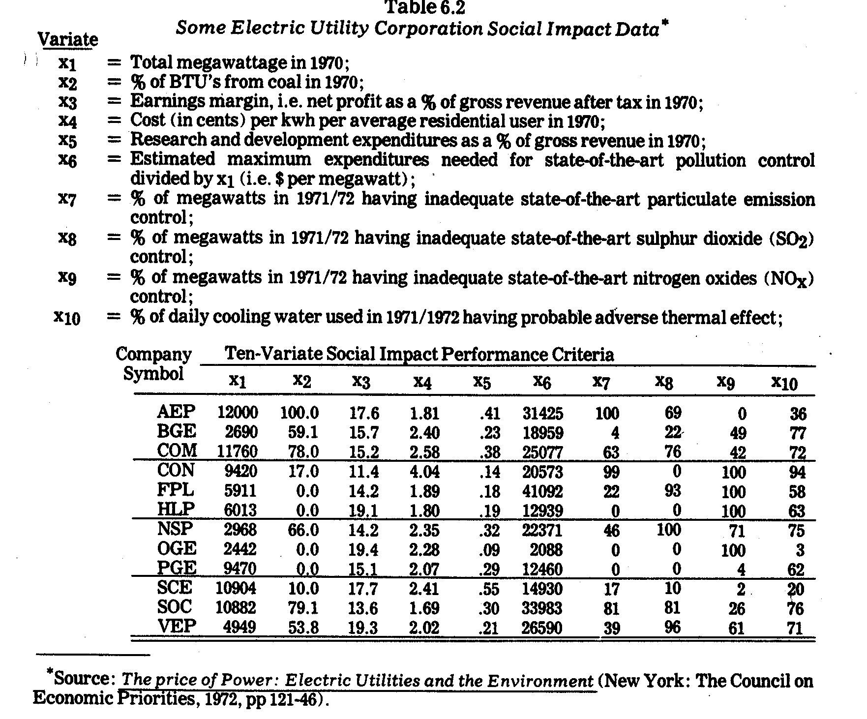
which follow will be the Table 6.2 data on variates x1,...x10.  It might be noted that except for x1 (megawattage), the other variates x2,...x10 are not necessarily directly associated with size of the companies involved.  For example, whereas pollutant volumes would normally be expected to increase with the size of an electric power company, percentage data such as that given for x7,...x10 pollution variates need not behave in such a manner.

    The reader is cautioned about some of the conclusions which are either explicitly drawn or implicitly inferred in the illustrations which follow.  These conclusions follow only from the data as tabulated in the Council on Economic Priorities Study.  The write-up for the CEP study contains many footnotes and other explanations on the nature and limitations of this data.  Most of these explanations are not repeated here but should be carefully heeded before accepting my analysis of the published data as fact.

    In some of the graphical displays it is difficult to handle more than a few variates at a time.  Therefore, from among the M=10 variates in Table 6.2, a select of subset four social impact criteria was extracted and is comprised of:

    (The Four-Variate Subset)
    x3= Earnings margin;
    x4= Cost per kwh;
    x5= R&D proportion;
    x6= State-of-the-art pollution control inadequacy.

    The above four variates cut across various interest groups, including shareholders, consumers, local communities, and the public-in-general (who might be especially interested in the R&D commitment.).


    9    Charles Komanoff, Holly Miller, and Sandy Noyes, The Price of Power: Electric Utilities and the Environment, Edited by Joanna Underwood, (New York: The Council on Economic Priorities, 1972).


    6.6--Graphic and Other Display Techniques

    6.6.1--Purposes.  Numerical data are convenient to view in graphical form whenever possible.  For instance, continuous variates are often displayed in Cartesian scatter plots along one, two, and occasionally even three dimensions.  Discrete data are often represented in histograms, pie charts, etc.  Such display techniques are familiar and need not be elaborated upon here other than to mention that they might be effectively employed in corporate social accounting.  For example, wages might be displayed in relation to age, sex, race, plant location, etc.  Pollutant outputs might be plotted in relation to time, weather conditions, plant locations, etc.  Product performance and plant safety might similarly be displayed in various ways.  To date, however, graphic displays are sparingly employed in corporate social audit reports.  Conversely, in the public sector economic and social indicators are commonly displayed in graphic form.

    Some of the more common purposes of graphical displays are mentioned below:

    1. (COMMUNICATION).  Frequently the major intent is to communicate to other persons as concisely and efficiently as possible.  Graphical displays are advantageous first of all because they are more likely to capture attention than are long columns of numbers or paragraphs of text.  Secondly, graphical displays are frequently among the most parsimonious means of communicating data.

    2. (DISCOVERY OF DISTRIBUTION PROPERTIES).  Sometimes the analyst constructs a graphical display of a single variate in order to discover its distributional properties, e.g., dispersion and skewness.  Following a mathematical analysis, outcomes or residuals are often plotted in order to identify violations of assumptions in the analysis.  For instance, regression residuals are frequently plotted in an effort to investigate conformance with normality, homoscedasticity, and independence assumptions.

    3. (DETECTION OF ABERRANT PHENOMENA).  Often data are plotted in order to disclose phenomena deviating from norms.  Graphic displays are often a quick and simple means of detecting awry or extreme reactions.

    4. (DETECTION OF LEVEL DIFFERENCES, SHAPES, AND CLUSTERS).  Graphical displays often disclose differences in levels of observations.  However, whereas level differences may often be discovered by merely scanning the data, hidden patterns, shapes, or clusters of phenomena may be disclosed (in graphical displays) which are almost impossible to discern by scanning the data itself.

    5. (TRANSFORMATION AND CONCATENATION).  Graphics may assist the analyst in determining what, if any, transformations of the data (e.g., translation of axes, rotation, and scaling transformations) provide more useful results.  Often these become linked in a sequence and, through concatenation in interactive computer graphics, can be combined in one procedure.

    6. (INVESTIGATION OF VARIATE AND ENTITY RELATIONSHIPS).  Another purpose of graphical displays may be to analyze the relationship between two or more variates.  For instance, scatter plots along two dimensions are frequently employed to study linear or nonlinear relations of two continuous variates.  Smooth functions may be fitted amongst data points.  If one of the variates is time, the purpose may be to identify trends, seasonal patterns, structural shifts, and drift of a variate of interest over time.

    Patterns or clusters may also be detected among entities.  For instance, companies (or divisions within companies) might be first plotted according to pollutant discharges and then be partitioned into subsets according to visual scannings of plotted points.

    An advantage of visual display is the tremendous ability and flexibility of humans for detecting spatially and temporally distributed features in data.  Mathematical models, though often an aid in discovering relationships, have much less flexibility and adaptive innovation ability.

    6.6.2--Limitations.  Graphic displays are physical representations of properties.  One limitation is that qualitative properties are usually cumbersome to display relative to quantitative properties.  Quantitative properties, however, are also difficult to display in more than two dimensions, even though the analyst is frequently interested in detecting patterns in multivariate space.  Thirdly, in most graphical displays there is usually an upper bound on the number of entities that can be effectively plotted and compared.  Fourthly, it is a fallacy to assume that graphic displays are a substitute for mathematical analysis.  Often the detection or communication of phenomena depends upon making appropriate mathematical transformations of data to be plotted.  Developments in computer graphics have greatly facilitated the combining of mathematics and graphics.

    Various approaches have been proposed for graphical display to overcome one or more of the above limitations, although usually trade-offs are encountered.  Several of these approaches are illustrated in the following discussion.  In many of these approaches an added difficulty arises in that how the variates (properties) are assigned to graphic pattern components either unintentionally or purposefully biases the outcomes.  Also, too many variates may obscure existent patterns in subsets of the variates.

    6.6.3--Profile Line Plots and Shape Correlations.  Although quantitative variates are difficult to plot in more than two dimensions, various techniques may be employed.  One such technique is profile analysis in which entities are usually compared on the basis of their "profiles" on two or more variates under study.  Profile analysis is employed extensively in educational and psychological testing, i.e., persons are compared on the basis of graphical profiles of test scores.  If variates are not measured in the same scales, they are typically standardized to avoid scaling differences.

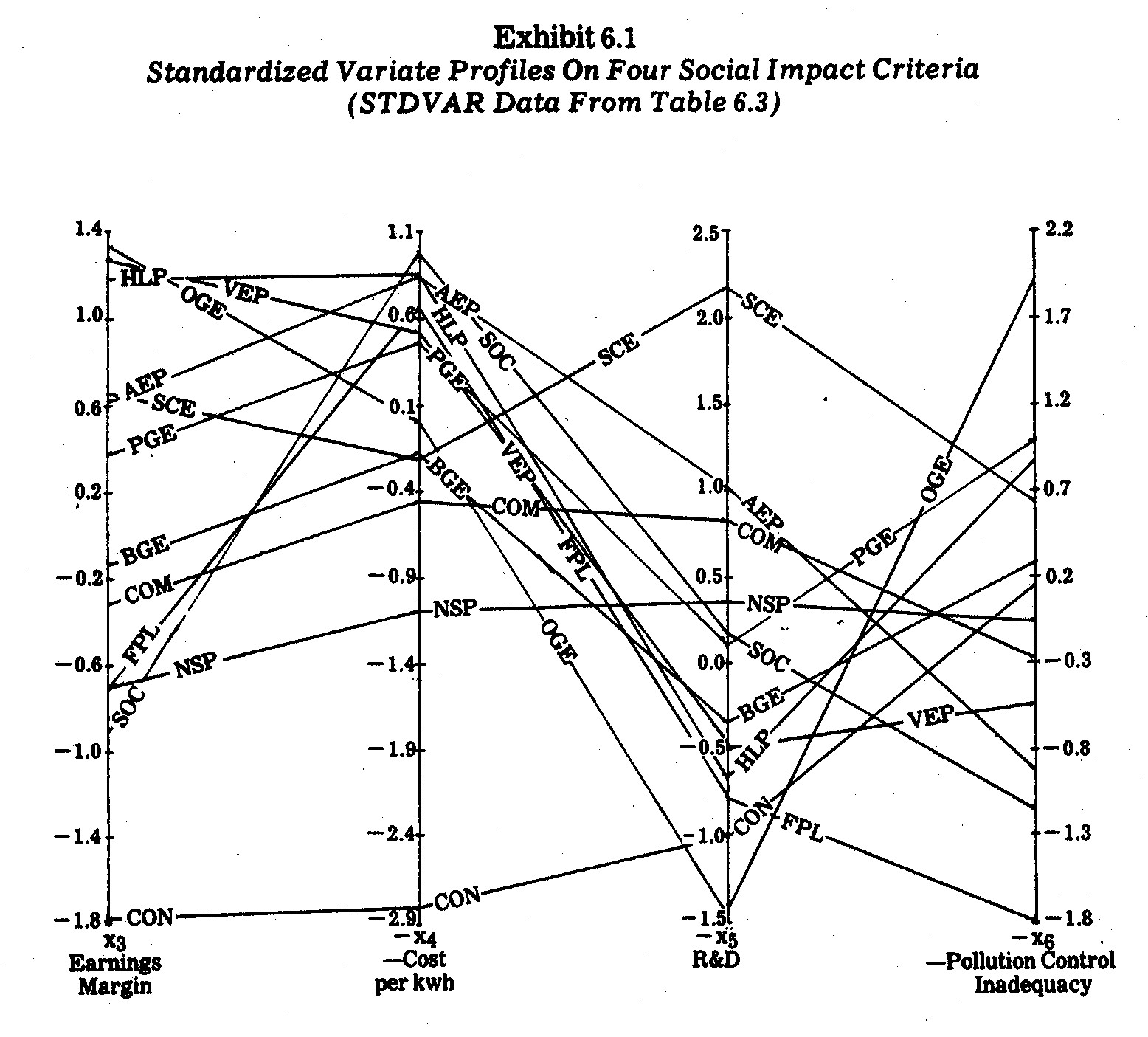
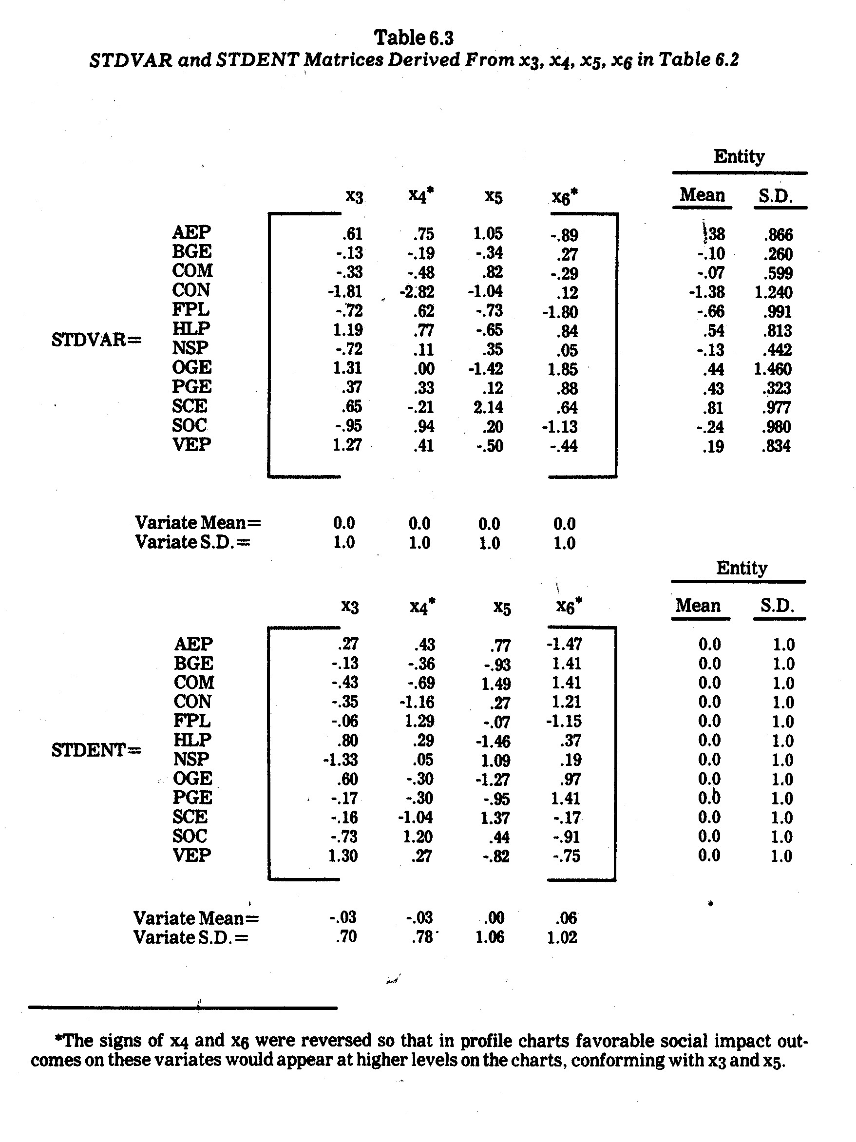
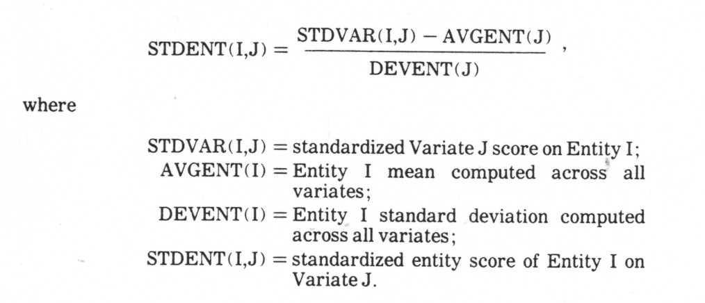
    For illustrative purposes, four variates (x3, x4, x5, and x6) were selected from the Table 6.2 data presented previously.  Although the raw data could be plotted in profile charts, I elected to standardize (normalize) the variates using the customary transformation


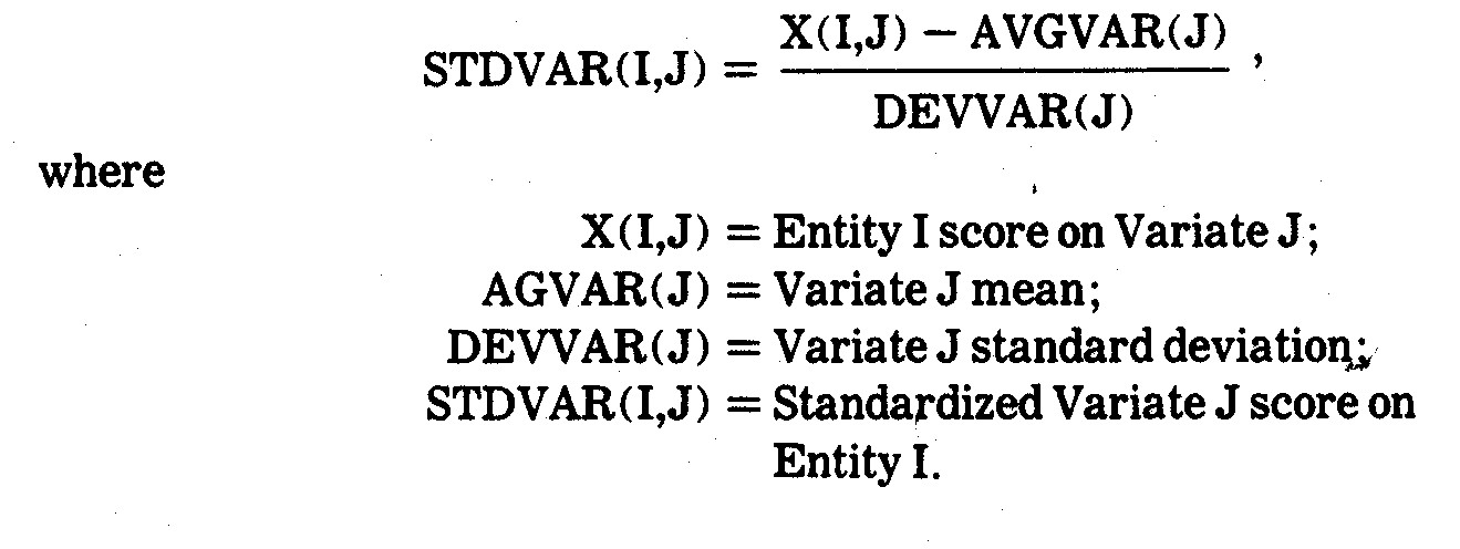
    The resultant standardized variate outcomes are shown in the STDVAR matrix in Table 6.3.  The electric utility company profiles derived from this data are shown in Exhibit 6.1.


    It is immediately evident that no single company is consistently "best" or "worst" in terms of all four of these criteria.  For instances, Oklahoma Gas and electric (OGE) had the highest earnings margin (19.4%) and the lowest allocation to research and development (9% of revenues).   Similarly, The Southern Company (SOC) has a relatively poor performance on three criteria but generates the cheapest power (1.69¢ per kwh) for average residential users.  On two criteria (earnings margin and price per kwh) Consolidated Edison Company of N.Y. (CON) falls way below all the other companies in performance.

    A careful inspection of Exhibit 6.1 reveals a number of profile similarities.  The Southern Company (SOC) and Florida Power and Light (FPL) have rather close profiles except for the x5 (R&D) criterion.  Houston Lighting and Power (HLP), Oklahoma Gas and Electric (OGE), and Virginia Electric and Power (VEP) have similar profiles, especially in terms of the first three criteria.  Commonwealth Edison (COM) and Northern States Power (NSP) have somewhat close profiles on all three criteria.  Pacific Gas and Electric (PGE) and Southern California (SCE) are also similar except for the x5 criterion (R&D allocation).

    These profile similarities seem to suggest certain geographic "types" since the above-mentioned likenesses are mostly between companies operating in somewhat contiguous regions.  This is interesting since some of the paired companies along these criteria have major differences as well, e.g., whereas SOC is a large holding company across various southern states and in 1970 generated electric power with 79.1% coal, 20.6% gas, and 0.3% oil, FPL is a much smaller southern company using 56% oil and 44% gas.10

    When examining profiles, analysts are sometimes interested in comparing profile shapes (configurations) irrespective of differences in profile levels and/or scatter.  A transformation which facilitates such comparisons is the profile scatter transformation


    This transformation eliminates both profile level (elevation) and profile scatter (standard deviation) differences.  The effect of profile elevation removal, in particular, is to bring profiles with similar configurations (at different levels) closer together.11  The profile scatter transformation yields what are called "pure shape" proviles.12  Profile charts derived after such a transformation of the data conform to the profile shape correlation coefficients computed from the formula


    Type your question here and then click Search

    This correlation coefficient (sometimes call a Q-technique correlation) is used when the analyst is interested in comparing profile shapes aside from elevation and scatter considerations.  In other words, the profile shape correlation coefficients are invariant under profile elevation and scatter transformations.  Other pairwise coefficients (such as Euclidean distances) are not necessarily invariant under such transformations, i.e., Euclidean distances reflect differences in profile levels whereas profile shape correlations measure differences in profile shapes (configurations).13


    10    The Council on Economic Priorities, The Price of Power: Electric Utilities and the Environment, Op. Cit., p. 144.

    11    From a mathematical standpoint, the profile elevation transformation (i.e., the subtraction of entity means) projects the entity scores from N space to a hyperplane of N-1 dimensions.

    12    In mathematical terms, the profile scatter transformation projects N entity scores to a hypershpere of N - 2 dimensions of constant radius lying in a hyperplane.

    13    The profile shape correlation coefficients can, however, be shown to be related to Euclidean distance by the formula

    CORENT(I,H) = 1 - DISENT(I,H))2
    _____________________________
    2(M - 1)


    where DISENT(I,H) is the Euclidean distance between Entity I and Entity H using STDENT data.


    The profile scatter transformation was performed on the STDVAR data in Table 6.3, yielding the STDENT standardized entity matrix also shown in Table 6.3.  The STDENT profiles are plotted in Exhibit 6.2.  One surprising and quite unexpected outcome is the near congruence of the Pacific Gas and Electric (PGE) and Baltimore Gas and Electric (BGE) profiles in Exhibit 6.2.  This indicates almost identical profile shapes for these two companies on the four criteria being analyzed, i.e., the two companies have almost identical profile "shapes" in Exhibit 6.1.  Similarly, the Oklahoma Gas and Electric (OGE) profile is closely related in shape to both the PGE and BGE profiles.  This indicates that these three companies must also have high profile shape correlations coefficients.  Another surprising likeness in profile shapes, as revealed in Exhibit 6.2., arises between Commonwealth Edison (COM) and Southern California Edison (SCE).  In this case, the two companies have similar profile shapes but differ in terms of profile elevation (in Exhibit 6.1).


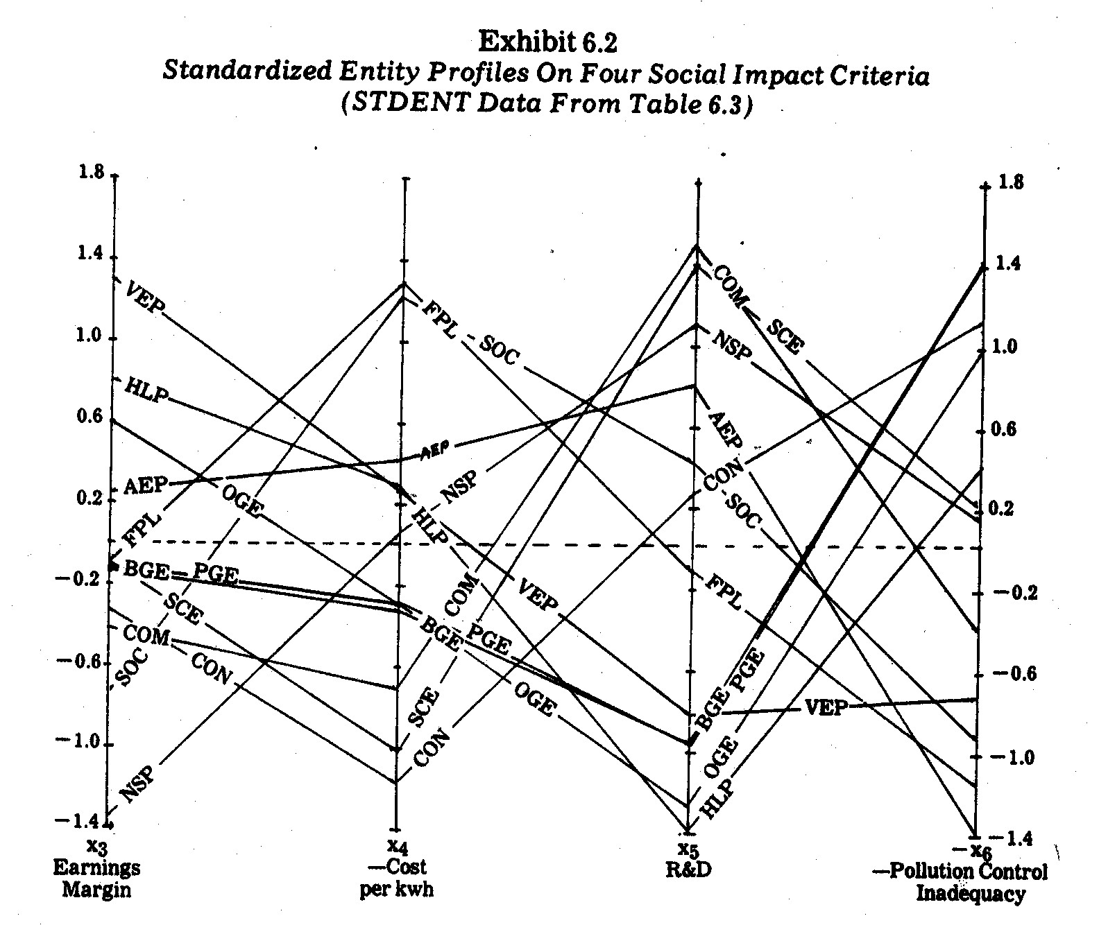
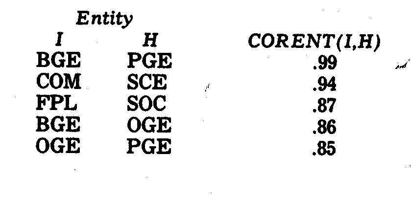
    The above visual conclusions from Exhibit 6.2 are borne out by the profile shape correlation coefficients shown in Table 6.4.  The five highest correlations are as follows:


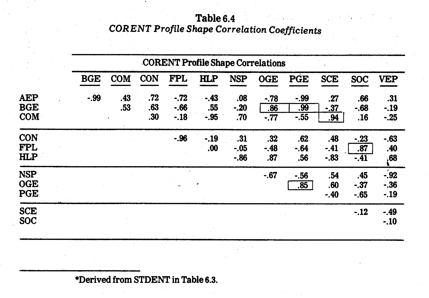
    What is a little less obvious in Exhibit 6.2 are the profile shapes least congruent.  In Table 6.4, however, the most negative profile shape correlation coefficients are revealed as:


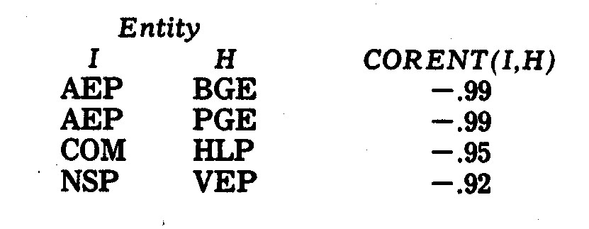
    These differences are not especially surprising except for the Northern States Power (NSP) and Virginia Electric Power (VEP) profiles.  These two companies are somewhat similar in size and in fuel usage.14  However, whereas the NSP profile in Exhibit 6.1 is relatively flat, the VEP profile moves from a high on earnings margin and cost per kwh to lows on R&D and pollution control inadequacy.


    14    In 1970, the fuel use for NSP was 66% coal, 33% gas, and 1% oil.  For VEP the percentages were 53.8% coal, 46% oil, and 0.2% gas.


    6.6.4--Principal Component (Factor Score) Profiles.  Profile analysis becomes clumsy when more than five or six variates (criteria) are under study, e.g., imagine trying to compare profile patterns over twenty or thirty social criteria.  Often, however, multicollinearities exist such that one, two, or several principal components or factors account for much or most of the variation in an entire system of variates.

    One approach is to transform the original variates into factors and then plot entity factor scores.  For one or two principal factors, entities can be plotted in scatter plots.  For more than two factors, entity profile configurations can be examined using underlying factors in lieu of original variates.

    Suppose there are M variates under study.  There are two major reasons why factor scores may be more of interest than original data:

    (1) Whereas the M variates under study may be systematically intercorrelated with one another, the factors (principal components) are linearly independent (orthogonal).  This is helpful in data analysis techniques which are linearly independent (orthogonal).  This is helpful in data analysis techniques which assume linear independence.

    (2) The factors (principal components) are extracted in such a manner that they successively account for smaller portions of the total variation among the M original variates.  If the first few factors account for a large share of this variation, and if they can be meaningfully interpreted, it may be possible to describe the system more parsimoniously (i.e., in fewer than M variates).

    The major difficulty in principal component or factor analysis often lies in interpreting the importance and meaning of the factors extracted from the original variates.  The relative importance of successive factors can be estimated by comparing their latent roots (eigenvalues).  Finding descriptive interpretations is more difficult.  The usual approach is to examine the factor loadings (eigenvectors), which are correlations between factors and original variates.  Frequently, subsets of the original variates having highest correlations with a given factor have something in common which is suggestive of what the factor depicts.15


    15    This approach was illustrated in the Chapter 4 principal component analysis of air pollution and human mortality data.  An excellent elementary example is also provided in W. W. Cooley and P. R. Lohnes, Multivariate Data Analysis (New York: John Wiley & Sons, Inc., Second Edition, 1971, pp. 133-36).


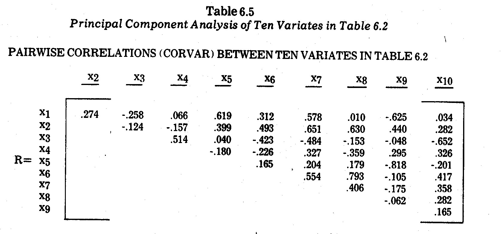
    For illustrative purposes, the pairwise correlations between variates x1,...,x10 given in Table 6.2 are given in the CORVAR matrix in Table 6.5.  An underlying factor structure is not easily determinable from merely scanning this correlation matrix.  A

    I.    PAIRWISE CORRELATIONS (CORVAIR) BETWEEN TEN VARIATES IN TABLE 6.2

    II.    FACTOR LOADINGS

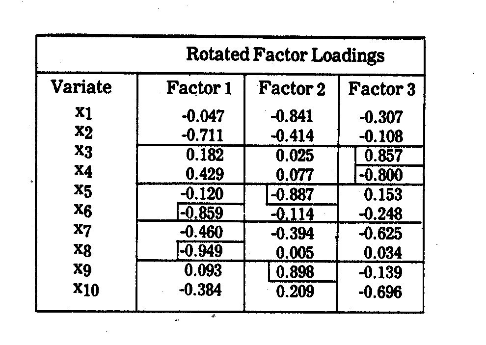
    III.    FACTOR INTERPRETATIONS

    (1) Factor 1 (Air Pollution Control Inadequacy): This factor loads highly on overall pollution inadequacy (x6) and sulphur dioxide control inadequacy (x8), both of which reflect air pollution under-investment in state-of-the-art controls available.  This factor also loads relatively high on coal usage (x2), suggesting that heavy coal burning companies have a more serious under-investment in such controls, although there is considerable dispute over what constitutes "state-of-the-art" control, e.g., the wet scrubber dispute is discussed later on.

    (2) Factor 1 (Technology): This appears to be largely an R&D (x5) and nitrogen oxides control inadequacy (x9) factor, the two variates being highly correlated at -.818.  Size of company in terms of megawattage (x1) also loads highly on Factor 2, partly reflecting the fact that there is a tendency for larger companies to have a higher R&D proportion and lower nitrogen oxides control inadequacy.

    (3) Factor 3 (Financial): This appears to be a combination of the company's earnings margin (x3) and average customer price per kwh (x4), the two being negatively correlated at -.5145.

    (4) Factor 4 thru 10 (Junk): These factors have latent roots less than one, and hence, are not viewed as relevant underlying factors.

    IV.    LATENT ROOTS (EIGENVALUES)

    Factor Latent Root Variance Accounted For
        Percentage Cumulative
    1 2,7466 27.466% 27.466%
    2 2,6882 26.882% 54.348%
    3 2,4751 24.751% 79.099%
    4-10 2,0901 20.901% 100.000%


    principal component analysis on the variates x1,...,x10 in Table 6.2 yielded the outcomes in Table 6.5.  Three factors emerged with latent roots exceeding one.  These three factors account for 79.1% of the variance in the ten-variate system.  Interpretations of these factors are not at all obvious or concise.  Based upon the rotated factor loadings shown in Table 6.5, the best interpretations I could come up with are also given in Table 6.5.

    The illustration points out one of the potential frustrations with principal component or factor analysis in general, i.e., a frequently encountered situation arises in which there is no concise and all-embracing concept for two or more rather heterogeneous variates closely correlated with a factor.  This is particularly evident in Factor 2 in Table 6.5, which loads highly on research and development (x5), nitrogen oxide control inadequacy (x9), and megawattage (x1).  It is also evident in Factor 3, which loads highly on earnings margin (x3) and cost (price) per kwh to an average residential electricity consumer (x4).


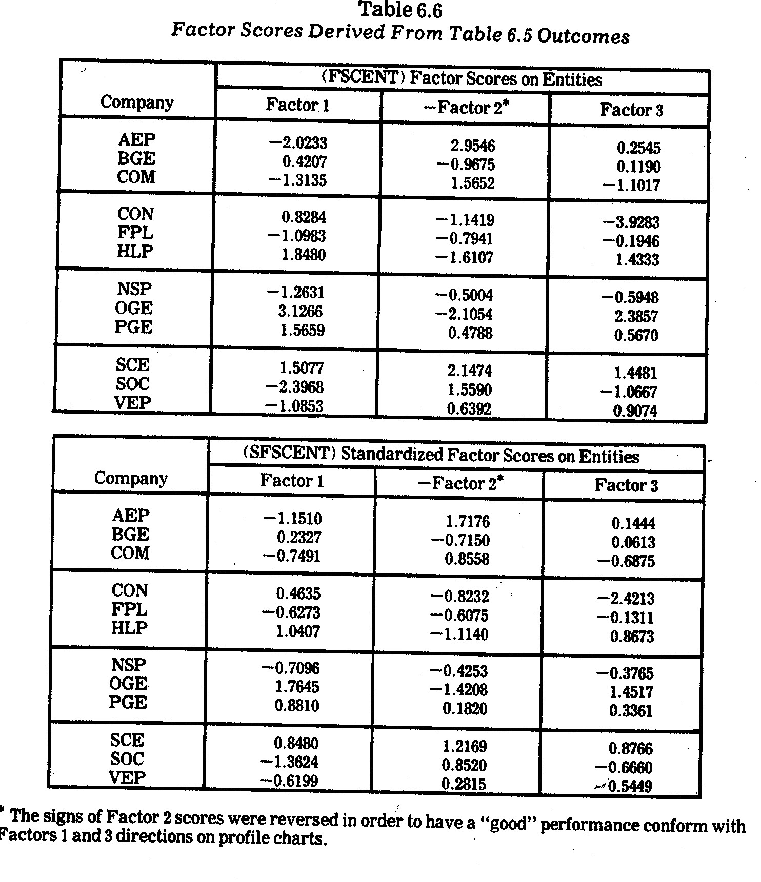
    The outcomes in Table 6.5 were utilized in transforming the M=10 variates (in Table 6.2) into the major factor scores (on each entity) sown in Table 6.6.  The company (entity) profiles derived from the standardized factor scores (SFSCENT) are shown in Exhibit 6.3.  No company consistently performs highest on all criteria, although SCE performs relatively well on all three major underlying factors, brief interpretations for which were given in Table 6.5.  The inconsistent performance of CON is manifested in its somewhat reasonable performance on Factor 1 (pollution control) relative to falling way below other companies on Factor 3 (financial performance) due to a combination of having both the lowest earnings margin and the highest kwh rates.  The inconsistent performance of AEP is also evident in its poor showing on Factor 1 (pollution control) relative to the highest showing on Factor 2 (technology) due to a combination of having a relatively high R&D commitment (x5) and a low nitrogen oxides state-of-the-art underinvestment (x9).  As indicated previously, however, the AEP performance on x9 is misleading since it is the lack of technology for "state-of-the-art" pollution control rather than investment in pollution controls which gives the coal-fired AEP such a good score on x9.


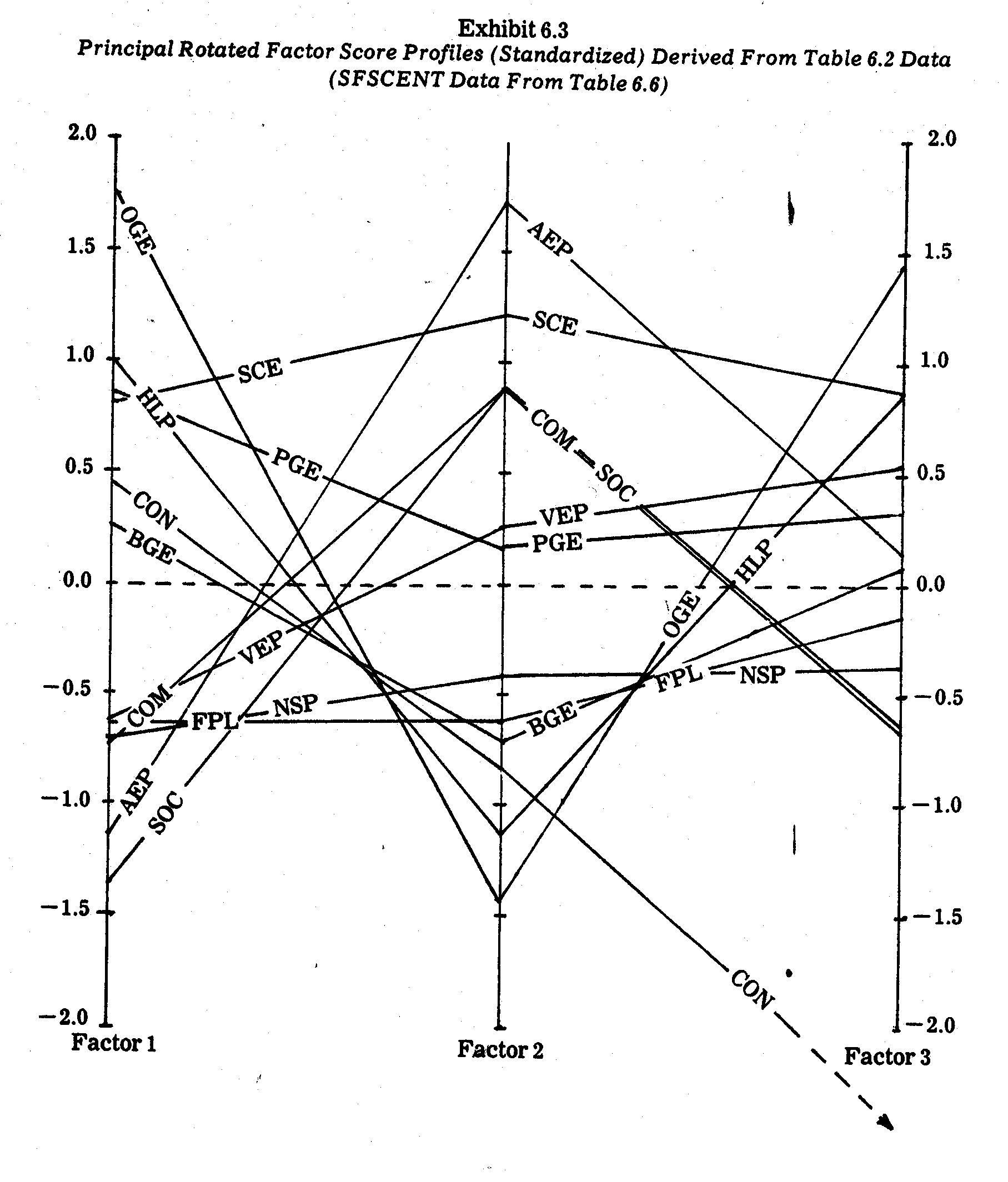
    Similarity in both level and shape on the three principal underlying factor profiles in Exhibit 6.3 are also evident.  For example, the large coal burning companies (AEP, COM, and SOC) have very similar profiles, with AEP pulling ahead on Factor 2 due to a higher R&D commitment.  In contrast, the smaller natural gas-fired OGE and HLP companies have almost congruent profiles with shapes nearly opposite those of the large coal-fired companies.  The larger SCE, however, does not succumb to the OGE and HLP drop along Factor 2 because of the exceptional performance of SCE on both R&D (x5) and nitrogen oxides (x9) criteria.

    One of the most important outcomes in the factor score profiles in Exhibit 6.3 arises in the amazing similarity between the Florida Power and Light (FPL) and Northern States Power (NSP) profiles.  In contrast, the M=10 variate raw scores for these companies (see Table 6.2) are much more divergent.16  This phenomenon provides an important illustration of how principal components or other types of factor analyses can be used to reduce a large number of variates into a more parsimonious subset of underlying principal factors.  At the same time it also illustrates "overkill" in the sense that the outcome may be too parsimonious.  For example, the primary determinants of Factor 3 appear to be quite different social impact criteria which, at least in this data, are negatively correlated.  Company scores on Factor 3 are caught between opposing forces.  For example, the FPL "poor" showing on earnings margin (x3) pulls against the FPL "good" score on electricity pricing (x4).  Similar negative correlations in performance criteria are present in other factors.  Hence, this is the case where, because of opposing interests in given factors, less parsimony in terms of keeping opposing criteria separated is probably more meaningful.


    16    Also note the divergent FPL and NSP profiles in Exhibit 6.1.


    6.6.5--Fourier Series Profiles.  In the preceding section, a principal component analysis was reported in which M=10 variates were parsimoniously reduced to M'=3 factors (principal components).  The resultant factor scores were plotted in the Exhibit 6.3.  Suppose, however, that such an analysis yielded a substantially larger number of underlying factors, e.g., suppose M=50 variates produced M'=15 factors of interest.  Profile charts are difficult to construct and evaluate for more than a few factors.

    An alternate approach which is especially interesting when there are more than a handful of underlying major factors is to use a Fourier series method originally proposed by Andrews.17  The procedure for plotting multivariate observations on each entity is to compute the following Fourier series transform on each entity (e.g., each company):


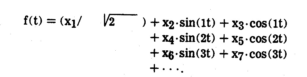
    The f(t) function is then plotted (best results are obtained from a computer plotter) for values of t over the range ±3.1416, such that each entity receives a plotted curve over this range of t.  Profiles of entities may then be compared both as to level and to configuration.  The number of variates is not a limiting constraint, i.e., the f(t) function is plotted against t rather than the xJ variates.  When the xJ variates are linearly independent and certain other assumptions are met, the f(t) outcomes have a number of interesting properties and are conducive to statistical inference testing of differences between entity profiles.
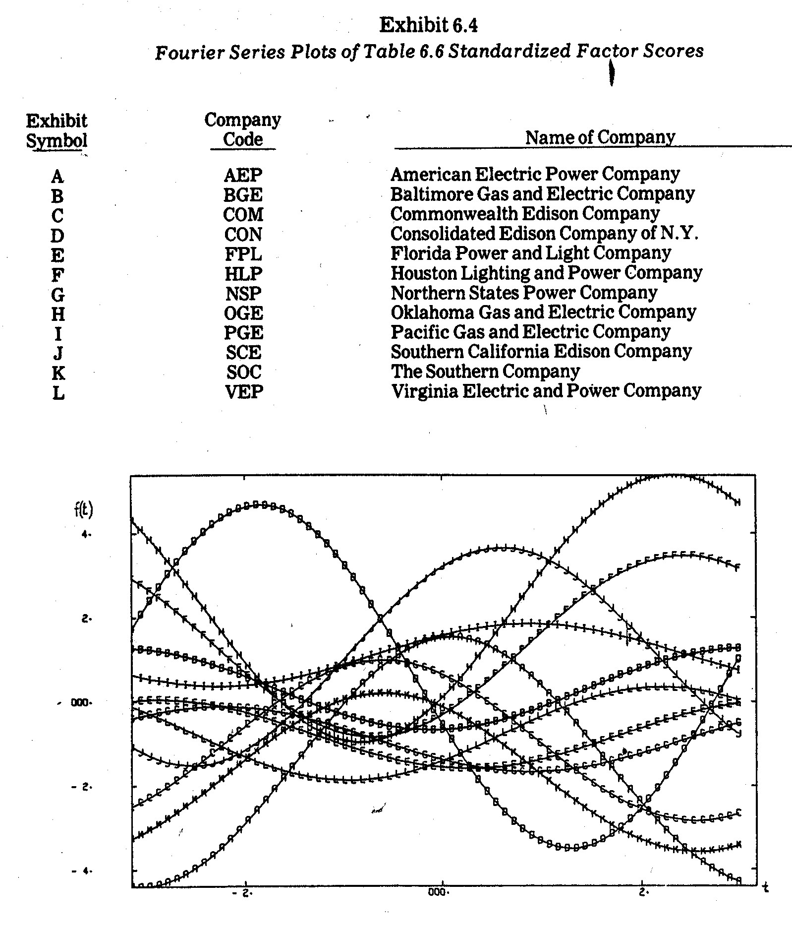
    Proceeding by way of illustration, consider the factor scores shown previously in Table 6.6.  These outcomes were transformed into Fourier series curves plotted in Exhibit 6.4.  Most plotted f(t) profiles yield conclusions similar to those derived previously from the profiles in Exhibit 6.3.  For example, in Exhibit 6.4 the FPL(E) and NSP(G) curves are nearly congruent, indicating that these two companies have almost identical scores on the three major underlying factors.  The similarity among the three largest coal-fired companies (AEP(A), COM(C), and SOC(K)) are also evident in their bell-shaped curves which differ markedly from the curves of the other companies.  The natural gas burning companies HLP(F) and OGE(H) also have similar profiles.  The widely differing performances of CON and SCE are also evident.

    When there are only a few factors (e.g., the three factors in Exhibit 6.3) there seems to be little advantage in resorting to the more complex Fourier series profiles such as those in Exhibit 6.4.  The Fourier series approach becomes more interesting when the number of factors becomes too unwieldy for a profile analysis on all factors simultaneously.  However, both approaches (e.g., those in Exhibits 6.3 and 6.4) are cumbersome when there are very many entities, e.g., the N=12 profiles plotted in the preceding profile exhibits approach the limit of human ability to visually compare profiles.


    17    D. F. Andrews, "Plots of High Dimensional Data," Biometrics, Vol. 28, March 1973, pp. 125-36.


    6.6.6--Geometric Patterns and Plotted Caricatures.  Instead of plotting multivariate data as scatter plots or profile line plots, it is sometimes better to consider other geometric patterns (e.g., triangles, rectangles, etc.) or caricatures (e.g., facial sketches).  It may be particularly advantageous to do so when:

    (1) The number of entities (N) is such that profile lines overlap and crisscross so much that entity comparisons are difficult, e.g., previous profile plots of N=12 electric utility companies were difficult to evaluate because of numerous intersecting line segments.

    (2) There are discrete qualitative variates under study which can be depicted as varying geometric shapes or caricature components.

    There is a limit to how many entities (N) can be depicted or how many variates (M) can be incorporated as features in geometric patterns or caricatures.  In recent years, however, a number of interesting innovations in these areas have arisen, some of which will be illustrated here.

    For example, Edgar Anderson proposed the drawing of geometric patterns which he termed "glyphs."18  These were intended primarily for the graphical display of multiattribute discrete variates in biology.  A glyph has a base (or core) with rays pointed upward, where each ray depicts a different attribute.  For example, an attribute having three categories is depicted by Anderson as a ray having three lengths, i.e., zero, medium, and long.

    A slightly modified glyph approach is illustrated in Exhibit 6.5.  In this case the standardized variates on x3, x4, x5, and x6 social impact criteria in Table 6.3 are depicted as separate rays (in clockwise order).  Each glyph corresponds to a different electric utility company.  The ray lengths are marked into unit gradations where:


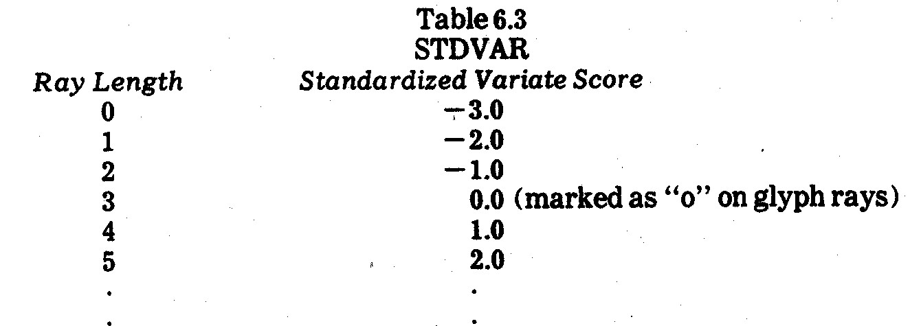
    The origin on a standardized variate (which is also the mean of a standardized variate) is marked with a "o" on those rays for which companies scored at or above the mean on the criterion in question.


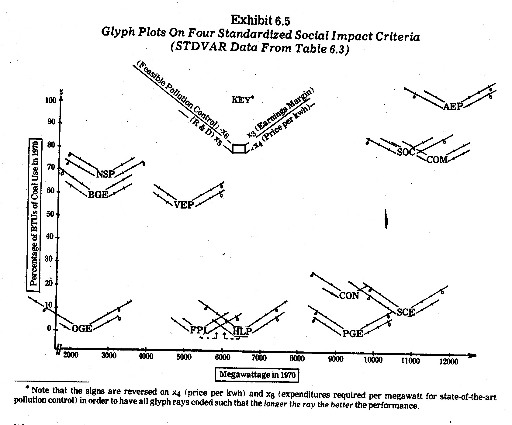
    In Exhibit 6.5 each glyph is plotted in a two-dimensional Euclidean space, where the horizontal axis corresponds to x1 (megawattage) and the verticle axis corresponds to x2 (coal usage) raw data scores from Table 6.2.  Note that the largest coal burning companies (AEP, COM, and SOC) are isolated by themselves in x1 and x2 space.  Smaller companies which also rely heavily on coal (NSP, BGE, and VEP) also cluster by themselves.  Companies which use little or no coal are also clustered on the x1 axis as large (SCE, PGE, and CON), medium (HLP and FPL) and small (OGE).

    The net result is that in Exhibit 6.5 multivariate data in six dimensions are plotted in two-dimensional space.  The company glyphs resemble frontal views of wounded biplanes returning from battle.  Performances on the x3, x4, x5, and x6 standardized criteria appear as wings (rays) of varying lengths.  If the origin, "o," is shown on the wing (ray), the company performed at or above the mean on the criterion in question.  The "o" origins resemble engines beneath a wing.  In this context, a company has an "engine" on a wing if it performed at or above the mean performance on that criterion.

    In this sense, the "best" performing companies in Exhibit 6.5 are those with the longest wings.  The only company performing above the standardized mean (zero) on all four social impact criteria (and therefore having all four "engines" intact under its glyph wings) is Pacific Gas and Electric (PGE).  Both HLP and OGE are natural gas burning companies which perform at or near the best on three criteria (x3, x4, and x6) but have little or no wing (ray) length on the x5 (R&D) criterion.  Similarly, SCE performs quite well on three criteria but falls slightly below the mean on the x4 (kwh price) criterion.  AEP and NSP are also "three-engine" glyph biplanes, where AEP falls short on x6 (pollution control inadequacy) and NSP falls short on x3 (earnings margin).

    In contrast, CON barely flies along on its single x6 (pollution control inadequacy) engine whereas FPL limps on its x4 (price per kwh) performer.  Other single-engine glyphs (BGE and COM) have better balance in terms of wing (ray) length on all four criteria in Exhibit 6.5.

    Among all the graphic display approaches illustrated thus far, I find the glyph approach quite appealing.  Anderson's glyph rays are plotted according to discrete ordinal scales, although nominal or continuous (as illustrated in Exhibit 6.5) variates may be plotted as glyph rays.  Glyphs may also be used as geometric pattern representations without having to be plotted in Euclidean space.  Anderson recommends no more than seven rays and that rays do no extend in all directions.  He also recommends having no more than three discrete levels for ray length (a recommendation which was not followed in Exhibit 6.5).  Continuous variates may also be transformed into these three discrete ordinal categories.  Multiple rays may be used for more than three categories or complexes of related variates.  Anderson writes:

    In attempting to work out complexes of related qualities, the analysis is facilitated if the ray lengths are coded in such a way that all the extreme values characteristic of one complex are assigned long rays and those characteristic of the other are assigned no rays.  For example, in studying hybridization between two subspecies of Campsis, one of the subspecies had a short tube, a wide limb, and much red in the flower; the other had a long tube, a small limb, and little red.  Redness and limb width were coded with long rays for much red and for wide limbs, tube length was coded in reverse with a long ray for short tubes.  This meant that those hybrids closely resembling the other parent as (sic.) a rayless dot.19

    For purposes of graphic plotting, the symbols drawn may be triangles, line segments, polygons, or most any caricature imaginable.  One of the most unique caricature plotting ideas is described by Tversky and Krantz.20  They depict alternate sketches of face shape (long versus wide), eyes (empty  versus filled-in), and mouth (straight versus curved) to represent three binary variates in two-dimensional plots.  The facial sketches were then used in a visual perception test of interdimensional additivity, i.e., that overall dissimilarity between faces could be decomposed into additive components represented by varying facial features.

    A more extensive and general facial plotting program was apparently developed independently by Chernoff,21 although both Tversky-Krantz and Chernoff utilize elliptical components.  Each variate (initially the computer program developed by Chernoff can handle up to 18 variates, but the program can be modified to accommodate more variates) is represented as a feature (eye shape, eye size, mouth shape, mouth size, etc.) in a computer-sketched face.  Differing values of the variate are distinguished by different sizes and/or shapes of the feature in question.  Each entity is depicted by a particular face whose features are determined by observed values of variates on that entity.  An advantage of facial caricatures over glyph plots is that numerous features can be depicted in faces whereas Anderson found that glyphs with more than seven rays were too cumbersome.

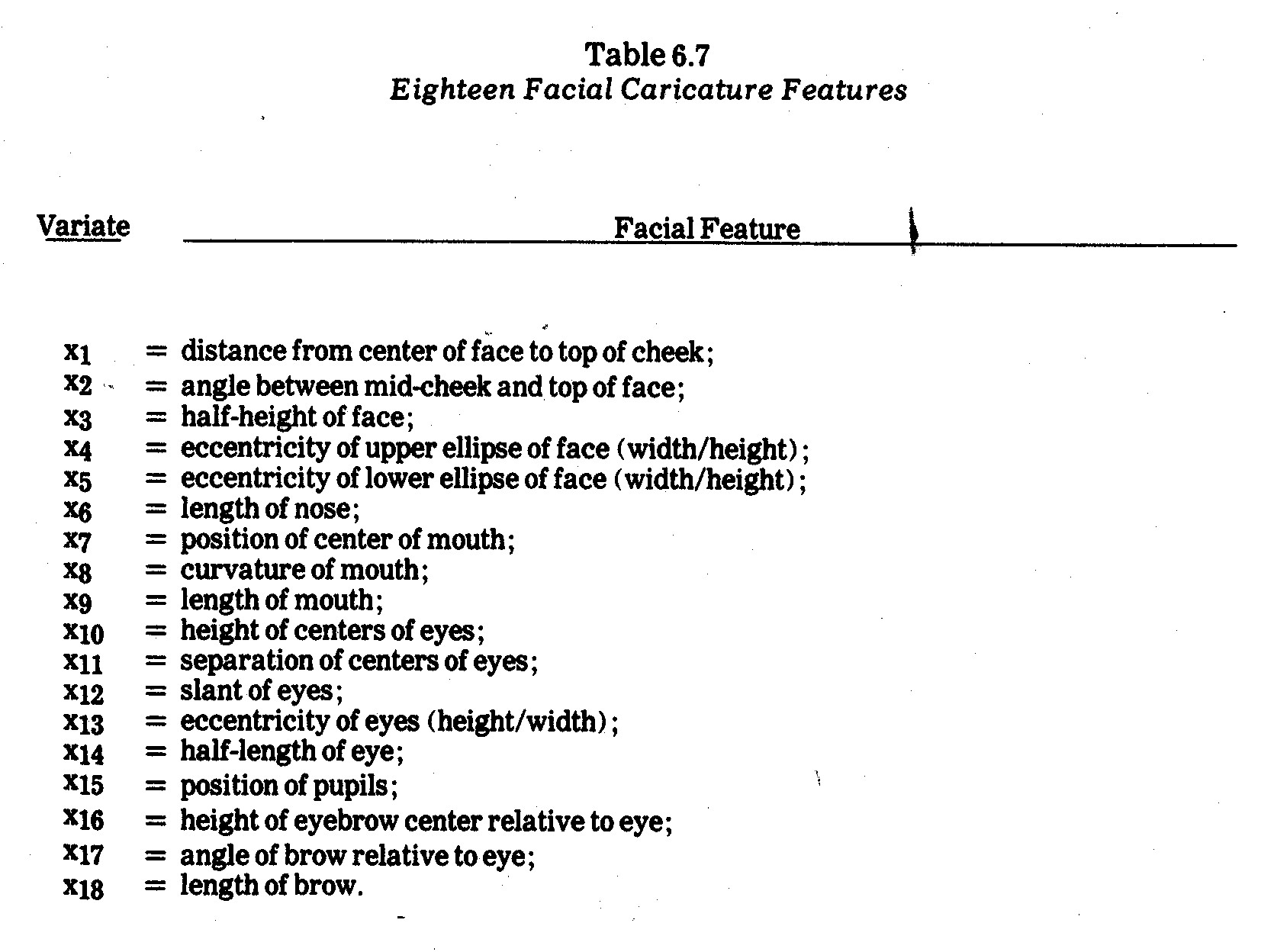
    The facial features in Chernoff's original program are listed in Table 6.7.  If there are fewer than M=18 variates under study, a given variate may (i) be assigned to more than one feature or (ii) certain features may remain fixed.


    For instance, the N=12 entities (electric utility companies) measured on M=4 social impact criteria in Table 6.3 are plotted as faces in Exhibit 6.6.  In this case the M=4 variates were randomly assigned to four different facial features, giving rise to 16 features which vary among the N=12 faces plotted in Exhibit 6.6.  The faces have been arranged in two-dimensional Euclidean space on x1 (megawattage) and x2 (coal usage) from Table 6.2, i.e., the exhibit depicts two Cartesian variates and sixteen facial variations determined by x3 (earnings margin), x4 (kwh pricing), x5 (R&D), and x6 (pollution control inadequacy).  Recall that the latter four criteria were also displayed in Exhibits 6.1 and 6.2 in profile charts and Exhibit 6.5 as glyph rays.

    After plotting the faces, I had a number of students, businessmen (e.g., those who attended my N.A.A. courses on accounting for corporate social responsibility22), and other friends try to match up the faces.  For this purpose the faces were not plotted in Euclidean space on x1 and x2 as they are in Exhibit 6.6 nor was there any indication as to what the faces depicted.  Interestingly, rather consistent partitionings of these N=12 faces into G=5 clusters (groups) emerged from those subjective evaluations.


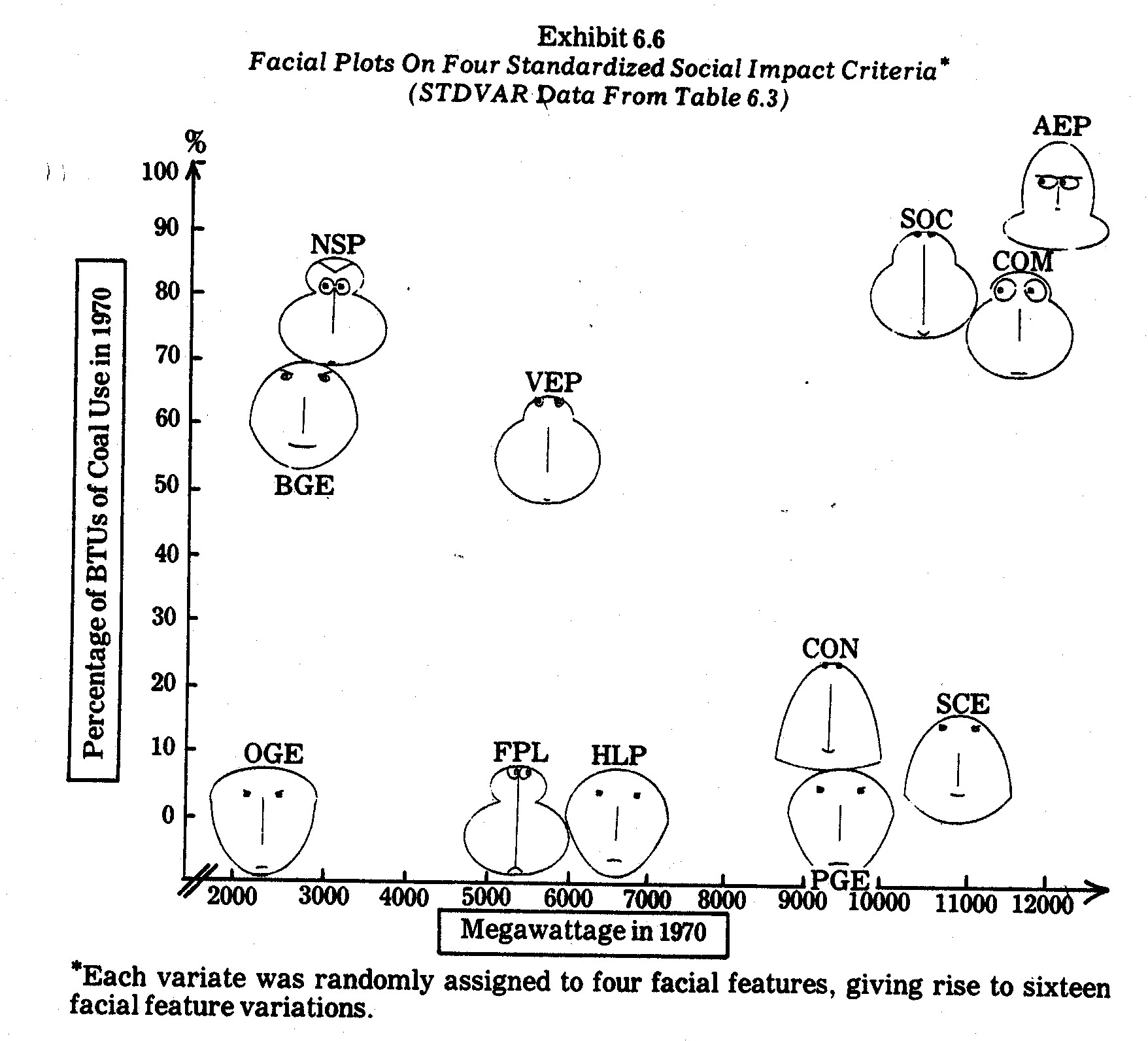
      The most consistent clustering were as follows:


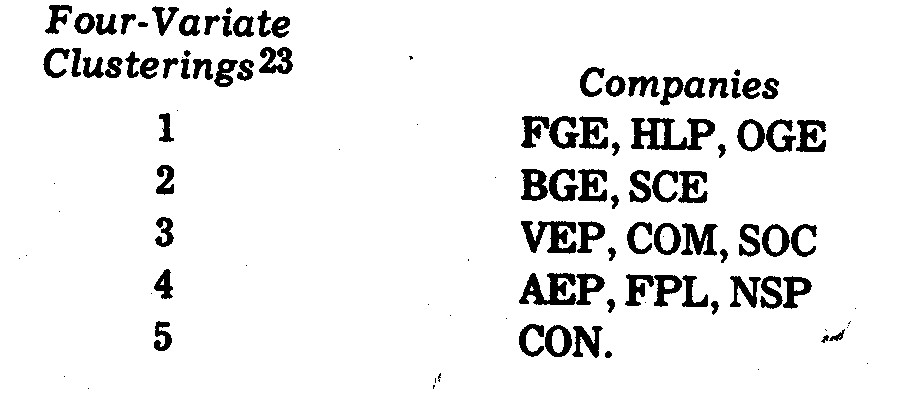
    Variations in the above clusterings tended to arise mainly in differing partitionings among the Cluster 1 and 2 companies, all of which tend to be the "good guys" in terms of Table 6.3 data relative to the companies in Clusters 3, 4, and 5.24  In any case, the subjective clusterings differed greatly in terms of x1 size and x2 coal usage variates (see Exhibit 6.6).  For example, BGE is a small and relatively heavy coal user whereas SCE is a much larger power company with only light usage of coal.  Similarly, AEP, NSP, and FPL vary widely in terms of size and/or coal usage.  It might also be noted that I tended to get fairly consistent outcomes when human subjects clustered faces obtained under two other random assignments of particular facial features to the M=4 social impact criteria in Table 6.3.


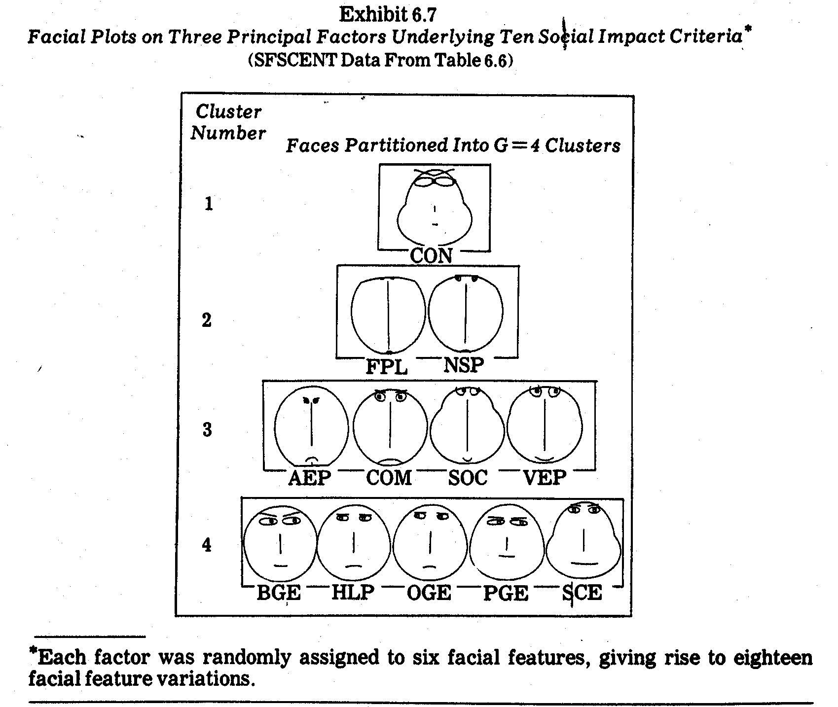
    In a second effort, I used the standardized (SFSCENT) factor scores in Table 6.6 (which in turn were derived from the M=10 social impact criteria in Table 6.2) to obtain the electric utility company faces shown in Exhibit 6.7.  The most consistent subjective clusterings (among the human subjects I persuaded to match up the faces) correspond to companies allocated to G=4 clusters (groups) as follows:

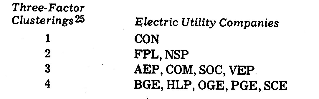
    Faces are grouped in Exhibit 6.7 to reflect these clusters.  Variations arose mainly when a few subjects matched CON, SOC, and SCE, apparently on the basis of head shape but ignoring major differences in length of nose, length of mouth, height of centers of eyes, separation of centers of eyes, half-length of eyes, position of pupils, eccentricities of eyes, and eyebrow features.26  The fact that some persons matched CON, SOC, and SCE faces highlights the need to make several plottings of faces with different random assignments of variates (in this case factors) to facial features.  The Exhibit 6.7 faces are the result of only one such random assignment.

    The more frequent clusterings of faces into G=4 clusters (groups) shown in Exhibit 6.7 conform fairly well with the Exhibit 6.3 profiles.  Both FPL and NSP faces are closely matched in Cluster 2, whereas CON by itself in Cluster 1 stands apart from the rest of the faces in feature combinations.  The Cluster 3 companies AEP, COM, and SOC have similar profiles in Exhibit 6.3, whereas the VEP difference in profile shape is not reflected in the Exhibit 6.7 faces.  In order to capture profile shape comparisons it would be better to first remove entity elevation and scatter (to arrive at STDENT values in the manner described previously) before plotting the faces.

    Cluster 4 in Exhibit 6.7 contains the least homogeneous profiles (from Exhibit 6.3).  In particular, BGE, HLP, OGE, and PGE are joined together, whereas both the BGE and PGE profiles differ rather markedly from the HLP and OGE profiles in Exhibit 6.3.  Once again this demonstrates that, if profile shape (rather than level) is of primary interest, a profile scatter transformation should be made prior to forming the faces.  Cluster 4 does tend to contain the "clean-guys" with higher proportions of natural gas-generated electric power.  The noteworthy exception in Exhibit 6.7 cluster 4 is Baltimore Gas and Electric (BGE) which in 1970 utilized 59.1% coal as opposed to 0.1% gas.  In terms of size and coal usage, BGE is much more like NSP and VEP, but its face (and its standardized principal factor scores) differs markedly from the NSP and VEP faces in Exhibit 6.7.

    An apropos question is (among the infinite patterns or caricatures which might be used)--"Why faces?".  Probably the best argument which might be raised in favor of faces is that all people with sight are used to seeing faces.  At an early age humans learn to distinguish, on the basis of manifest facial features, hundreds or even thousands of faces (both real and cartoon).  A second argument is that numerous variates can be depicted by facial features (jaw line, cheeks,  nose, eyes, ears, hair, dimples, wrinkles, etc.) in terms of shape, size, and orientation.  If additional body features (neck, chest, abdomen, etc.) are added in, thousands of variates can, in theory, be included.  Prior to computer-aided plotting, however, slight variations in continuous variates would have been difficult to precisely portray.

    It is usually possible to compare more entities in caricature plotting than in profile analysis.  Chernoff, for example, provides two empirical illustrations comprised of 88 and 53 entities (faces) respectively.27  A visual cluster analysis was attempted by various persons in both instances, with consistent agreement on clusterings of Chernoff's many facial caricatures.

    There is a limit, however, to how many faces can be visually compared and clustered by human analysts.  I cannot imagine, for example, comparing N=729 caricatures in the Pickett and White study to be mentioned later on, i.e., if faces were drawn smaller and condensed for "texture' comparisons, features in each face would be obscured.  Thus, the facial caricature approach would probably be used for a fewer number of individual comparisons, although the maximum upper bound of faces that can be compared depends upon many circumstances.

    Another drawback of the facial caricature approach, it seems to me, is that in a given facial feature only extreme variations are easily discerned.  This can be partly overcome by assigning a variate to two or more features which, in combination, serve to bring out lesser variations.

    Still another drawback is that some facial features may have more importance than others in distinguishing faces.  This implies that clustering outcomes may may be biased when assigning variates to facial features.  This can be partly overcome by repeating the analysis several times under alternative assignments of variates to features.  This approach, of course, increases the time, effort, and cost of the study in terms of computers, plotters, and persons examining facial caricatures.

    An especially bothersome phenomenon in both profile and pattern display approaches (including facial caricatures) is that the addition of too many variates may tend to obscure patterns in smaller subsets of the variates under study.  The solution seems to fall back on repeated attempts under judicious selections of subsets of variates.  In this regard, statistical analysis and graphic analysis might work hand-in-hand.  For instance, a multiple regression might be performed to "take out the effects" of certain variates (as in covariance analysis) prior to plotting regression residuals.  Similarly, a principal component analysis might be performed in order to extract interpretable orthogonal factors to be used in lieu of intercorrelated variates.  This latter approach was illustrated previously in Exhibit 6.7.


    18    Edgar Anderson, "A Semigraphical Method for the Analysis of Complex Problems," Technometrics, Vol. 2, August 1960, pp. 387-91.

    19    Ibid, p. 391.

    20    Amos Tversky and David H. Krantz, "Similarity in Schematic Faces: A Test of Interdimensional Additivity," Perception and Psychophysics, Vol. 5, 1969, pp. 124-28.

    21    Herman Chernoff, "The Use of Faces to Represent Points in n-Dimensional Space Graphically," Technical Report No. 71, Department of Statistics, Stanford University, December 27, 1971.  Portions of this paper are also published in the Journal of the American Statistical Association, June 1973, pp. 361-68.

    22     These N.A.A. courses were mentioned in greater detail in Chapter 3.

    23    Using Exhibit 6.6 faces, which in turn were derived using STDVAR data from Table 6.3 on x3, x4, x5, and x6.  I hesitated to conduct a formal analysis of the subjective clusterings for a number of reasons, one of which is that time constraints under which subjects were asked to compare faces varied greatly due to circumstances outside of my control.  Only 33 persons submitted completed subjective clusterings according to my instructions, which allowed them to choose both the number of clusters and the assignment of faces to clusters.  The mode clustering outcome (12 cases) was that shown above.  Variations tended to not differ greatly from this mode.

    24    There are exceptions noted previously, however, such as the low R&D commitments (x5) of HLP and OGE relative to AEP and COM.  The ultimate judgment of "good versus "bad" entails consideration of other criteria and operating constraints.

    25    The three factors (components are the Table 6.6 standardized factor scores underlying the M=10 variates in Table 6.2.  I hesitated to conduct a formal analysis of subjective clustering variations for reasons noted previously.

    26    Each of the three standardized factors (from Table 6.7) was randomly assigned to six facial features giving rise to eighteen facial feature variations in Exhibit 6.7.

    27    The first of these involved eight variates observed on each of 88 specimens from the Encene Limestone Formation in northwestern Jamaica.  The second involved twelve variates observed on each of 53 mineral core specimen from a core drilled in a Colorado mountainside.  In both instances the variates were all quantitative in nature.


    6.6.7--Texture Analysis in Large Sample Graphs.  If geometric patterns or caricatures are to be compared for a large number of entities, comparisons of individual entities may become futile (unless the intent is to discover one or a few aberrant entities which stand out from the crowd).  In such instances, however, it may be possible to identify patterns among dense groupings of entities.  In information display terminology this is sometimes called analyzing the "texture" patterns.  For example, Pickett and White28 use computer-graphic triangles to represent N=729 college students.  The triangles are drawn quite small in order to fit on a single page.  Each triangle depicts five variates in the manner described below:

    Each triangle presents five measures.  Two of the measures control the position of the triangle in its unmarked 30x30 raster unit cell.  Another measure controls the altitude of the triangle, another its orientation and another the width of its base.29

    Whereas in preceding Exhibits 6.1 thru 6.7, individual entity (company) profiles could be compared with one another, it is difficult to imagine such comparisons among the mass of N=729 triangles (depicting college students) drawn by Pickett and White.  Many of their triangles are so small that their plot is hardly more than small, faint lines.  Instead of individual comparisons, the Pickett and White approach is normally used to compare predefined groups or classes of entities.  For this reason, entities are arranged in the Pickett and White illustration as described below:

    The data are arranged into three groups, forming verticle bands of equal width.  The left band contains profiles of dropouts, the middle band profiles of regular graduates, the right band profiles of honor graduates.30

    From these outcomes, Pickett and White concluded the following:

    Again the hope would be that some new hints of differences among these three groups might be derived by looking at such a display.  One intriguing thing that has been suggested by brief perusals so far is that honor students may be more similar to dropouts than they are to regular graduates.  It is insights of this rather unexpected sort which, if they prove to be valid, would make such a regular display technique very much worth while.31

    In graphic displays with densities such as that illustrated by Pickett and White, the images resemble something analogous to the texture of interwoven or interwined threads.  Human perception of visual "texture" has been the subject of behavioral study.32  The objective might be to perform either:

    (i)    Cluster Analysis--to identify similar clusters or areas having common "texture" in visual image;

    (ii)    Discrimination--to compare "textures" of different groupings of entities in order to determine whether variates under study differentiate the (known) groups.

    It is important to note that in discrimination efforts the groupings are predefined for graphic display purposes.  In their college student illustration, for instance, Pickett and White determined in advance the student dropout, regular student, and honor student groupings.  The students were plotted in three contiguous verticle "bands" of triangles according to which group they belonged.  In contrast, for cluster analysis purposes entities would not be plotted according to such predefined structure.  Analysts would instead plot the entities at random and then attempt to determine "if" and "how many" clusters seemed to emerge on the basis of visual texture similarities.  Attempts would be made subsequently to identify and interpret the groupings.  Cluster analysis is discussed in greater detail later on.


    28    Ronald M. Pickett and Benjamin W. White, "Constructing Data Pictures," Seventh National Symposium on Information Display, Society for Information Display, 1966, pp. 75-81.

    29    Ibid, p. 80.  Pickett and White note that in a stero (three-dimensional) display two additional variates could be represented by the depth and tilt of each triangle.

    30    Ibid, pp. 79-80.

    31    Ibid, p. 80.

    32    See R. M. Pickett, "The Perception of Visual Texture," Journal of Experimental Psychology, Vol. 68, 1964, pp. 13-20.


    6.6.8--A Crystal-Ball Look Into the Future.  Tremendous strides have been made in graphics in recent years, particularly computer graphics.  There have been significant advances in plotting accuracy, shading interactive graphics, luminescence, cathode ray tube techniques, film recording, and large screen projection, not to mention related advances in color television, photography, and picture transmission.  The future holds forth laser displays, light modulation techniques, and improved use of color, e.g., multicolor phospher.  There are also harbingers of total sensual experience systems using visual, sound, touch, and odor stimuli.  The idea of combing of such inputs (not merely for entertainment but for serious analysis of multivariate properties) is fascinating to conjecture about in armchair speculation.  Information display is in fact a bright spot amidst the gloom of being swamped in the spate of a data floodtide in corporate social accounting.

    From the standpoint of visual display, effective three-dimensional plotting would be a tremendous help in analyzing data.  There have been some advances in line perspective displays and shading.33  Stereoscopic displays hold forth some potential,34 along with holographic display techniques.35  However, nothing seems as effective as three-dimensional physical models capable of being viewed from varying perspectives.  Efficient ways of constructing three-dimensional displays have yet to be developed.

    Also of special interest in data analysis is interactive computer graphics, which allows the computer and the analyst to "interact" in determining the nature of graphic displays.36  The computer is utilized for various purposes, the major ones being data transformation and concatenation.  Translation, rotation, and scaling changes are commonly performed in interactive sequences as analyst and machine interact.37  In addition, more complex data analysis routines (e.g., principal component analysis, multidimensional scaling, etc.) may be called up from the computer library to produce outcomes which the analyst becomes interested in seeing displayed.  Although most interactive computer graphic systems are still exploratory in nature, it does appear that such capabilities are in the horizon.  This newer technology may revolutionize both corporate social accounting and traditional financial and managerial accounting as well.


    33    An excellent discussion can be found in Part 4 of William M. Newman and Robert F. Sproull, Principles of Interactive Computer Graphics (New York: McGraw-Hill Book Company, 1973).

    34    See, for example, Richard Stover, "Autostereoscopic Three Dimensional Display," Information Display, Vol. 9, January/February 1972.

    35    See A. D. Jacobson, "Requirements for Holographic Display," Information Display, Vol. 7, Nov./Dec. 1970.

    36    See D. J. Hall, G. H. Ball, and J. W. Eusebio, "Promenade--An Interactive Graphics Pattern-Recognition System," Information Display, Vol. 5, Nov/Dec 1968.  Also see S. A. Watson, "Dataplot: A System for On-Line Graphical Display of Statistical Data," Information Display, Vol. 4, July/August 1967.

    37    An excellent discussion is given in Newman and Sproll, Op Cit.


    6.7--Numerical Taxonomy

    6.7.1--Definition of Terms.  Natural scientists have long been faced with situations in which they attempt to compare entities (organisms, subjects, specimens, or "organizational taxonomic units" called OTU's) on the basis of multiple variates (characteristics, properties, attributes).  In taxonomy such comparions are made for purposes of both defining taxa (groups, classifications, or subsets) and assigning entities to taxa.

    Taxonomic procedures also take place in economics and business (e.g., the definitions of industries and assignment of companies to industry classes) although the terminology is quite different.  Natural scientists (with the help of scholars from various other disciplines) have, however, developed certain numerical taxonomy procedures which have only rarely been applied in business and economics.38  The purpose of this section will be to illustrate how some of these numerical procedures might be useful in corporate social accounting.  First, however, some of the taxonomy terminology will be more precisely defines as presented in Sneath and Sokal:39

    (1) SYSTEMATICS.  Sneath and Sokal borrow Simpson's definition of "systematics" as "the scientific study of the kinds and diversity of organisms and any and all relationships among them."40  In corporate social accounting such "organisms" might be companies in general, companies in a given industry, factories, mines, mills, or some other subdivision of corporations.  However, they might also be interest groups among employees, customers, investors, etc.

    (2) CLASSIFICATION.  Again borrowing from Simpson, classification is defined as "the ordering of organisms into groups (or sets) on the basis of their relationships."41  Classification is common in defining industry groupings of companies.  However, other types of classification may also be of interest, e.g., classification of social impacts or interest groups.

    (3) IDENTIFICATION.  Sneath and Sokal define identification as the "allocation of additional unidentified objects to the correct class once its classification has been established."42  Relating this to social accounting, suppose firms in a given region are classified as either meeting or not meeting a set of norms or standards (e.g., pollution levels, minority employment, etc.).  Variables of interest would be observed and then identification of class membership could be established.

    (4) TAXONOMY.  Simpson defined taxonomy as "the theoretical study of classification, including its bases, principles, procedures and rules."43

    (5) NUMERICAL TAXONOMY.  Sneath and Sokal define numerical taxonomy as "the grouping by numerical methods of taxonomic units into taxa on the basis of their character states."44  Various related terms (e.g., mathematical taxonomy, quantitative taxonomy, numerical systematics, taxometrics, and multivariate morphometrics) have also been used, but numerical taxonomy seems to be the most widely employed, even in fields outside the natural sciences.


    38    There are some applications in business and economics, a few of which are as follows: W. D. Fisher, Clustering and Aggregation in Economics (Baltimore: John Hopkins Press, 1969); R. G. Fisher, W. T. Williams, and G. N. Lance, "An Application of Techniques of Numerical Taxonomy to Company Information," Econ. Rec., Vol. 43 pp. 566-87; F. Goronzy, "A Numerical Taxonomy on Business Enterprises," in A. J. Cole (Ed.), Numerical Taxonomy (London: Academic Press, 1969, pp. 42-52; T. Joyce and C. Channon, "Classifying Market Survey Respondents," Applied Statistics, Vol. 15, 1966, pp. 191-215; R. E. Frank and P. E. Green, "Numerical Taxonomy in Marketing Analysis.  A Review Article," Journal of Marketing Research, Vol. 5, 1968, pp. 83-94; P. E. Green, R. E. Frank, and P. J. Robinson, "Cluster Analysis in Test Market Selection," Management Science, Vol. 13, 1967, pp. B387-B400; R. E. Jensen, "A Cluster Analysis Study of Financial Performance of Selected Business Firms," The Accounting Review, Vol. XLVI, January 1971, pp. 36-56; B. King, "Market and Industry Factors in Stock Price Behavior," The Journal of Business, Supplement 1966; F. M. Bass, "A Taxonomy of Magazine Readership," The Journal of Business, Vol. 42, 1969, pp. 337-63; A.S.C. Ehrenberg, "Factor Analytic Search for Program Types," Journal of Advertising Research, 1968, pp. 55-63; J. G. Myers, "On Some Applications of Cluster Analysis for the Study of Consumer Typologies and Attitudinal Behavior Change" In Johan Ardnt (Editor), Insights Into Consumer Behavior (New York: Allyn and Bacon, 1968); J. G. Myers and F. M. Nicosia, "On the Study of Consumer Typologies," Journal of Marketing Research, Vol. 5, 1968, pp. 182-93; J. N. Sheth, "The Multivariate Revolution in Marketing Research," Journal of Marketing, Vol. 35, 1971, pp.3-19.

    39    Peter H. A. Sneath and Robert R. Sokal, Numerical Taxonomy: The Principles and Practice of Numerical Classification (San Francisco: W. H. Freeman and  Company, 1973).

    40    G. G. Simpson, Principles of Animal Taxonomy (New York: Columbia University Press, 1961, p. 7).

    41    Ibid, p. 9.

    42    Sneath and  Sokal, Op. Cit., p. 3.

    43    Simpson, Op. Cit., p. 11.

    44    Sneath and  Sokal, Op. Cit., p. 4.


    6.7.2--Purpose.  The fundamentals of numerical taxonomy in the natural sciences are grounded in the early works of an 18th century French botanist named Adanson.  These fundamentals, sometimes called neo-Adansonian, are summarized by Sneath and Sokal as follows:

    1.    The greater the content of information in the taxa of a classification and the more characters on which it is based, the better a given classification will be.

    2.    A priori, every character is of equal weight in creating natural taxa.

    3.    Overall similarity between any two entities is a function of their individual similarities in each of the many characters in which they are being compared.

    4.    Distinct taxa can be recognized because correlations of characters differ in the groups under study.

    5.    Phylogenetic inferences can be made from the taxonomic structures of a group and from character correlations, given certain assumptions about evolutionary pathways and mechanisms.

    6.    Taxonomy is viewed and practiced as an empirical science.

    7.    Classifications are based on phenetic similarity.45

    In practice such fundamentals are not always adhered to literally.  For instance, rather than include all possible variates (characters), subsets of variates are sometimes selectively chosen.  Similarly, equal weighting is not always employed, nor is classification limited solely to phenetic similarity.

    Obviously, certain of these fundamentals grounded in the natural sciences are not directly applicable to corporate social accounting.  However, the point to be stressed is that in the process of information condensation (in the context discussed in the early parts of this chapter) some of the fundamentals are inherent, particularly similarity based upon character states, discovery of taxa, and the sorting or classification of entities into taxa.

    Information display, clustering, and discrimination techniques illustrated previously for corporate social accounting might be used in subjective taxonomy efforts.  The purpose of this section will be to explore numerical techniques commonly used in numerical taxonomy for such purposes.  After variates (e.g., corporate social impact criteria) have been observed the next step is usually to define some measure of association (resemblance, distance, correlation, similarity, likeness, etc.) between entities being compared.  For instance, rather than human visual scanning of the data or data displays, numerical indices of association (similarity or dissimilarity) between entities or groups of entities are explicitly defined.

    Subsequent steps depend upon the purpose of the investigation.  If classes (groups, clusters, taxa, subsets, etc.) have been predefined, a purpose may be merely to assign entities to classes (identification).  More often, however, the analyst does not know "if" or "how many" groupings exist among entities.  Instead, a cluster analysis may be performed to discover the existence of "natural" clusters.  The usual procedure is to utilize some clustering algorithm which partitions entities into subsets (clusters) based upon their pairwise measures of association.  Sneath and Sokal write:

    These numerical methods are collectively called cluster analysis.  They are methods for establishing and defining clusters of mutually similar entities from the t x t resemblance matrix.  These clusters may be likened to hills and peaks on a topographic chart, and the criteria for establishing the clusters are analogous to the contour lines of such a map.  Rigid criteria correspond to high elevation lines that surround isolated high peaks--for example, species groups in a matrix of resemblances between species.  As the criteria become more relaxed the clusters grow and become interrelated in the same way that isolated peaks acquire broader bases and become connected to form mountain complexes and eventually chains, with progress from higher to lower-level contour lines...Differences in methods of clustering refer mainly to rules for forming clusters and for partitioning the organisms in taxonomic (character) space.

    The important common aspect of all these methods is that they permit the delimitation of taxonomic groups in an objective manner, given a matrix of coefficients of relationship.  Boundaries for taxonomic groups can be visualized as the contour lines already discussed or they can be represented as the intersections of horizontal transects with the branches of the tree-like diagrams of relationship commonly employed in numerical taxonomy.  Comparable limits can be drawn for all taxonomic groups within a particular study.  Boundaries or transects at progressively lower levels of resemblance would create taxa of increasingly higher taxonomic rank.46

    The numerical taxonomy methods referred to above may serve any or all of the purposes of condensation of data discussed at the beginning of this chapter--aggregation, filtering, and analysis.  Entities (or variates) are aggregated when being clustered into groups or sets.  Filtering takes place in the sense that unique items are isolated by remaining apart and not joining in multiple-entity clusters,47 or if forced to merge with others in a cluster, the "compactness" of the cluster explodes.  Data analysis may be facilitated in a number of ways, a major one being the discovery of "natural' or "unsuspected" groupings which provide clues for further investigation.  Sometimes these numerical methods are utilized in the search for underlying structure in a mass of data.


    45    Sneath and Sokal, Op. Cit., p. 5.

    46    Sneath and Sokal, Op. Cit., p. 7.

    47    For example, in an earlier cluster analysis of major corporations on the basis of financial performance and stock trading data, I found that top performers (in terms of ex-post price appreciation) tended to remain isolated apart from companies that merged more readily into clusters.  See R. E. Jensen, "A Cluster Analysis Study of Financial Performance of Selected Business Firms," The Accounting Review, Vol. XLVI, January 1971, pp. 36-56.


    6.7.3--Factor Analysis.  The many items in Appendix A illustrate that possible variates on corporate social actions and impacts abound.  Factor analysis (or related multidimensional scaling) may be used to condense such a multitude of variates into a more parsimonious set of underlying factors.  Use of principal component factor analysis for this purpose was illustrated both in this chapter (see Table 6.5) and in Chapter 4.

    Use of factor analysis in comparing companies might follow along similar lines of several political science studies in comparing nations.  For example, Rummel collected observations on 236 variates on over 80 nations of each of several studies in the Dimensionality of Nations (DON) project.48  This is one of many studies49 in which factor analysis was used to achieve both parsimony and identification of underlying orthogonal factors.  Since the listing of corporate social impact variates in Appendix A is  so overwhelming, it may be useful to search in a similar manner for underlying factors among various subsets of these variates.


    48    See Rudolph J. Rummell, "The Dimensionality of Nations Project," in Comparing Nations: The Use of Quantitative Data in Cross-National Research, Edited by Richard L. Merritt and Stein Rokkan (New Haven: Yale University Press, 1966, pp. 109-30).  Also see R. J. Rummell, The Dimensions of Nations (Beverly Hills: Sage Publications, 1972).

    49    For example, see Jack E. Vincent, Factor Analysis in International Relations (Gainesville: University of Florida Press, 1971).


    6.7.4--Cluster Analysis.  The term cluster analysis50 is commonly used to refer to a wide assortment of techniques for partitioning N entities into G clusters (groups, clumps, categories, classes, subsets, types, etc.).  Usually neither the number (G) of clusters nor their meanings are predefined.  Instead, clustering methods seek to find natural (heuristic, hidden, latent, etc.) groupings.

    Some clustering methods are subjective, often employing visual comparisons.  For example, if profiles or caricatures are compared and then sorted into subsets according to which ones seem to be "more alike," this is a type of cluster analysis.  Such visual clusterings were illustrated previously when comparing the N=12 electric utility companies, e.g., subjective clustering can be attempted on Exhibits 6.1 thru 6.7.

    In contrast, there are also wide assortments of numerical techniques available, most of which employ computer algorithms for sorting and assigning entities into clusters.  Such numerical techniques are "objective" in the sense that, once the variates and entities are determined and the clustering approach is specified, the clustering outcomes are not affected by human judgment.  Human judgment, of course, must enter into the selection of entities, choice of variates to observe, and the interpretation of clustering outcomes.

    Proceeding by way of illustration, consider the M=3 standardized factor scores on each of the N=12 electric utility companies in Table 6.6.  In general, the number of ways in which N entities may be allocated among G nonempty and mutually exclusive groups is given by the formula

    The above S(N,G) formula is known as the closed-form formula for Stirlings' Numbers of the Second Kind.  A serious problem in both deriving and evaluating clusters is that S(N,G) explodes into astronomical values for even small N values.  An added complication in cluster analysis is that the nature or number of groups (clusters) to be formed is not usually specified in advance.  Hence, the total number of clustering outcomes in such circumstances may include all possible numbers of groups (clusters) from G=1,...,N.  As a result, the total number of possible clustering outcomes becomes an even more astronomical TOTS(N,N) value given by

    For example, the TOTS(12,12)=4,213,597 number of feasible ways of partitioning the N=12 electric utility companies into nonempty and mutually exclusive clusters is derived in Table 6.8.  Even in this "small" clustering problem, total enumeration of all clustering alternatives is computationally very expensive.  Given some type of clustering homogeneity criterion, however, the cluster analyst would like to know the "best" clustering alternative for each G value of interest.

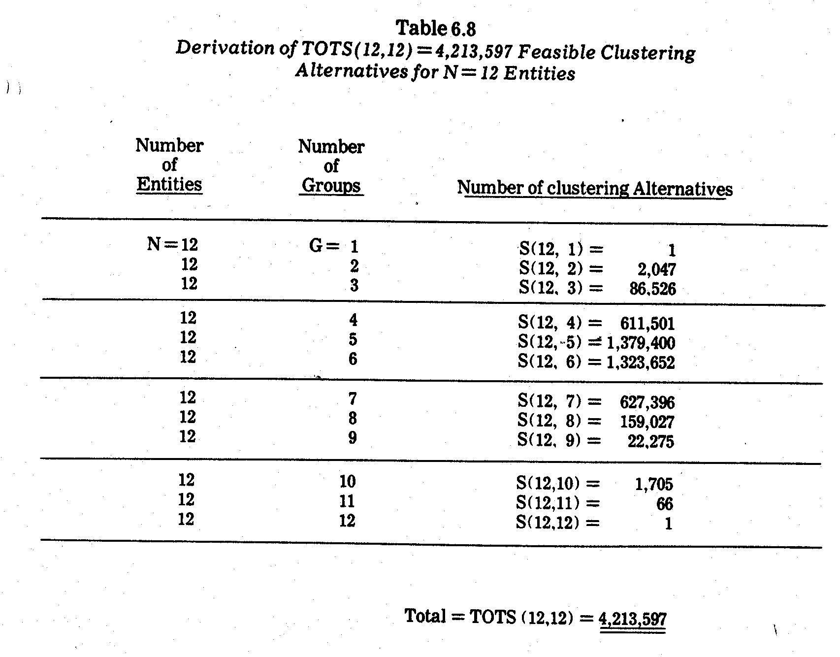
    Some years back I developed a dynamic programming algorithm designed to yield the optimal clustering solutions without having to enumerate all feasible clustering alternatives.51  A number of other researchers have also formulated integer programming approaches.52  But neither dynamic programming nor integer programming are sufficiently efficient for most clustering problems (other than very small or large problems having special structure).  In most instances, a heuristic (hierarchical, linkage) algorithm must be resorted to, some of which are extremely efficient and popular.53  A review of various techniques is given by Anderberg, Everitt and Duran and Odell.54

    There are many variations in cluster analysis, some which are discussed below:

    (1) Whether or not entities are directly traceable to one or more groups.  For example, factor analysis, principal component analysis, and multidimensional scaling can sometimes be viewed as types of cluster analysis in which items (entities or variates) are represented by a smaller  number of factor, component, or axis groupings which are composites of the items.  However, individual items (entities) are  not sorted and allocated to groupings in such a manner that any group contains an identifiable subset of specific items (entities).55  Unless noted otherwise, I will usually assume that items being grouped are directly traceable to one or more groups, as is usually the case in clustering and classification models.

    (2) Whether or not entities are partitioned into mutually exclusive groups.  In most instances, cluster analysis has been applied where N entities are to be partitioned into both mutually exclusive and collectively exhaustive groups.  However, some applications exist where groups (clusters) overlap.56  Overlapping groups greatly complicate the number of clustering alternatives and the analysis and interpretation of clustering outcomes.  Unless noted otherwise, it is generally assumed implicitly that groups do  not overlap, i.e., that groups are mutually exclusive.

    (3) Whether or not pairwise association indices of similarity (e.g., correlation coefficients) or dissimilarity (e.g., Euclidean distances) are utilized in the clustering algorithm.  In most instances such indices between pairs of items are utilized.  A number of clustering algorithms do not, however, require pairwise comparisons using such indices, e.g., direct clustering methods of Hartigan57 and normix (or mixture) analysis by Wolfe.58

    (4) Whether or not clustering algorithms are objective or subjective.  In most instances, clusters are generated by "objective" numerical algorithms on a computer.  In other instances, however, display techniques may be used, requiring human observers subjectively to form the clusters, e.g., clustering by visual comparisons of profiles and caricatures illustrated previously in this chapter.

    (5) Whether or not clusters are "optimal" in terms of a stated objective function.  Many clustering algorithms are hierarchical in nature such that the number of groups (clusters) varies from stage to stage of the algorithm.  At a given stage, the partitionings of the entities are not necessarily "optimal" in terms of the clustering objective function.  Often, however, it is not practical to further attempt to find the optimal clusters at each stage of the hierarchy.

    Hierarchical clustering techniques may be further subdivided into those which are divisive versus agglomerative.  A divisive hierarchical technique beings with all entities lumped together and then splits them into smaller and smaller subsets until each entity comprises a cluster by itself.  An agglomerative hierarchical approach begins with each entity in a separate cluster and then successively combines (merges) clusters until at the final stage all entities fall into a single cluster.  The analyst then chooses one or more intervening stages to analyze in greater detail.

    (6) Whether entities or variates are to be clustered.  In most instances, entities are clustered on the basis of variates observed on each of the entities.  It is possible, however, to cluster the variates rather than entities.  It is also possible to cluster both variates and entities at the same time.

    (7) Whether or not all variates are measured in mixed scales.  In most instances, variates under study are all continuous, all ordinal, or all nominal.  In a mixed-scale problem some of the variates may be a combination of continuous, ordinal, and nominal.  Mixed scale problems are difficult to deal with in numerical approaches, and hence, the analyst may prefer to resort to subjective approaches.

    (8) Whether clusters are to be predictive rather than merely descriptive.  Descriptive clusters are evaluated only in terms of the internal input variates used in the clustering process.  Predictive clusters are normally evaluated in terms of some external criterion variate not used in the clustering process but subsequently of interest after the clusters are identified.


    50    Terms other than cluster analysis which arise in the literature include clumping, partitioning, grouping, or classifying theory.

    51    Robert E. Jensen, "A Dynamic Programming Algorithm for Cluster Analysis," The Journal of Operations Research, Vol. 17, 1969, pp. 1034-57.  Also reproduced in B. S. Duran and P. L. Odell, Cluster Analysis: A Survey (New York: Springer-Verlag, Chapter 3, 1974).

    52    See, for example, H. D. Vinod, "Integer Programming and the Theory of Grouping," Journal of the American Statistical Association, June 1969, pp. 506-19.  One of the best formulations to date was presented by George Diehr, "Minimum Variance Partitions and Mathematical Programming," Paper Presented at the National Meetings of The Classification Society, Atlanta, Georgia, April 1973.

    53    One exceedingly popular formulation is the hierarchical algorithm described by J. H. Ward, "Hierarchical Grouping to Optimize an Objective Function," Journal of the American Statistical Association, Vol. 58, 1963, pp. 236-44.  An even more computationally efficient approach for large N is the k-means algorithm derived by J. B. MacQueen, "Some Methods of Classification and Analysis of Multivariate Observations," Proceedings of the Fifth Berkeley Symposium On Mathematical Statistics and Probability (Berkeley: University of California Press, 1967, pp. 280-98).

    54    M. R. Anderberg, Cluster Analysis for Applications (New York: Academic Press, 1973).  B. Everitt, Cluster Analysis (New York: Halsted Press, 1974).  B. S. Duran and P. L. Odell, Cluster Analysis: A Survey (New York: Springer-Verlag, 1974.)

    55    The term item is used since either entities or variates may be grouped, and in some cases both entities and variates are grouped.  It will be convenient to assume, however, that items to be grouped are entities (rather than variates) unless explicitly stated otherwise.

    56    Examples of cluster analysis with overlapping groups include: R. M. Needham, "A Method for Using Computers in Information Classification," Proceedings of I.F.I.P. Congress, 1962, p. 284-298; R. M. Needham and K. S. Jones, "Keyword and Clumps," Journal of Documentation, Vol. 20, 1964, pp. 5-15; A. G. Dale, N. Dale, and E. D. Pendergraft, "A Programming System for Automatic Classification With Applications in Linguistic and Information Retrieval Research," Paper No. LRC64, WTM-5, Linguistics Research Center, 1964; M. G. Kendall, "Discrimination and Classification," in P. R. Krishnaiah (Editor), Multivariate Analysis (New York: Academic Press, 1966, 165-84); L. L. McQuitty, "Agreement Analysis: Classifying Persons by Predominant Patterns of Responses," The British J. of Statistical Psychology, Vol. 9, 1956, pp. 5-16.

    57    J. A. Hartigan, "Direct Clustering of a Data Matrix," Journal of the American Statistical Association, Vol. 67, 1972, pp. 123-29.

    58    J. H. Wolfe, "NORMIX: Computational Methods for Estimating the Parameters of Multivariate Mixtures of Distributions," Research Memorandum, SRM 68-2, U.S. Naval Personnel Research Activity, San Diego, 1967; also see "Pattern Clustering by Multivariate Mixture Analysis," Multivariate Behavioral Research, Vol. 5, 1970, pp. 329-50.


    6.7.5--Euclidean Distances Between Companies.  In earlier sections clusterings of N=12 electric utility companies on the basis of profile or caricature visual displays were illustrated.  A numerical clustering approach will now be illustrated.  The following elements are utilized:

    DATA--Standardized factor scores in Table 6.6:

    MEASURES OF ASSOCIATION--Euclidean distances between pairs of companies;

    CLUSTERING ALGORITHM--The JENCLS General Classification Program at the University of Maine (a clustering routine comparable to Ward's hierarchical grouping routine mentioned previously.

    DENDOGRAPH--A tree-like diagram depicting the entity (company) mergings into clusters at sequential stages in the hierarchical clustering algorithm.

    The data and Euclidean distances are shown in Table 6.9.  The pair of companies most alike (with Euclidean distance of 0.38 in terms of the three major factors from Table 6.6) underlying the ten criteria (from Table 6.2) are Florida Power and Light (FPL) and Northern States Power (NSP).  Their factor score similarities (see Exhibit 6.3) are somewhat surprising since these two companies exhibit rather large differences among the M=10 original criteria in Table 6.2.  The next closest pair of companies consists of Commonwealth Edison (COM) and The Southern Company (COM) with a Euclidean distance of 0.61 in Table 6.10.


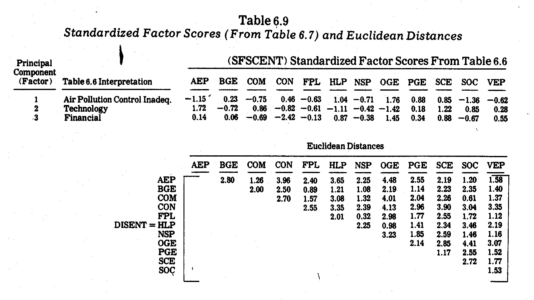
    In contrast, American Electric Power (AEP) and Oklahoma Gas and Electric (OGE) are least alike with a Euclidean distance of 4.48.  This is not surprising since AEP is an immense coal-fired conglomerate with severe pollution problems but a relatively high R&D commitment.  The OGE company, on the other hand, is a much smaller natural gas-fired company with almost no particulate and sulphur dioxide emission problems but higher electricity prices and underinvestment in nitrogen oxides emission control.  The OGE company also has a much lower R&D expenditure as a proportion of revenues.

    Use of standardized scores has an advantage of not differentially weighting individual variates because of scaling differences.  Use of factor scores (from Table 6.6) in lieu of the M=10 original variates has an added advantage of linear independence (orthogonality) between inputs in the Euclidean distance calculations.  For example, if Euclidean distances were calculated from the M=10 variates in Table 6.2 (after variate standardization), correlated pollution or other variates would be "double counted" and, thereby, tend to overwhelm individual variates by themselves.  Factor analysis recasts the entire system of variates into fewer "factors" which are not correlated, and hence, are not double counted in Euclidean distance calculations.

    6.7.6--Hierarchical Clustering Outcomes.  Enumeration of all TOTS(12,12)=4,213,597 possible clustering outcomes (see Table 6.9) seemed impractical for this study.  Instead an agglomerative hierarchical approach59 was used in which all N=12 companies are first viewed as G=12 single-entity clusters at Stage 1.  At Stage 2, the closest pair of companies (in terms of Table 6.9 Euclidean distances) are merged into one cluster, thereby leaving G=11 clusters at Stage 2.  Two clusters are merged in each succeeding stage until at Stage 12 all N=12 companies are forced into G=1 cluster.

    The hierarchical mergings of these electric utility companies into clusters are pictured in a dendograph-type diagram in Exhibit 6.8.  Unfortunately, there are no statistical tests or generally accepted mathematical criteria as to what stage (i.e., as to the number, G, of cluster groupings) should be considered "best."  Parsimony increases as there are fewer and fewer clusters, i.e., as G becomes smaller.  Usually, however, this parsimony is offset by decreasing within-group homogeneity as entities (in this case electric utility companies) are forced into larger and larger clusters.

    One clustering homogeneity criterion is the pooled within-groups sums of squares, otherwise known as "Trace W" criterion,60 where W is the dispersion matrix on all the variates (in this case the three-factors in Table 6.10).  Although the use of Trace W as a "stopping" criterion is somewhat controversial,61 the Trace W values at each clustering stage are shown in Exhibit 6.8.62  The large jump in Trace W between Stages 8 and 9 suggests that Stage 8 yields relatively homogeneous clusters and parsimonious groupings of the companies into G=5 groups (clusters), which might be viewed here as empirical "types" in terms of the original M=10 social impact criteria in Table 6.2.

    The Stage 8 clusterings into "types are as follows:

    Cluster 1 is comprised of the largest coal-fired companies.  Clusters 4 and 5 contain the least-polluting companies with much higher natural gas usage.  Conversely, Clusters 4 versus 5 differ primarily in terms of size and R&D expenditures as a proportion of revenues (the three underlying major factors on which the Exhibit 6.8 clusterings are based were briefly interpreted in Table 6.5), i.e., Cluster 5 companies have a much higher commitment to R&D than Cluster 4 companies.  Consolidated Edison of New York (CON) stands apart (Cluster 3) from all other companies, in large measure due to its exceptionally poor performance on Factor 3, i.e., due to having the lowest earnings margin and the highest kwh prices on electricity of all the companies in the study.


    59    My JENCLS General Classification Program at the University of Maine was utilized.  The program contains a hierarchical clustering algorithm which, for this data, yields clusterings in a similar manner to Ward's hierarchical grouping program, i.e., See J. H. Ward, Op. Cit.

    60    Other criteria such as |W| and G|W[ are discussed elsewhere.  See, for example, F. H. C. Marriott, "Practical Problems in a Method of Cluster Analysis," Biometrics, Vol. 27, 1971 pp. 501-14.

    61    See Robert L. Thorndike, "Who Belongs in the Family?", Psychometrika, Vol. 18, 1953, pp. 267-76.

    62    When Euclidean distances are available it is easier to compute Trace W from averaged sums of all pairwise Euclidean distances (squared) in the manner described in Robert E. Jensen, "A Dynamic Programming Algorithm for Cluster Analysis," Journal of Operations Research, Vol. 17, 1969, pp. 1034-57.

    63    These clustering outcomes are given at Stage 8 in Exhibit 6.8.


    6.8--Summary

    The major intent of this chapter was to explore means by which multivariate social criteria can be simultaneously compared on companies without having to convert everything into monetary units (as is the case in traditional financial accounting).  Graphic and other display techniques were considered.  An important advantage of display techniques lies in the ability to exploit human mental powers in sorting and making comparisons between entities and/or variates.  Another advantage is the ability to combine both quantitative and qualitative variations in a single display.

    Drawbacks of visual displays lie mainly in the subjectivity and obvious cumbersomeness of making comparisons if many entities and/or considerable detail are included in the display.  Profile charts, for example, are highly satisfactory where there are small numbers (e.g., less than twelve) of entities and a few (e.g., less than six) quantitative variates.  Certain mathematical transformations (e.g., principal component analysis) may help to reduce the number of variates to be treated in the display, although interpretations may be somewhat complex.  Fourier series plots appear to have few advantages over profile plots except where there are too many variates (or factors) for profile plots.  Also statistical inference testing becomes possible when a number of restrictive assumptions are satisfied in the Fourier series model.

    Geometric pattern and/or caricature displays may accommodate more entities and variates than do profile charts.  In addition, qualitative variations may be accommodated in many types of such displays.  Two such approaches illustrated in this chapter were glyph plots and facial caricatures.  Facial caricatures can be utilized for a greater number of variates than can glyphs, although the facial comparisons become quite dependent upon how human viewers subjectively weight different features when comparing faces.  There will also be skeptics who view comparisons of abstract representations (such as faces) as being nonsense or silly fun-and-games.

    Cluster analysis and other tools in numerical taxonomy were designed primarily to overcome some of the difficulties caused by subjectivity in taxonomy classifications in the natural sciences.  Numerical techniques have the important advantage of yielding "objective" groupings (provided the variates and appropriate mathematical approaches can be agreed upon) in the sense that allocations of entities (or variates) to groups is accomplished by mathematical techniques (usually on a computer) rather than human observers.  This advantage, however, is offset by computational difficulties and the fact that different approaches work better than others for certain types of clusterings.  In contrast, the human mind is much more flexible (e.g., when presented with visual displays) in detecting clusters and abberrations.

    In practice it is probably best to compare "subjective" visual display clusterings with "objective" numerical clusterings.  Both approaches were illustrated in this chapter.  For example, Table 6.2 listed performance data for N=12 private electric utility companies on M=10 social impact criteria.  A principal component analysis was performed, reducing these criteria to three underlying independent factors (interpreted in Table 6.5).  Rotated factor scores were then analyzed in visual displays (profile charts and facial caricatures) and in a hierarchical clustering algorithm.  Although the number of clusters which emerge is open to debate, it seemed to me that Stage 8 was a reasonable stopping point (where G=5 clusters) in Exhibit 6.8.  The human observers I presented with the Exhibit 6.7 faces tended to choose G=4 clusters.  The groupings in both cases were similar but not identical, as is indicated in Exhibit 6.9.  In particular, the BGE classification seems to be the least consistent.  The "objective" numerical clusterings in Exhibit 6.8 include BGE with CEP, FPL, and NSP.  This is consistent with their Factor 2 (Technology) and Factor 3 (Financial) similarities evidenced in Exhibit 6.3.  However, Exhibit 6.3 also reveals how BGE (and CON) pull ahead of the pack with respect to Factor 1 (State-of-the-Art Pollution Control).  This is especially surprising since BGE is a relatively heavy coal user (59.1% under x2 in Table 6.2).  The exceptional performance (relative to other coal and/or oil burning companies) on particulate and sulphur dioxide control seems to be the reason for BGE's inclusion with the "clean guys" in Cluster 4 in Exhibit 6.7.  But the falling down of BGE on Factors 2 and 3 (see Exhibit 6.3), however, partly explains the inconsistencies in BGE classifications in Exhibit 6.7 versus Exhibit 6.8.  Similarly, the exceptional Factor 1 performance of CON also gives it certain facial features resembling Cluster 4 "clean guys" in Exhibit 6.7.

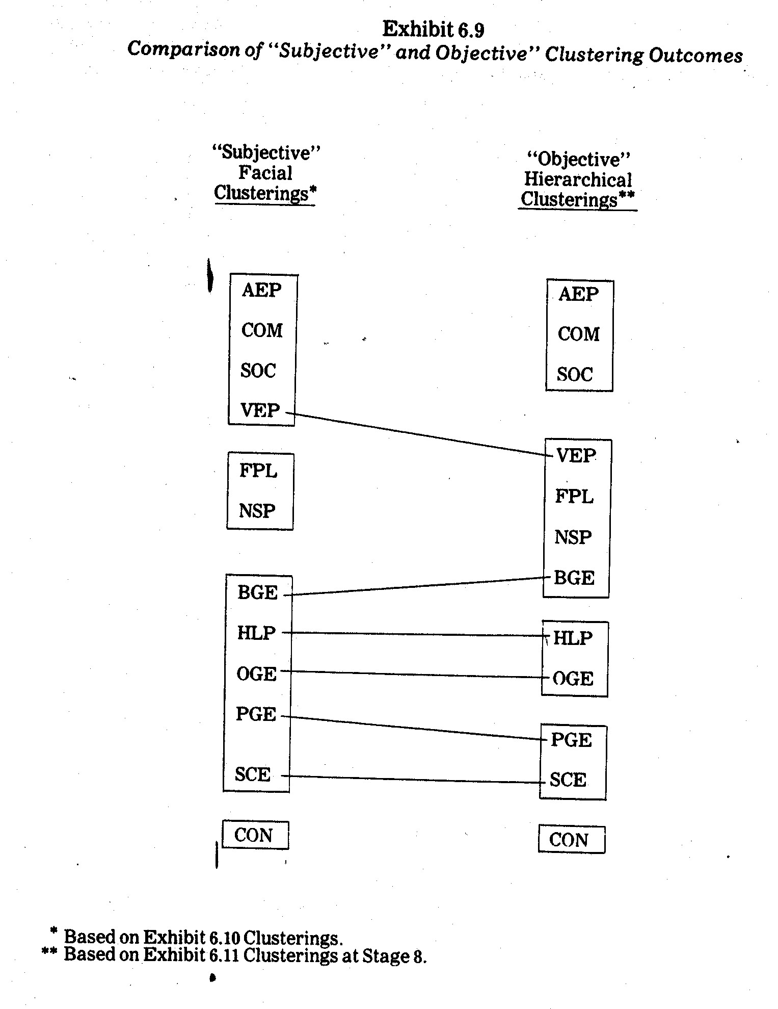
    As expected, the "objective" hierarchical clusterings in Exhibit 6.8 (based on Euclidean distances) agree more closely with profile similarities in Exhibit 6.3 than do the "subjective" clusterings in Exhibit 6.7.  The "subjective" facial clusterings differ largely because of apparent unequal weightings given to different facial features by human observers.  For example, eyebrow size and shape variations seem to be much less important than eye size and shape variations.  One means of overcoming this problem is to make a number of facial plottings under different assignments of variates (or factors) to facial features and attempt to discover if human observers tend to detect consistent clusters under such variations.

    I stress that no significance whatever should be placed upon which companies have the most "agreeable," "appealing," or "happy" faces.  In both Exhibits 6.6 and 6.7, the social impact variates (or factors) were randomly assigned to facial features.  The purpose is merely to compare faces with one another in an effort to discover subsets which seem to be most (or least) alike.  One advantage of the caricature (e.g., glyphs or faces) comparisons (e.g., see Exhibit 6.7) relative to numerical clustering outcomes (see Exhibit 6.8) is that alternative clusterings are a little more evident.  For example, in Exhibit 6.7 it is evident that, although BGE has certain things in common with most other Cluster 4 companies (e.g., head size, head shape, nose length, mouth length, position of center of mouth, separation between centers of eyes, and position of pupils), BGE also has features in common with CON in Cluster 1 (e.g., eyebrow length, height of centers of eyes, half-length of eyes, and angle of brows).  This similarity is also evident in the profiles in Exhibit 6.3 but is not shown as clearly in the cluster-merging (dendograph) diagram in Exhibit 6.8.

    Both "objective" and "subjective" cluster analysis approaches illustrated in this chapter are means by which entities (e.g., companies) may be sorted into "types" on the basis of multivariate criteria (e.g., the M=10 social impact criteria in Table 6.2).  The interpretation of these "types," and more particularly the ranking of the "types" along a "good versus bad" or "high versus low" composite of all criteria simultaneously, is a much more difficult and controversial undertaking.  Material in Chapters 7 and 8 have some relevance to such endeavors.

    6.9--Suggestions for Further Research

    The number of criteria (i.e., the M=10 variates in Table 6.2) is too small for a thorough taxonomy study of corporate social criteria.  Many additional criteria (e.g., see Appendix A ) must be considered.  However, relevant data on which corporations can be compared along a much wider spectrum are lacking.  It seems that future corporate comparisons such as those illustrated in this chapter will await better data.  Such data might either be generated in large-scale studies of companies or from required (and uniform) reporting practices imposed upon corporations.  Internal studies by the companies themselves are of less use due to likely inconsistencies in definitions, measurement techniques, accuracy, and scope of investigation.

    Much further study is obviously needed to determine what attributes (criteria) are most important to study.  The added Chapter 5 considerations must be better resolved.  If data become available, however, multivariate analyses such as those mentioned in this chapter are especially interesting to pursue, e.g., in both seeking underlying factors amidst criteria and empirical "types" of companies.  Dimensions of social conflict and interaction are also of interest in future research.  Chapter 7, in particular, bears upon such issues.

    Clusterings in this chapter concerned companies at a point in time.  Another area of interest might be the study of evolutionary patterns over time with respect to economic, social, and environmental criteria.  For example, cladistic taxonomy64 reconstructs the branching patterns over different time planes.  This might be further extended to considerations of evolutionary rates, parallelism, and convergence.


    64    Classification by clades is discussed in J. S. Huxley, "Evolutionary Processes and Taxonomy With Special Reference to Grades," Uppsala University Arssks, 1958, pp. 21-39.  For other references, see Chapter 6 in P. H. A. Sneath and R. R. Sokal, Numerical Taxonomy (San Francisco: W. H. Freeman and Company, 1973).